Western Identities
 Tuesday · Jun 10 · 2008 | 4:39 PM PDT
  29 Comments
 Concept art! We're sticking to the western conference for this one.
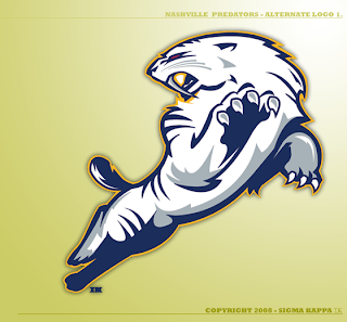
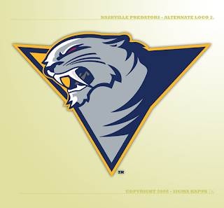
The same designer who created this logo for the New Jersey Devils has a few ideas for the Nashville Predators.
That's just cool.
And I have nothing bad to say about this one either. I love getting work from talented artists. Just makes the mind wander.
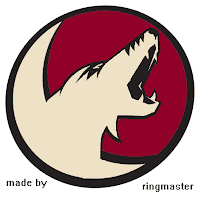
Next up is an idea for a hybrid Phoenix Coyotes logo.
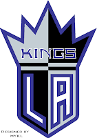
Hadn't considered that before. Also a Los Angeles Kings concept.
Resist the urge to start in with the comments about Sacramento of the NBA. We know.
Lastly, I thought we'd finish up with another wallpaper. Tomorrow will be the big day though — the official start of Wallpaper Wednesdays. You guys liked the Boston Bruins wallpaper so much, the designer's made one for the Oilers as well.
This might also be a good time to drop a hint that the new Icethetics name will be taking over very soon.





Reader Comments (29)
I really like the designs of the Predators logos but where are the hockey sticks?
If I were to see these logos on the street, I would have no idea if they are the NBA, NFL or even, ugh, soccer. The Sharks logo is exellent because of this.
Like the Predators logos, but the head of the first one looks odd. The second head is cool, but the "triangle" looks a bit awkward.
Someone make a Leafs wallpaper :)
That Predator logo looks like he's playing so it doesn't really intimidate me. Doesn't it look like he's playing tag or something? It should be more like the Panthers logo where he's leaping out at you. Maybe just change the angle of the head because it looks good.
most hockey logos don't have hockey stuff in them, dandy. The thrashers, the sharks, the isles, the caps, the pens and some of the vintage logos are the only ones that have hockey sticks in their logos that i can think of. Does the blues logo not look like an entrance to some jazz club?