Western Identities
 Tuesday · Jun 10 · 2008 | 4:39 PM PDT
  29 Comments
 Concept art! We're sticking to the western conference for this one.
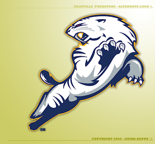
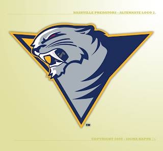
The same designer who created this logo for the New Jersey Devils has a few ideas for the Nashville Predators.
That's just cool.
And I have nothing bad to say about this one either. I love getting work from talented artists. Just makes the mind wander.
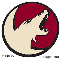
Next up is an idea for a hybrid Phoenix Coyotes logo.
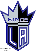
Hadn't considered that before. Also a Los Angeles Kings concept.
Resist the urge to start in with the comments about Sacramento of the NBA. We know.
Lastly, I thought we'd finish up with another wallpaper. Tomorrow will be the big day though — the official start of Wallpaper Wednesdays. You guys liked the Boston Bruins wallpaper so much, the designer's made one for the Oilers as well.
This might also be a good time to drop a hint that the new Icethetics name will be taking over very soon.



Reader Comments (29)
i want a sabres wallpaper
The first one has a Pred-a-slug head. Looks wrong.
if you can make a preds logo with a full body, why not a coyotes logo?
Those Nashville logos are pretty good. I like them better than what's currently being used.
Not sure about the Phoenix one. It's not bad, but I think their current one is really good.
sacremento(b-ball) and l.a.(hockey) should really have a sitdown meeting to discuss who is eventually going to change there colors or mascot.
i found this post awsome
i made the kings one(i know i know reeeealy original)
but i must have got my friend intrested, he made the coyotes one
look for designed by mykl on some
thats me!
...also
if the first one was just the head
killer
doesnt look like a slug to me dennis
Those two Preds logos are back-and-forth for the best Preds possibilities I've ever seen. Niiiice. :D
The Predators concepts are awesome, and the perfect example of a logo that you wish you could see on a real NHL jersey. That would just look incredible on the ice.
I'm also partial to the proposed Coyotes design. One thing that stands out to me is combining two images that are a symbol for the same thing. Using both the head and the moon as a symbol for the Coyote I think is a good idea. I am a Kings fan, and one of my favorite logos is the Coat of Arms logo from 1997-2002. I like a logo that has good symbolism with multiple ways that the team's nickname is represented in that logo.
I know that's not really a good reason to like a logo, but great symbolism is the key to a great logo (such as the Red Wings logo; the wing representing speed and the tire representing the "Motor City").
Something I just noticed about the second Predators logo: it seems to be a spin-off of the San Jose Sharks logo. For that reason, I don't think that logo has much originality, even if the designer didn't see any similarity when s/he created it.
It does look good, don't get me wrong, but it has too much in common with the Sharks' logo, in my opinion.
awesome oilers wallpaper!!!!! using it right now
so here is an idea.
how about having POLLS with team logo creations between the guy who did this preds one, and GFB?
the first preds logo, although well done, looks like a high school logo, not a pro sports logo.
man, that preds logo is sweet.
the 2nd preds logo is wicked sweet... god i wished team reps stumble on this blog and look at all the different logo designs that would improve the teams image and merchindice
oh and cant wait to see what they do with my Panthers logo
I made the coyotes one, but I don't like it that much. I look forward to more of my work being posted in the future (hopefully).
For the two Preds logos I think they should swap heads. The first one has a 3D body with a 2D head. Put the 3D head on the body and I think it would be even better!
Not crazy about the first Preds logo, but absolutely love the second (headshot) logo and also love the Coyotes logo. Nice work.
I love the second Preds logo. If the triangle were a little more uniform, it'd be perfect.
Woohoo, he used my Oilers wallpaper too, and next I'll do a Sabers one and if there are anymore requests, write'em in.
snyperp please make a flyers one, also the guy who made the preds logo seems to be as good as if not better than gfb
the head of the 1st preds one looks like an angry beaver. The preds could use something new, but those suck. A logo does not need to look like a poorly drawn cartoon.
i definately think the full body logo with the second logos head would be a lot better than both of these.
WHY IS THE COYOTE HOWLING AWAY FROM THE MOON???