Just To Freak You Out XXXVII
 Friday · Jun 13 · 2008 | 6:26 PM PDT
  15 Comments
 Two weeks have elapsed since the last Freak Out Friday, so right on time it's here again. And oddly enough, we're starting where we started last time — with the clubs from New York.
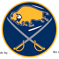
I think that needs no explanation. And sticking with NY for a moment, check out this Buffalo Sabres logo concept.
Yeah it takes a minute to really realize what you're seeing. At first you're thinking, "yeah, that classic '70s logo... but wait, something is a little off about it — aside from the buffalo being yellow, that is." Oh that's it! It has a slug head.
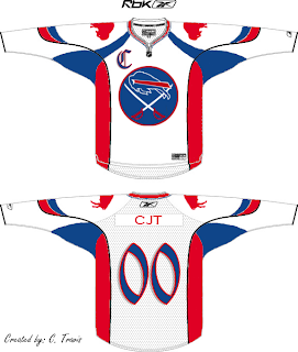
And just when you thought the Sabres hadn't been through enough for one Freak Out post, just wait for this.
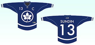
Perhaps if the Bills played hockey... No, just no. And while we're on the topic of odd jerseys, we have another.
I believe we've seen something of this nature before, but it's still funny to me.
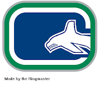
Now we're heading out west for the rest of the post — starting with a very strange Vancouver Canucks concept logo.
The whale is diving into the "C" ... get it? (Say it out loud if you haven't gotten it yet.)
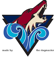
And with the QMJHL logo tournament in full swing over at ToHL, a reader sent me this logo crossing the Rimouski Oceanic with the Phoenix Coyotes.
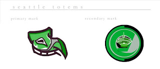
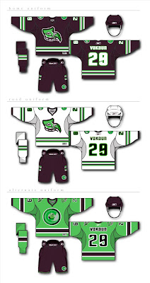
Finally, on a completely different tack, someone has not only created a brand for a team, they've created a brand new team. I'm told the Florida Panthers should move to Seattle to become the Totems.
Now I'm no fan of the stinkin' Panthers but if this is the only option, I can't say I'd wholeheartedly support it. The design comes complete with jerseys and everything.
So keep your freaky artwork coming so I can keep this series going. Check back in two weeks for the next Freak Out Friday.
Oh, and to anyone out there who doesn't believe in the evil powers of Friday the 13th, consider this: Tim Russert dropped dead in the NBC newsroom today, a 6.9 magnitude earthquake rattled Japan, Iowa is under water and a tornado just tore off a bunch of roofs and wiped out a Wal-Mart down here in my part of Florida.
Yeah, but that Wal-Mart had it coming.



Reader Comments (15)
LMAO at the NY Rangelanders jersey.
wow.....friday the 13th sucks!!
and there's 3 of them next year!
--------------------------------
www.nfllogos.blogspot.com
wow, that "totems" concept is awful. I'm not even sure what we're supposed to be seeing. I didn't know logos were supposed to bring flashbacks of Magic Eye.
Plus, the color scheme just reminds me of pistachio ice cream, which isn't a very good thing.
I think it would be great idea to have a team in Seattle, just not with that concept. I can't even make out what the symbol is supposed to be; it looks like a tadpole to me.
I like the real Seattel Totems' unis much better.
http://seattlejrtotems.pucksystems2.com/photo_gallery/show/4238
They're a Single-A junior club.
I could go with having a team in Seattle--especially if they lose the Sonics.
I guess they currently root for the Sharks. I think Vancouver is closer, but I'm pretty sure proximity is usually negated by national borders.
that leafs one is bad. I think its based on air canada logo. I dont mind the original Sabres logo with the buffaslug head though.
That Bills one...kinda left me in a stupor mind set. thats...just...not right...
p.s.
yeah friday the 13th sucked! Buffalo had a wicked Thunderstorm and our power kept shutting off! And i was deeply saddened by the loss of South Buffalo native Tim Russert...
ok first my stinkin panthers stay here in south florida lol... move a team like atlanta... seattle would be a great place for hockey maybe call the seattle sirens... named after the logo for starbucks :-)
I like the color scheme for the Seattle team, but again, I don't get what the logo is supposed to be. The logo could be a lot worse...
And every time I see that TML logo I think it looks a lot like the NYC Parks logo...
*freaks out*
Us native South Buffalonians will miss Russert, who never forgot his roots and always found time to throw out a "Go Sabres" or a "Go Bills" whenever their respective seasons were on.
I like the totems... the logo is supposed to be a thunderbird or eagle or something thats a top of a totem pole I think... and I like that pistachio colour more teams need diverse colours...
I really like the Leafs concept. I don't think it deserves a place in "Freak Out Friday". Everything else, especially the Totems (even the name is hideous) is pretty bad.
There's some real garbage in this post.
The Seattle Totems were a former WHL team formed in 1945 and named the Totems from 1958-1975 and a current NPHL (Northern Pacific Hockey League) team. The logo of the current WHL team, Seattle Thunderbirds (as of 1985) came from the original team.