Land Of 10,000 Concepts
 Monday · Jun 16 · 2008 | 3:07 PM PDT
  9 Comments
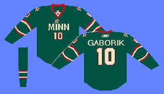
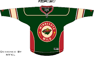
 Yeah and I have about that many concepts for the Minnesota Wild tonight. After I posted the news about what their new third jersey will look like, my inbox was inundated with fan created designs. So naturally I have a bunch to share.
The one on the left is an odd combination of Wild and North Stars that doesn't completely suck. Sure, it's weird and you'll never see it on a jersey, but look at that thing. Crazy. Of course on the right is a simple green sweater from Jacob at We're Revolting!
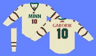
Here's an interesting one.
I think MINN is just weird but then I'm not from there so I don't get to have a say. What do you think of a wheat-colored design?
Here's an odd set, taking a page out of the Dallas Stars' book. Funny how that works.
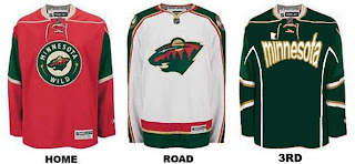
Still got a few more to share. The one on the left could work as a couple of options for a third jersey or a completely new home and away set.
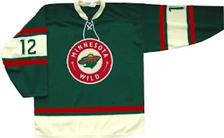
On the right is a wheat-colored version of the current red home sweater. And we'll finish things off on the same tack, only going the green route instead.
The last one just has a different striping pattern.
My thanks go out to everyone who's been submitting artwork. You guys are the reason I continue to have content for this blog on a daily basis. Keep them coming. I tend to post the best stuff sooner rather than later so really put your heart into it!





Reader Comments (9)
where is the wild "W" that has the wild stuff etched into it?
I made this as a joke (it was in a Freak-out Friday post), but people seemed to like it...maybe they should head in this direction...
http://picasaweb.google.com/nhlconcepts/MinnesotaWild/photo#5194065899289701266" REL="nofollow">http://picasaweb.google.com/nhlconcepts/MinnesotaWild/photo#5194065899289701266
The second LAST one is the best by-far
I'm not gonna lie....I don't really like any of those
_____________________________
http://nfllogos.blogspot.com/
The second-last one is basically the same thing as the oilers third jersey
atownjacket: Me neither
Out of the bottom four images of the post, I only care for the first three of them, meaning I eliminate the last one... no offense to the artists in their speculatory concepts, I hope they don't ever see the light of day.
It is enough the RBK Edge jerseys the Wild have now are a downgrade from 2006-2007. Now if those concepts described by the reader who went to the event are true, it's a downturn from what the Wild should keep doing... make it simple, traditional and yet very appealing. They did a great job with the alternate before it became the home jersey. They do something drastic and ridiculous, there is no way I'd buy that or want to look at them.
Whatever happened to GhettoFarmBoy's idea he created last year? THOSE should be suggested to the Wild.
http://nhllogos.blogspot.com/2007/08/more-thoughts-on-wild.html
I like GFB's MN State logo and think that should be incorporated somewhere on the jersey whether as a shoulder patch or main crest.
wait gfb designed that?(2 comments above)
i made the last one
i dont like it that much