Tuesday
Jun172008
New Looks For The Whole League
 Tuesday · Jun 17 · 2008 | 2:55 PM PDT
  35 Comments
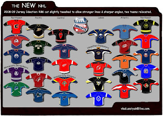
 I've opted to be lazy today. I have concept art but it's all in one graphic. One reader has redesigned the uniforms and logos of every single team in the NHL. Some of them are great... but some of them are terrible. I'll leave it up to you to decide what's what.
Comment away! Another edition of Wallpaper Wednesday comes tomorrow.


Reader Comments (35)
taking a look at these a second time, i realize how awful these concepts are.
does anyone notice how extremely inconsistent the size of the crest logos appear sweater to sweater?
boggles my mind, and just plain awful.
Berserkers? What does this guy watch "clerks" religiously or something? Anyways, in all that garbage there is one detail I do like on the sharks jersey. It looks like there are some gill like stripes on the side panels which could be a pretty cool little detail.
I really like the lighting jersey
______________________________
http://nfllogos.blogspot.com/
Geez, you guys are harsh. The poor guy probably spent lots of time on this and you're just ripping it to shreds. I'm not gonna pretend like it's a masterpiece, but I like some of these jerseys. Like the Penguins, Sabres, I like the colour used for the Hurricanes but that's not the striping pattern they should use. There were more I liked but that's just off the top of my head.
I like the Caps jersey.
The Leafs' jersey looks a lot like the Blue Jays' Canada Day jerseys (http://www.geocities.com/Colosseum/Park/1138/photos/photo-rogerclemens.jpg)
Vancouver - yay, the skate logo is back (sort of)! I might be the only one, but I like the mix between those different styles.
Obviously, that Sabres logo needs to come back.
And if it's up to me, leave the O6 logos alone.
flames is fine, i hate that ducks one, buffalo and pittsburgh good and i know i like another few, dont remember which ones.
i think atownjacket should stop self-promoting his rip-off website; but that's just me.
idea
GFB should do this with his stuff
I like the Sens, a return to the classic 2D logo. Beautiful.
Now, as for the divisions, really? New Jersey's going to get separated from the Rangers? Toronto's going to be separated from both Montreal and Ottawa? Pittsburgh won't be with Philly, who also isn't with the Rangers and Islanders? A lot of the designs are poor, but what the heck was the thought process on the divisions?