Reworking Logos
 Monday · Jun 2 · 2008 | 12:59 PM PDT
  17 Comments
 It's time once again for some concept art. Today we're looking at reworking various team logos. Some with good results, others not so much.
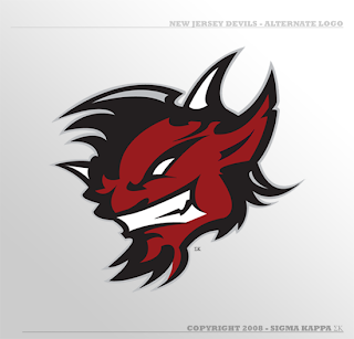
We'll start with an alternate logo concept for the New Jersey Devils. It bares some similarity to an idea created by Matt for his Rebranding the NHL series. Only this one is graphically simpler.
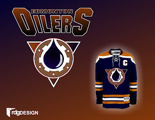
So that's pretty cool. We've also got an Edmonton Oilers logo here.
Nice, effective, but a complete disregard for the team's logo history and not modern enough to warrant it (like the gear logo on the old third jersey).
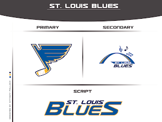
Got something new for the Blues as well.
Interesting turning the note into a hockey stick but the secondary is just to intricate to form a great logo. Nice idea, though.
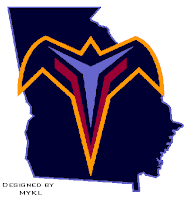
That's a simple concept but one that need never see the light of day. I think to some extent, incorporating the state or provincial outline works but not in every instance.
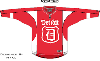
We'll finish things off with some new looks for the two teams currently battling for Lord Stanley's Cup. By the way, is it just me, or does it seem like they're dragging this series out with all the days off in between games?
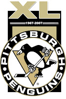
A simple flash to the past there. And with the Penguins celebrating 40 years in the NHL, one reader submitted a unique commemorative logo paying heed to the club's history.
Overall, a decent, if not above average, batch of concept art for you today. By the way, I've got a new series I'm kicking off on Wednesday. Tune in then to see what that's all about. (Just remember, I like alliteration.)



Reader Comments (17)
don't worry about them dragging the series out chris, tonight will mark the end of the 2007/2008 nhl season.
lets go team Sweden.. I mean, Detroit
they're hardly dragging it out. the only 2 day lay off was last week, thursday/friday. there's only been one day off between games otherwise.
you want a best of seven in 14 days?
[plus, cbc needs their saturday night showdown. you're in tv. you know that.]
either way, a euro captain wins his first cup tonight.
p.s.
the devils rework is nice... matt's is still a few steps up, but it's nice.
the secondary blues logo would work fine with a single eighth note under the arch and removing the superfluous flow killers overtop.
[blogspot needs a comment edit option]
YAY!!! Concept Art!!!
btw, I found the Caps lock key! haha
GO PENS!!! That's what you commenters above get for being cocky...
YAY!!! Concept Art!!!
btw, I found the Caps lock key! haha
Hooray!
That Oilers logo isn't too bad. I don't think I'd want it for a main crest, but as a shoulder patch or something it might be OK. What's the triangle for, though? It doesn't look bad, just wondering as Pittsburgh uses it for a reason. I can't think of that reason right now, but I'm pretty sure there is one!
Oh yeah, thanks for the full set of stripes on the jersey. It's appreciated!
ghetto does St Lou on Wed. More cookie cutter artwork?
C_V_J I think that this is better than Matts as his devils was probably the worst he has done so far.
Jason, this may seem like a stupid question, but what is the meaning of the triangle for the Pens?
According to wikipedia: "For their inaugural season, the logo featured a hefty-looking skating penguin wearing a scarf, on a yellow triangle inside a circle reading "Pittsburgh Penguins". The yellow triangle is a reference to the Golden Triangle in the city of Pittsburgh."
The Sharks' wiki doesn't specifically say that their logo's triangle is related to this, but it'd make sense: "Over 5000 potential names were submitted by mail for the new team. While the first-place finisher was "Blades," the Gunds were concerned about the name's negative connotations (weapons, etc.) and went with the runner-up, "Sharks." The name was said to have been inspired by the large number of sharks living in the Pacific Ocean. Seven different varieties live there, and one area of water near the Bay Area is known as the "red triangle" because of its shark population."
No mention in the Ducks' wiki of the triangle used in their previous logo.
On the Blues secondary logo with the arch...that's just a rip-off the St.Louis Rams 1995 logo. I've seen several people try to play with it already and it doesn't work. The blue note with the hockey stick is disgusting. The blue note is one of the NHL's last simple logos and got all the improvement it needed in 1998 when the new colors were premiered.
hahahaha awsome
2 of mine got posted
on the thrashers, i saw the milwaukee brewer logo wwhere the m is in frount of wisconsin, and i wanted to do that to some extent
so i decided on the thrashers
and on detroit jersey, i like the newer jerseys with like piping,(not plain old stripes)and i couldnt come up withj a desent updated wing logo, so i put together old and new...it wasnt THAT bad...i do regret the triangles on the chest
look for designed by mykl
thats me
For the Thrashers' logo.. why? First of all, I can't picture a Thrashers logo without a thrasher. Second, putting the state of Georgia doesn't do anything to the logo aside from make the "T" logo not look so plain.. but I don't think that logo should exist, anyway.
Man if the Oilers went to that jersey I think I would move to a different NHL city and start cheering for them. When will nonOiler fans get the message that the Oilers Logo to us Oil fans is as important to us as the Canadians logo is to Habs fans!
This jersey though http://bp0.blogger.com/_r8tWGVHrjGI/R8yIusGkiiI/AAAAAAAAD7c/lTvbbLKl9zA/s1600-h/JRH_EDMjerseyconcept1.jpg is the absolute best concept I have ever seen. I would buy two of each if they made that jersey! Note the original 1970's logo!