Reworking NHL Uniforms
 Tuesday · Jun 24 · 2008 | 3:09 PM PDT
  21 Comments
 There's another new artist I've received several submissions from but he's not looking to redesign team logos league-wide — just the uniforms. His sets include a home, road and alternate jersey for every club. On Sunday I posted his Ducks set (it's the first one in the post). But he's been working his way through the NHL alphabetically and I have a few more to share with you today.
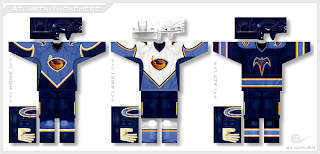
We'll begin with the Thrashers.
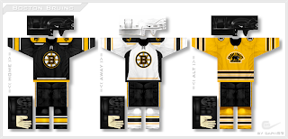
I have yet to see a design from him that I don't like. And that streak continues with the Bruins.
If you scroll down to the bottom of the post you'll see a bonus alternate sweater design. But first, the Sabres.
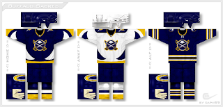
A very unique set here mixing old with new in terms of logo design — a rare example of the designer going with a completely new logo. The Flames are next.
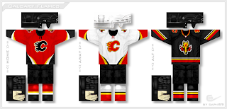
In this design he reintroduces the horse head secondary logo (which I always liked) while keeping the jerseys mostly unchanged except for the striping patterns.
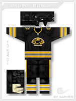
And finally, here's a look at that bonus Bruins alternate design.
It's basically a black version of the yellow one above.
I'm enjoying very much being able to post some outstanding work lately from some very talented artists. I look forward to being able to share more with you as ICETHETICS launches in just one week.



Reader Comments (21)
IMO, the two words which best describe these designs are "epic" and "win". My only, minor, dislike is of the double-stripe on the B's alts...but otherwise, spot on.
I actually really liked those double stripes on the alternates.
I don't like that the horse replaced the two flags on the flames home and away jerseys though. It was giving the team more of an identity by using the flags rather than the horse.
i'm glad to see that the Sabres jerseys put more emphasis on the sabres themselves then the buffalo.
GFB is gonna have to really wow me with his sabres redesign if its gonna beat.... this guys
I am not a big fan of the curves that he used in the Ducks and Thrashers. They seem like they would be very difficult to manufacture and they seem like they would not look right on the ice. Each angle of the player would be a different view because of the curves.
The Thrashers, Sabres, and Flames jerseys look incredible here. For the Thrashers, the brown on the logo doesn't match the light-blue on the jersey normally, but somehow it works here. For everybody in the Sabres' organization.. is a logo with actual sabres too much to ask for?
I LOVE THE THRASHERS JERSEY!!!!
The Sabres is the only one I really like more than the current unis. That said, the Sabres one, with the subtle logo redesign is the most amazing I have seen for the Sabres. None are bad, or even OK, all at least sorta good.
P.S. The horse was always sorta a cool alternate. Good for using it.
I've known this designer for a while now, well, not known him known him... anyways. he's always had great ideas and he hasnt slipped over the years.
the gold bruins alt is killer. classic style and a throw back to a mega oldschool jersey.
thrashers look awesome with the blues and yellow and white as the colors, but like someone else said, the extra colors on the logos dont fit
Those are all excellent. Especially the Sabres. Of course, just about anything would be an improvement over the tripe we currently wear.
Thanks for your sharing.
These are wonderful article.Thanks for your sharing.
Thanks for providing this is type of i useful nformation.<a href=http://www.sunglasses-club.com/ >oakley sunglasses</a>
I gave my site a few examples below. If you appreciate my comments in you enter.
Generally I do not post on blogs, but I would like to say that this post really forced me to do so, Excellent post!<a href=http://www.mvpchristian.com/ >Christian Louboutin</a>
It's funny how we adopt words and adapt our lexicon to the times. This is a very useful slant on things.
That is an awfully astounding column you've posted.Thanks a lot for that a fantastically amazing post!<a href=http://www.mvpchristian.com/ >Christian Louboutin Shoes</a>
thanks for your post loving it
jordan fusion ones
jordan fusion obama
jordan fusion royal
jordan fusion lime green
jordan fusion olive
jordan fusion retros
jordan fusion shorts
We are reliable provider dedicating to offering our customers high qualiy cheap designer handbags online.
Few watch aficionados realize that the Japanese brand seiko watch has a history as old as many of its Swiss rivals. Founded in the 1880s, the company began manufacturing wrist seiko watches after World War I and quickly became an innovative leader, developing one of the world's first seiko automatic and seiko chronograph. But perhaps Seiko's greatest achievement came about in its race with the American brand Bulova to harness new technology, leading to the quartz watch, which revolutionized the industry and nearly drove the Swiss out of business.
More innovations followed, including the first computer wristwatch, in 1984, and the first nonbattery seiko kinetic watch. To this list we can now add another groundbreaker: the Seiko Spring Drive mechanical movement, which is accurate to one second per day, making it approximately three times more precise than the average mechanical watch. The Spring Drive also provides an enduring seventy-two hours of power reserve (most watches offer about forty) and winds 30 percent faster than a conventional movement.
According to seiko uk, twenty-eight years of work went into developing this movement, and only five of the company's hundreds of watchmakers possess the requisite skills to assemble it. Regardless of its technological history, the seiko 5 is a skillfully designed watch, with graceful hands and interesting use of off-center dials.
Hi, The topic that you have discussed in the post is really amazing, I think now I have a strong hold over the topic after going through the post.