Sunday
Jun292008
Red Wings Alternate Logo Art
 Sunday · Jun 29 · 2008 | 3:40 PM PDT
  23 Comments
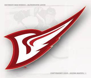
 I've got Detroit Red Wings concept logos tonight. The first comes from an artist I like who's come up with new marks for the Devils, Predators, Senators, Flyers and last week, the Coyotes.
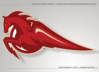
It's a great piece of artwork, I'm just not entirely sure it's worth considering as a replacement for the Stanley Cup champs' current symbol. That aside, he's got a pretty nice secondary as well.
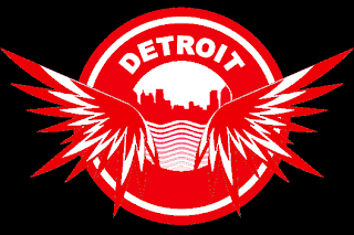
The last logo I have to share with you is from a different designer. Have a look.
Two more days until ICETHETICS launches. Get excited!


Reader Comments (23)
The Shoulder Patch logo is wonderful.
I dont think anything could replace Detroit's logo ever
the patch logo would be awesome if they were called the detroit unicorns,,
The horse must symbolize HorsePower, I believe... which must really suit Detroit well since it's the Motor City... cars, horses, power you get the picture?
Not a fan, unfortunately. The secondary looks like a red cockroach or something.
the first thing that comes to my mind when looking at the secondary logo is the old mobil logo:
http://www.logodesignworks.com/logo-designs/logo-design-m/main/MobilPegasusA.gif
I love the Red Wings logo so much as it is, and like the Avalanche logo, I can't see how you can improve upon it.
However, Sigma Kappa still makes some incredible designs. Even though it's impossible to improve on some curent designs, they're still beautiful to look at.
To make the 1st Concept Perfect, All You Have to do is reverse the logo and make the rounded part of the D Look Like a Tire. It would still look like a D of course.
dont mess with detroit..period. its hard to improve on perfection y'know? some good art work tho
Great job... Youre a great desiger but no offense... Detroit is a hard team to mess with... anyways... I'm still a huge fan of your work
lol sorry for thpost but The first tim I wrote... i didnt see the above one :D
The shoulder patch is terrific. I like the flying D too. Good art work. I know that the Red Wings are never going to change, and I don't think they should, but I admire the quality of this work. If Detroit had a minor league team also called the Red Wings, this would be a marvelous look for them. And by no means am I suggesting this is a minor league look. If the Detroit Red Wings were an expansion team, this would work great too.
That third one is nice - it reminds me of the Detroit Compuware Ambassadors from the OHL.
I really like Sigma Kappa's designs, but no go on any of these. Sorry.
pascal...doesn't look anything like a unicorn. a unicorn has a horn and no wings. a winged horse is a pegasus.
The Red Wings are one of my least favourite teams and I really dont like traditional logos too much, but since they are so rich in history, this set of designs doesnt work, it is too modern and i personally dont realy like it. However, the Red Wings, aside from their history, are hard to design for because they have a name that really doesnt give many options and quite frankly, i wouldnt pick as a team name for them. Teams like the Lightning, Flames, Thrashers(not that the bird is feared, but it sounds cool) or Hurricanes, just to name a few, sound like names for teams that you should be afraid of. However, names like Ducks, Maple Leafs, Blues and Red Wings wouldnt make me run away if I knew zippo about hockey. After all, the Wings are really good and a fan with any knowledge of hockey knows that the Wings are really, really good (unlike the Leafs).
The artist that created that first red wings logo (the D with the wing) had the right concept but wasnt really thinking. The "D" would be flying backwards if the wing were attached to it that way. The wing should be coming off the other side of the "D", otherwise it just looks stupid!
I like most of this guy's work. This, not so much.
yeah, the wing is look backwards on the D. i'd like to see this with the wing reversed or with a modern wheel rather than a d.
The pegasus version would have worked great in the '90s when the Pistons had rebranded their look and logo (unfortunately to the trendy color of teal at the time). The presence of the horse in the Pistons' logo would have made a nice analog to this version for the Wings to create a sort of united partnership between the sports teams of the city like how, purposely or inadvertently, the teams in Texas make use of the Lone Star in their logos. It creates a sort of consistency that's kinda' neat to think about.
I didn't think to change the future logos as artist's ideas but better wait in the future as Detriot Redwings breaks the stanley cup champions over Montrel Canidians records (most stanley cups) I love the way of this Detroit Redwings' logo as for now!
I didn't think to change the future logos as artist's ideas but better wait in the future as Detriot Redwings breaks the stanley cup champions over Montrel Canidians records (most stanley cups) I love the way of this Detroit Redwings' logo as for now!
the shoulder patch is alright........ i still they shouldnt change the logo tho.....