The Blackhawks Saga
 Sunday · Jun 8 · 2008 | 5:25 PM PDT
  31 Comments
 If you've been reading my blog for any length of time, you're more than well aware of my aversion to the logo and uniforms of the Chicago Blackhawks. Now it's not that I just dislike them, it's that they're consistently billed as being the best logo/uniform combination in the NHL.
Yet no one has ever supplied a good reason!
I like their uniform design just find but I think their logo is old-fashioned — and not in the good way like the Canadiens. Even the Bruins had the sense to keep their look updated without kissing tradition goodbye.
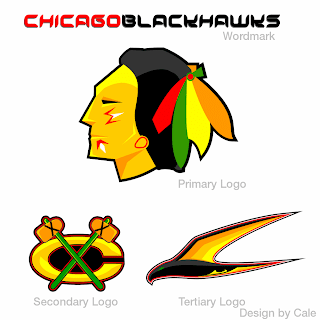
To that end, I got an email this past week with a great logo set I can't help but feel is an improvement.
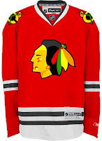
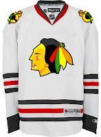
There are also jerseys — same design, just with the new logos.
Feel free to tell me I'm wrong and that the 'Hawks should change nothing, but know that I've heard it all before. And if you're among those who believe Chicago has the best look in the league, allow me to challenge you to explain. My position is that they are solid. They're not horrible, but how are they the best?
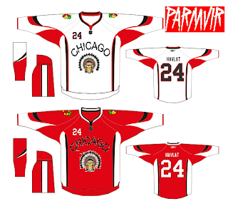
By the way, when redesigning the look of one of the league's oldest and most storied franchises, here's something to avoid.
Get ready. Monday's coming.


Reader Comments (31)
Me gusta the tertiary logo.. finally, a black hawk!! How a team can go so long in their franchise history with that name and not have a "black hawk" anywhere at any time, we'll never know.
Back to the actual logo and jersey: I wouldn't say it's the best; I give that to the Canadiens, and I wouldn't expect many arguments to the contrary. It's a decent job with a nice design; simple, but not too simple.
calvin12, don't start. There's a lot more to the issue than just "choosing" a place of residence, but this isn't about socio-political issues.
The submitted "modernization" of the 'Hawks logo is indeed terrible. It oversimplifies what's already a touchy subject and is, to me, bordering on racially insensitive caricature much like Chief Wahoo of Cleveland. After all, if our society can't accept a hypothetical team called the Montgomery Negroes, for example, I fail to see why the Washington Redskins or Cleveland Indians is still acceptable as team names. The submitted 'Hawks logo screams that sort of dismissal to me.
to KSY92003:
why on earth would the blackhawks have an actual black hawk bird as one of its logos? The team is not named after a bird. that logo has to be the most moronic logo i've ever seen. the blackhawks are named after a military unit in ww1 which was named after chief blackhawk, hence the indian head logo.
how could you want to change what is NOT BROKEN? Hawks jersey/logo is the best. Why do you think the logo you just put up there looks better? It's blurry and looks like a little kid created it. Leave the Hawks jersey alone, IT'S A CLASSIC. Less is more, no need to change a perfect thing.
why on earth would the blackhawks have an actual black hawk bird as one of its logos? The team is not named after a bird. that logo has to be the most moronic logo i've ever seen. the blackhawks are named after a military unit in ww1 which was named after chief blackhawk, hence the indian head logo.
All correct. The Hawks do have a black bird, "Tommy Hawk", as a mascot appealing to children. Certainly preferable to using an American Indian-type character.
What makes things a bit more palatable than the usual offensive stereotypical American Indian logos, etc., are two things (IMO). First, the team is named after a specific person -- Makataimeshekiakiak (Black Hawk in English), as opposed to entire race, tribe, or nationality. The logo looks a bit more like the Black Hawk statue overlooking the Rock River near Oregon, Illinois, than certain portraits of Makataimeshekiakiak.
Second, the American-Indian imagery is kept to a minimum. Other than the Indian head logo, and the crossed tomahawks, nothing else -- no "war drums," "Indian chants," or the like.
While there have been many complaints over the names and chants of many professional and college teams (Atlanta Braves, Cleveland Indians, North Dakota Fighting Sioux), there have been almost none about the Hawks.
The reason why the Hawks' jersey is the best looking is the color scheme and line work. Any designer could tell you that. The red, yellow, while and gold all work together like Christmas morning, and the line work of the logo is bold and stands out with complimenting contrast to the jersey.
The proposed "improvements" look like bad photoshop filters applied to the current... Just amateur looking. I applaud the effort though to improve, but sometimes you just shouldn't mess too much with what works. Definitely not an improvement.