The Blackhawks Saga
 Sunday · Jun 8 · 2008 | 5:25 PM PDT
  31 Comments
 If you've been reading my blog for any length of time, you're more than well aware of my aversion to the logo and uniforms of the Chicago Blackhawks. Now it's not that I just dislike them, it's that they're consistently billed as being the best logo/uniform combination in the NHL.
Yet no one has ever supplied a good reason!
I like their uniform design just find but I think their logo is old-fashioned — and not in the good way like the Canadiens. Even the Bruins had the sense to keep their look updated without kissing tradition goodbye.
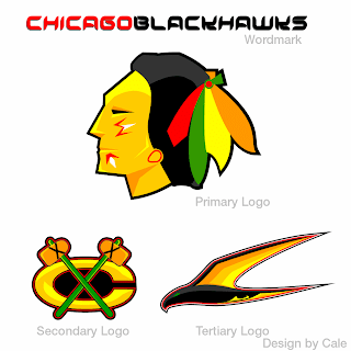
To that end, I got an email this past week with a great logo set I can't help but feel is an improvement.
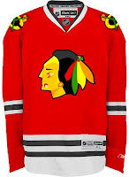
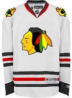
There are also jerseys — same design, just with the new logos.
Feel free to tell me I'm wrong and that the 'Hawks should change nothing, but know that I've heard it all before. And if you're among those who believe Chicago has the best look in the league, allow me to challenge you to explain. My position is that they are solid. They're not horrible, but how are they the best?
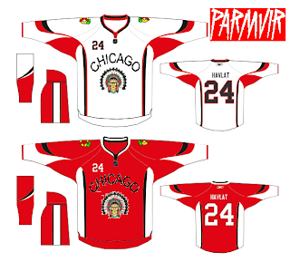
By the way, when redesigning the look of one of the league's oldest and most storied franchises, here's something to avoid.
Get ready. Monday's coming.


Reader Comments (31)
that 1st Blackhawks jersey is terrible!
Is he supposed to be an Indian or an asian?
I don't know why anybody would make a new Chicago jersey because the current one is perfect.....no reason needed.
That last set of jerseys uses the Frolunda HC logo. I like this logos in the first set except the primary. BUt I love the actual black hawk.
The current logo is the best out of the three.
sorry but what does tertiary mean?
I agree with atown jacket
no changes need to be made to the original ones and the first jesey does make it look like an asian
The detail in the blackhawks current logo is one of the good thinks about it, along with the great colours. In this new logo the detail has competely disappeared.
and godsave1thequeen:
tertiary means third
tertiary means third.
the current blackhawks logo has only been around since the mid 60s so its not as long as it seems. before that they had a few really poor designs.
the current logo itself isnt the best in the league (at least not to me). however myself (and im assuming others) like the logo for what it represents. the logo, like the montreal logo, has becoming something of a tribute to the league and its history. under the current logo the blackhawks played in the old Chicago Stadium where the fans became so loud that opposing teams couldnt hear themeselves think. where, at every home game, there was a sea of red around the area. under that logo the invention of the curved stick took place. where names like Hull, Esposito, Mikita of the 70's transitioned to Belfour, Chelios, and Roenick of the 90's. it just one of those classic hockey symbols that people can gather around and tell stories about. with the current reemergence of the blackhawks and the bright future ahead of them the logo can help bridge the time gap between Hull and Kane.
the logos that were put up are horrible. the first one looks like a corporation took over the logo and stripped the character out of it. the second one is just to weird for me. i wouldnt mind a slight repolishing of logo, it just needs to be done right, like Boston, Pittsburgh or Washington.
Wow, those logos were terrible. That downgrade would be even worse than Ottawa's new 2D disaster. Fortunately, so far, the organization has had the good sense not to use it.
The Blackhawk logo has tradition, is well-designed and has a great use of color. Quite simply, it's hard to top it. It has no weaknesses.
Chris,
I, like you, do not get why people think the Blackhawks logo and jerseys are so great. I also do not think they are bad. They are just decent.
However, I completely disagree with you in thinking that the logo presented here is an improvement. I do not like it at all.
And even though I don't think it is the best logo or jersey, I can see why they would not change. It does have the history behind it, which makes it classic. I am all for classic.
I even think the habs logo ain't too hot. But its amazing history leaves it untouchable.
I love the Hawks logo and especially their jersey design, but I can't explain why. It's just good.
Terrible, absolutely terrible. Every ounce of it.
The first one looks too simple. It's just... I don't like it at all.
The second one is the Frolunda Indians logo from Sweden. So no votes for that either.
I think the Blackhawks logo is one of the greatest in the history of sports. I don't know why, but theres just something about it. Theres no way you can replace it.
Chris - you need to go look at an official B-Hawks jersey up close. The stiching in the primary and secondary logi and the level of detail are amazing. The colours are great in the logo too. What other team has definite primary colours, but also has logos that incorporate different colours so well. How cool is that? C'mon people!
Personally, I don't think the Hawks have the best jerseys in the league necessarily, But I do feel that the logo is perfect the way it is. It's bright and colourful, it catches your eye and pleases it. It's just..."icetetically" pleasing.
I also have to say that I dislike the new logo.
i'm against the blackhawk logo if only for its stereotypical representation of north american aboriginals.
as an aboriginal myself, i find it less than appealing to think that the only representation of my people in the sport of hockey is an indescript cheif wearing a headdress on a jersey.
i have the same argument against the indians and redskins [who are both far more offensive]. i think the logo looks okay, but i don't like what it represents.
[yes, i am aware of the historical relevance of the team being named blackhawks - hence why i think it needs to be changed]
No offense c_v_j, I get where you're coming from BUT sometimes an apple is just an apple. It's just a name, it's just a logo. I'm 100% Irish but I'm not screaming bloody murder about ND Fighting Irish or about how everybody get's drunk and act's like a horses arse on St. Patrick's day! Hell let's get P.E.T.A involved, no more animal names because the animals are offended(Pgh Penguins...my Fav team since 1981, Anaheim Ducks, Boston Bruins, Chicago Bears, Atlanta Falcons,etc...) How about the Catholic church being offended by(California Angels). Blackbeard the Pirate is rolling over in his grave because the Pittsburgh Pirates are giving piracy a bad name! It's just a name, It's just a logo.
to be fair, arrowcat - everything you said after the part about PETA is a non-sequitor. so to the point on hand, i appreciate your unique perspective on my take here, and will simply have to note that you clearly don't understand my issue with these logos.
in closing, opening a comment with "no offense" does not lead you to become immune from causing offense. keep that in mind before you use it next time.
you're correct I will never ever understand. I will never understand the worthlessness that the early Irish immigrants felt when they came to America.Our immigrant ancestors were not wanted in America. Ads for employment often were followed by "NO IRISH NEED APPLY." They were forced to live in cellars and shanties, partly because of poverty but also because they were considered bad for the neighborhood. I'm not screaming "I want an apology for the way my ancestors were treated. Again I will never understand your opposition to a "name or logo"
arrowcat, i was not trying to make any implication whatsoever to your ancestory... you're talking to a guy whose people are still forced to live on reservations if they want to practice their heritage though - so this is a kettle and teapot situation.
i don't want to get into a pissing contest about pain/suffering/what-have-you. what i do want to say is that i think racially themed sports names aren't cool in my books. fightin' irish OR redskins, i don't think it matters - either way i don't think it should happen.
when i stated you wouldn't understand, i simply meant that there's no way for me to explain to you my opposition to these western institutions given the stance you're taking.
if you think it's okay to represent sports franchises using racial stereotypes, that's fine... that's also why people like you and i are always going to be looking at chiefs and leprechauns. the difference is, you chose not to care and i do.
i really don't mean to highjack this post though. it's a post about the unis of the blackhawks, not societal practices. they're a good colour scheme, and the intricacy in the logo is among the best in the league. as long as they don't go back to blackshirts, i'm happy.
Sorry I get carried away sometimes. It's all good. I hate the black jersey also, as much as I hate the Flyers(Pens fan since 1981) I really wish they would go back to the Orange jersey. So many bad memories of the Flyers coming to Pitt and wearing Orange road jerseys, damn I miss that jersey...LOL!!
oh, man. the flyers orange jerseys were so much better!
thanks for being cool man.
I love this blog!!!
Yikes! It's the Golden State Warrior dude.
The Chicago Blackhawks jersey is a great jersey because it is simple. The logo is to the point (although looks nothing like the Sac War Chief Ma-ka-tai-me-she-kia-kiak). The colors are used appropriately with classic stripes. The shoulder logos are the inspiration for other shoulder logos across the league. The numbers are bold, two-color blocks that can be easily viewed on TV or in the 300 level. It is the ultimate hockey jersey - Enough said!
there all BRUTAL!
c_v_j: arrowcat, i was not trying to make any implication whatsoever to your ancestory... you're talking to a guy whose people are still forced to live on reservations if they want to practice their heritage though - so this is a kettle and teapot situation.
No one is forcing anyone to live on a reservation.