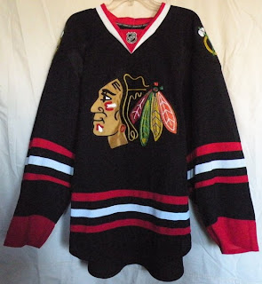
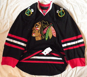
Blackhawks Third Jersey Leaks Too!
 29 Comments
  Wednesday · Oct 15 · 2008 | 7:00 PM PDT
  Seems like the leaks are flowing like water this year — unlike last when the Rbk EDGE first rolled out. First it was the Lightning and Flyers last week. Then the Canucks just last night.
Now, we have our first look at the Chicago Blackhawks' third jersey.
This alternate sweater had the least amount of suspense and buzz about it considering there was no change from what the Hawks wore prior to the EDGE era. The black jersey was simply adapted to the EDGE style.
Right down to the shoulder patch.
These images were provided on a message board called The 300 Level by a user named gusev. There are more images available there if you're interested.
Again, this is not an official unveiling. These are leaked images of the jersey. It's my understanding the sweater will make its on-ice debut on November 3 when the Blackhawks face the Avalanche in Chicago. I wouldn't expect any sort of unveiling ceremony or event. It'll probably just show up that night in the game.
 blackhawks,
  jerseys,
  news,
news,  rumors,
  thirds


Reader Comments (29)
glad it wasn't something too outside the box.
nice, classic. they are allowed to wear black since it's in their history.
it would be amazing with pants with a lot of red.
now start winning, hawks.
'commit to the indian!!'
blackhawks is a sexy name and it deserves a sexy black jersey
Oh the joy!
That jersey was actually on ebay a few days ago when I was looking for hawks jerseys. If it was on ebay, my bet is it is a fake.
Link:
http://cgi.ebay.com/CHICAGO-BLACKHAWKS-AUTHENTIC-RBK-EDGE-HOME-JERSEY-SZ-52_W0QQitemZ320309518315QQcmdZViewItem?hash=item320309518315&_trkparms=72%3A1205|39%3A1|66%3A2|65%3A12|240%3A1318&_trksid=p3911.c0.m14
Look at the pictures at the bottom.
I've always thought the Blackhawks were a team that should have a black jersey.. just like the Blue Jackets' blue jersey, the Red Wings' red jersey, and the Blues' blue jersey. It just makes sense. But red looks so good on this team that I can't see them not using it as their primary. So the Blackhawks having a black jersey in their set is a great idea, and I love this look.
I just came to a very scary thought. There are four NHL teams with a color in their team nickname. Interestingly enough, all four of those teams are in the Central division. I say move the Predators out and rename the division the "Color division".
One of my favs. Exactly what we expected though.
On a side note, I loved the banner where it used to be. First thing in the top corner, where it belongs! I love that feature but now it's burried under all the polls.
Pretty. No surprise though.
I do hope the barber pole one that they're rumored to be wearing for the winter classic becomes their permanent alt though. Has a lot more history and is a very, very sweet looking design.
One of the nicer black jerseys in the NHL in recent memory.
sorry, its super-duper-fake. the sleves and body are cut way too loose, plus there's no jock tag on the front. really the only "EDGE" feature is the neck-line. but i wouldn't expect anything different once the real thing comes out
What's a jock tag? You don't mean that stupid silver tag that they put on the front of replicas with the size (e.g., XL) on it?
I'd shudder seeing this FAKE monstrosity on Ice. The REAL one will look so much better.
Oh BTW thanks for putting the poll bar back on the left Chris. :D
Even though it is fake, i am sure this is what to expect when the real jersey is released.
that's not fake you idiots. thats 100% authentic. as someone who owns authentic edge hawks jerseys, i can attest to that being 100% identical down to the last stitch.
Don't they usually have a reebok symbol on the bottom of the sleeve too? maybe?
I think it would look better if the Cuff was White and not red.
Look at the traditional loop stitching on the shoulder patch...instead of the normal tackle twill and zig zag stitches. Besides the fact that it is a nice touch, I think it adds to the fact that this is authentic. Let's also give Chris some credit here...he has identified fakes in the past, he obviously trusts this source...
This may be fake, but it's not far off. The biggest thing I noticed, it doesn't have the same shape as the rest of the Edge jerseys.
the shoulder logo seems to be out of proportion...something just isnt right about it...
Tyco678 is correct! Where is the Reebok logo on the sleeve if it is real?!?!?!?
Hey guys, I just feel like I need to step in and clarify some things. These are photos of a genuine Rbk EDGE Blackhawks third jersey. It's not a fake. I thought that was pretty obvious.
The "jock tag" referred to earlier is actually the tie down for the pants. It's on the inside of the back of the jersey — not the front. The photo makes it look strange.
There is no Reebok logo on the sleeves of an authentic sweater nor is there a tag on the front at the bottom like there is on a Premier jersey. The cut and shape is exactly the same as any EDGE authentic — it's just laid out a little awkwardly in the photos.
I don't understand where the idea that it's fake came from, but trust me, I'd let you know if I thought it was. This is the real deal. Any questions? Just ask.
Ah, so a "jock tag" is a fight strap, gotcha.
Very confusing that there two "Chris" posters (i.e., one other than Icethetics' Chris), because the first one says it's "super duper fake", while the second (Icethetics' Chris) says "I don't understand where the idea that it's fake came from, but trust me, I'd let you know if I thought it was." I was lost there for a second (before I checked profiles), thinking you had a split personality.
but why does the material close-up look exactly like air-knit? are they all like this now?
carpandean, No, a Jock tag is that stupid thing on the front of the jersey. The poster who originally mentioned it was wrong in saying it was a jock tag, it's actually a fight strap.
And glovesave, You're dead on on the loop stitching, The blackhawks are one of the few teams in pro sports that still have the logo patches made like that. I doubt somebody making a fake would a. Know that b. Take that much effort even if they knew.
The actual authentic have the air-knit style, I've seen Phantoms authentics up-close and they have the same design.
Would be nicer if the cuffs were just left black, IMO.
Exactly, Arossi417, When the EDGE was first introduced, many players complained that it was retaining too much sweat in wrong areas, so many jerseys were switched back to the Air-knit material, just with the EDGE design. If you look at any of the authentic jerseys from around November on last year, they will have the same look.
These are very sharp... But at the same time - nothing special.
These pictures came from my Ebay store!
Well, This Jersey was Dead On...