New Third Jersey Image Leaks
 17 Comments
  Wednesday · Oct 29 · 2008 | 7:57 PM PDT
 Apparently, there's a guy or some illegitimate company selling bogus Rbk EDGE third jerseys on ebay. How do we know they're fake? Well for one thing, Reebok hasn't started shipping them yet. But that doesn't mean there weren't legitimate pictures of them.
The listings included six teams in all: the Atlanta Thrashers, Boston Bruins, Buffalo Sabres, Phoenix Coyotes, St. Louis Blues and Tampa Bay Lightning. That's three teams that have officially unveiled them and three that haven't. Let's start with those.
There's nothing that we haven't already seen, but there are pics from different angles than what we've already seen. This is most helpful with the Coyotes in seeing what those sleeve stripes look like. But what makes me think these pictures show us what the actual jerseys will look like? Because of three others we've seen officially that were right.
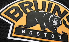
Among the plethora of pictures were some close ups of the crests. First, the new ones...
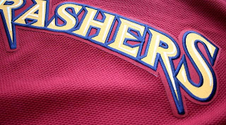
...and then Atlanta's just because I thought it was a cool shot.
Thanks to Charlie for the tip on these pictures.
Hope that satisfies your itch for third jersey news tonight. I'll have more tomorrow, plus an announcement regarding the new banner some you have already noticed at the top of the page.


Reader Comments (17)
that Blues jersey is sexy wow
Liking the new 'yotes
not really a big deal, but does anyone else see how fake the hoof on the coyote looks? it looks like a 10 year old sewed it on there.
Well if those jerseys were actually made in Indonesia then it probably was a 10 year old that sewed on the coyote hoof!
Chris do you have a close up shot of the Sabres logo?
so we now know that the Bolts have weird side piping underneath the arms.
Coyote hooves? lol You know coyotes are dogs, right? Paws. That's what they have.
I still really dislike the "BOLTS" written on the Tampa Bay jersey.
I'm okay with "THRASHERS" but "BOLTS" and soon "SENS" seem ridiculous...
I'm still waiting for that Kings jersey to be leaked. I'm really surprised it hasn't yet.. or are you just holding out on us, Chris?
I think the Thrashers jersey would look better if they didn't have the numbers underneath it. Obviously, it would look best with a proper logo on the front but it's not too shabby. Much better than the Dallas ones.
And "BOLTS" is absolutely ridiculous.
bpc89, here is a close up of the Sabres logo!
http://i262.photobucket.com/albums/ii117/SabreNotSlugs/IMG_9180copy.jpg
I still think that Blues jersey is a letdown, considering that they already have a great first jersey set, and the third makes the jersey less complicated, but makes the logo more complicated. It's not something I think makes any sense at all. I also think that they way they snuck the Arch onto the normal jerseys is classic.
Since the RBK Premier jerseys originate in Indonesia, I think they are legit. They just didn't happen to find their way onto the cargo ship to bring them to the rest of the world.
I'm a Lightning fan but that third jersey is horrible. BOLTS going down the front and the full logo on the shoulders, it's just not working for me.
just thought that i'd mention that despite the fact that we have this idea that reebok hasnt shipped out the new third jerseys, there are several Canadian retailers already selling the new Leafs third jersey, in fact I saw it in one store 3 days before it had even been revealed, and dont tell me these are the old third jerseys, cause they're not... new material, new cut, new all over, legit rbk edge leafs third jerseys
I totally dislike the Thrashers jersey, they look like they were made for a football team...
... no football teams wanted it so the thrashers took it
I dont quite like the Bruins new jersey I dont know it just seems wierd. thop nice joke about the thrashers jersey hahaha