Bolts, Flyers Thirds Leak!
 50 Comments
  Wednesday · Oct 8 · 2008 | 10:45 PM PDT
 My Reebok mole — who shall remain nameless to protect the innocent — has more offerings. I first broke these during the Live Chat earlier tonight, so if you participated or watched the replay, then you already know.
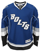
I have high quality promotional images for the third jerseys of the Tampa Bay Lightning and Philadelphia Flyers to share with you today. My team first.
 All the rumors were right for the Lightning's new third jersey. It's blue and it spells BOLTS right across the front, slanting downward. Even looking at it now, the colloquialism surprises me. It's an unusual sight for a professional sports uniform — but then so was a giant humanoid duck bursting from beneath a sheet of ice until 1995.
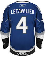
The first thing you'll probably notice is the obviously misspelling of Lecavalier on the back of the jersey. That particular image was probably never meant to be made public. Oops. But allow me to draw your attention away from that and to the bottom of the sweater.
Notice the TAMPA BAY stitched along the black stripe? Are we taking a page out of the Kings' book now? At least it's on the back. So speaking as a Lightning fan, there are some things I'm not thrilled with, but overall I'm happy with it and I will be wearing it on Christmas morning — likely before then too.
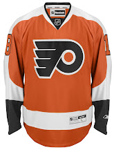
 Next we move onto the Lightning's first ever playoff foe, the Philadelphia Flyers. This is another one the rumors got right. But then we've known what it will look like since March when cell phone photos first surfaced.
The Flyers are joining the handful of teams going retro with their new third jerseys — as you can see.
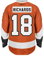
No egregious spelling errors on this jersey, but the nameplate is a cool feature. They're leaving out no detail on this throwback sweater, opting for black text on a white nameplate on an orange jersey. Bold. Well done.
You may have noticed the orange numbers on the sleeves seem to be overlapping onto the orange of the jersey. I'm not sure if this is accurate as the numbers were clearly added digitally and weren't on the photographed jersey. For that, we'll have to wait for the official announcement and unveiling by the team.
Keep in mind that these images are not from the teams and I do not consider them to be official unveilings. They're leaks and I almost feel bad about posting them, ruining the surprises for the teams. However, they're out now and I'd like to get your feedback.
By the way, if you decide to post these images elsewhere on the interwebs, I'd love it if you could link back to Icethetics!


Reader Comments (50)
the flyers' original jerseys actually had that, as seen here
http://www.freewebs.com/philadelphiaautos/Kindrachuk8x10.jpg
as for the lightning...that's terrible!!!
far worse than the butt-logos that are all over the NBA right now. the extra underarm piping makes a decent design (minus the wordmark), pretty bad. the wordmark puts it way over the top, and in general, it sucks!
The Tampa jersey isn't bad but "Bolts" is just terrible
Think the Tampa jersey wouldn't look half bad...if it wasn't for that horrible "Bolts" across the front. That's like the Canucks having "'Nucks" on their 3rd, and Coyotes having "'Yotes", etc, etc. BAD, BAD, BAD!
The Flyers one looks great! Classic.
I actually don't mind the Lightning one...
After looking at the new Thrasher sweater, the BOLTS look pretty darn good to me.
Good god, 'Bolts'? Are you fucking kidding me? It's like last year's All-Star jerseys, only now they're being worn several times over the next god-knows how many years. This has been an ARTOCIOUS day for the NHL's wardrobe.
Flyers - perfect.
Lightning - how original... NOT. So lame. So boring. So stupid!! Ok, bolts.... the Habs don't have HABS written across their chests... I don't even know anyone who calls them the "bolts"!! Dumbest thing ever.
Just about everyone I know calls them the Bolts.
I personally like it.
I actually really like the Lightning ones. I was expecting the worst and was actually pleasantly surprised. The "BOLTS" has even grown on me and I love that shade of blue. Well done.
Lightning turned out much better than expected. It would be really good if there was a logo, but this is a pleasant surprise. Personally, I've never understood the "Tampa Bay" text incorporated into the primary. I think it'd be much bolder w/o it. And the utter dork in me will cite to DC Comics as my source. See Flash and Captain Marvel. Throw the primary logo w/o text on this jersey and you'd have yourself a real winner.
Speaking of "Tampa Bay," seeing the text on the back of the bottom makes it look like its supposed to be like CCM, koho, other jersey manufacturer instead of the team. That's really out of place. The higher ups REALLY can't resist putting the city's name somewhere in there can they?
the Flyers unforms from back in the day actually did have overlapping sleeve numbers. at the time im sure it was just a case of being sloppy, but now its part of the proper "retro Flyers" look.
I'm actually gonna start with the Flyers jersey. Overall, it looks really nice. I don't exactly understand the white nameplate with black font, but I realize that it is a throwback feature. It'll take some time, but I'm certain it will eventually grow on me.
Now, for the "Bolts". A thought occurred to me as I was about to go to sleep: "It's bad enough that they put "BOLTS" on the front. It's worse that we have to see it on the bodies of 20 players.. for 60+ minutes!"
I also love that, as bad as the Kings' third jersey is rumored to be, the primary set is still good enough for the Stars, Canucks, and Lightning to take a page out of their book.
Also, it's funny how they act like we don't know it's a Reebok jersey. I mean look at the Lightning jersey. I mean just from those pictures, You can see "Reebok" or the logo nine times. Granted, when somebody is wearing the jersey, you can't see the six up at the neckline, and the players won't have the patch on the bottom of the jersey, but c'mon, we know that Reebok took over the NHL jerseys. How many times do you need to tell people with one jersey?
Wow.
All these comments make me happy I'm a fan of the one team that will probably never, ever, mess with their jersey design.
Of course, I say that now...
Tampa looks a lot better than I was expecting. I'm not big on the "BOLTS" thing, but at least it looks like a hockey jersey. Put the primary logo on the front of that jersey and you have something. Dunno about the "TAMPA BAY" on the ass. Doesn't seem needed, but it's small enough that it doesn't stand out too much. What does that thin piping add? Why bother?
They're both very nice looking jerseys, I kind of like the Tampa Bay wordmark on the back.
the colours of the TB jersey are beautiful.
as for the 'logo', better luck next time.
(we should start a pool on how long it will take for some of these design to disapear - i would say the thrashers is gone at the beginning of the 2011 season, but wait, the team will be in qbc or wnpg by then...)
s-m...the Thrasher uni is terrible, not doubt. The team, however, is not moving. The owners are tied to them, the Hawks AND the arena...so unless you know of a way to pick up Philips Arena and move it to Quebec or Winnipeg, it isn't happening.
Oh my goodness what have they done to my Lightning?? I love the blue color, but I much prefer some of the designs that were featured on your site for the "Rebranding the NHL". That was much better to the "Bolts".
Of course, I suppose this isn't quite as bad as this: http://i34.photobucket.com/albums/d133/bergmanrocks/ligthningthirdjersey.jpg
And by the way, that "Tampa Bay" word mark on the back of the jersey reminds me a lot of the back of my alma mater's uniform pants on their new uniforms: http://vmedia.rivals.com/uploads/903/472259.jpg
The Everblades opening night is Friday! I'm going, got a new Blades jersey picked out. I didn't buy the 10th Anniversay ones, I thought they looked stupid.
I think the Bolts Third Jersey looks good. Compared with what other teams have now or have yet to reveal, it's quite decent. The colours blend quite well...Just like the Icethetics Colours minus the orange...you should for sure get Icethetics on the back of it Chris!
Meanwhile no surprise with the Flyers. But still, Woot!
personally, i think the lighnting jersey is pretty sweet
Lightning should have added a lace up front neckline to make it look real retro. Overall , not bad. Loyal fans have called them the Bolts since'92 - just never, not ever the 'Ning!
I actually like the lightning jersey .... I didn't think I would knowing it had Bolts written on the front but the colors are awesome. I also like the Tampa Bay on the back.
I actually like the Tampa Bay third. In fact, the Lightning should change their name to the Tampa Bay Bolts. Afterall, they were the first to plague the NHL with the singular collective noun team name. That's like the Atlanta/Calgary Flames being called the Fire or the Chicago Blackhawks being called the Tribe. Singular collective nouns are okay in soccer, lacrosse, and arena football, but not in the big-league NHL. At least with the Avalanche, you can call them the Avs. Overall, very nice third.
As for the Flyers, I LOVE IT!! Whether you love or hate the Broad Street Bullies, you cannot deny the fact that their orange jerseys with their Flying P crest made them look like an Original Six franchise. I don't mind the white nameplate, though I prefer orange with white letters. Cannot wait to see them on the ice!
I rather Enjoy the Bolts jersey. i think it would be perfect if it was the logo on there but over all i really like this jersey.
If you wanna be technical, the Lightning crest is on their shoulders, so Tampa Bay only appears 3 times on it.
i finally like a tampa bay jersey it's a miracle and if they hadn't been stupid enough to call themselves the lightening instead of say tampa bay bolts i think most people on here wouldn't have a problem. the only thing i'm not into is they have that same random piping like on the flames jersey that just stops half way down the arm does anybody have a reason for that. i even like the tampa bay across the bottom stripe it's pretty sharp looking. The flyers are looking mean again and along with the leafs and oilers this week did a good job of going with classic hockey jersey's that are iconic and have meaning. i wouldn't shammy my car with that thrashers jersey. new slogan "more classic, less plastic".
Andre,
You have the Lightning, Avalanche, and Wild. At least with the first two you have, as you said Avs, and Bolts, but what do you do with Wild? I despise singular team names.
Flyers jerseys look great! Bolts jersey doesn't bother me as much as I anticipated (Thrashers).
How about has anyone noticed that they spelled Lecavalier (Leeavalier) wrong. TB Bolts are a bunch of dummies.
wkm625,
I know exactly what you're saying. When Minnesota revealed that they were going with the name "Wild", I wanted to vomit. Seriously. The Wild what? The Wildcats? Too common. the Wildmen? Too bushleague. I know that Norman Green, aka Norman "Greed" left a horrible taste in the mouths of Minnesota hockey fans. However, it really disappoints me that the owners of the new Minnesota franchise and the Dallas Stars weren't willing to work out a deal to get the North Stars' name and history back to Minnesota. When the NBA SuperSonics moved to Oklahoma City, they left the Sonics name, colours, and team history back in Seattle for a future expansion team. "Stars" is too common of a name as it is. Dallas could have gone with a name like "Bullseyes" or "Marshals". Can you imagine the huge mania of the Wild getting the North Stars name back and skating on to the ice in their forest green, gold, and white(no black) uniforms with the iconic N-Star crest?? The North Stars went to two Stanley Cup finals and they had a number of great players, ie. Bill Goldsworthy, Bobby Smith, Neal Broten, Dino Ciccarelli, Craig Hartsburg.
"How about has anyone noticed"
When you open with that you have no right to call anyone a dummy.
And yes, if you read the post, Chris pointed it out.
Anyway, The "Bolts" jersey is cooler than I thought would be and the Flyers jersey is alright. Never been that big a fan of vintage.
Tampa Bay: Put the current logo on the front and lose the side piping and that's a nice jersey. Otherwise... not so much. Yes, it's better than the ugly that Atlanta unveiled yesterday. These remind me of an all-star jersey. Other than the TSN guys on Sportsdesk who call them the Bolts once in a while just to sound cool, I don't know anyone who calls them that.
Philadelphia: The Flyers join the Leafs, Oilers, and the Sabres (except for the silver side piping) as the teams who have gotten right so far. I love the retro sweaters. Well done Flyers! Why the hell did you get rid of orange in the first place?
I have a feeling that maybe next year or in the near future the Lightning will change their name to the Bolts. In the game NHL 09, the announcer only calls them the Bolts during play-by-play, and now this jersey. MLB's Tampa Bay Devil Rays changed their team name to just Rays this year. Maybe these guys will follow suit. Just a conspiracy theory, haha.
Marcmmp, you may have a good point there. Remember how the Minnesota North Stars changed their uniforms in 1991 to the logo that just said "Stars"? Two years later, they were the Dallas Stars. I'm not saying the Lightning are going to move, but this jersey does smack of a potential name change.
...and just for the record, that old TB third (the one with the ocean storm scene on the front) is one of my favorite NHL jerseys ever. I'm not a Lightning fan at all, but I'd buy it if I ever saw it for sale anywhere.
I can't get over how ironically appropriate the placement of the TAMPA BAY wordmark is. Even the Kings don't go so far as to equate their wordmark with ass.
the philly 3rds are really nice... i would get one if i didn't hate them.
but the Tampa 3rds are REALLY ugly, sorry dude
The BOLTS is a nice jersey but like everyone else, I don't care for the nickname on it. I agree with Washington about dropping "Tampa Bay" from their primary logo. That would look great on this jersey. Very nice colors!
PHILLY is okay. I never really liked that original orange vintage jersey. Too much orange looks like pylons. I would rather see an "updated" take on this jersey. Their current home/away jerseys are great.
I like my teams third jersey! I like to think that maybe the blue will become primary and match closey with the Rays (although the Bucs red and pewter..) but It brings at least 2 of the teams in the Bay area together!! and Actually we do call our team the Bolts... I've heard many a poeple call the Lightning the 'Bolts'
i like the flyers jersey but since were goin retro wouldn't have made more sense for them to unveil the jersey during on of the two pre season games at the spectrum then against carolina in november, but idk i dont really understand why teams are so hush hush about all this stuff too
The Tampa Bay one isnt too bad. "Bolts" though?!? I know its a secondary nickname and all... but I guess it could be worse (see Atlanta Thrashers 3rd jersey)
Flyers... What can I say?!? PERFECT! :D Just absolutely perfect :D
what ever happened to CONCEPT POSTS???
you dont show anymore more concept pieces
that was the main reason i'd come to this site.
u can find news almost anywhere else =/
i love the site chris,
but i feel its changed too much.
That "Bolts" jersey would be absolutely amazing if they'd have been smart enough to write their actual team name, at least the secondary logo. Either would be MUCH better. This is a joke. I don't think any team as been as stupid as to put their nickname on their jerseys 'til now. I sure hope no one else has considered it, or else I fear the look of hockey is heading in the wrong direction. Good job Dallas.
As for the Flyers, perfect. Here's a team who knows what they're doing. I'm loving the white name box. I don't know, it just does it for me. Great job, best jerseys thus far, along with St. Louis.
any idea as to when they are being officially unveiled?
Wow. Truly disappointing. Extremely ugly.
The Flyers jersey is amazing. Its a great way to honor the last year at Americas Showplace The Spectrum.
And the "BOLTS" Im pretty sure no one outside of Tampa Bay and ESPN use the term "BOLTS" and the only reason the ESPN guys use "BOLTS" is so they sound like hockey fans and people that know hockey. It probly wouldve looked better if they put a lighting bolt going across the jersey and it said Lightning cause last time I checked there called the Tampa Bay Lightning not the Tampa Bay "BOLTS". You dont see the Capitals making an alternate and putting "CAPS" on it.
GO FLYERS
I mean the Tampa third is ok. It's not the greatest. But I think it will look better on the ice than just in a Picture. I think its cool that the Flyers are bringing back those jerseys. Those are a big part of their history. I think its pretty cool
I hate the Flyers jerseys... Especially the lettering for the name on the back. It just looks awful.
As for the Lightning jerseys... They look too much like Western Conference All-Star jerseys. Not a fan of either of these.
As a NHL fan, I don't like either jersey. I hope they will only be used in a few games.
I'm not a fan of teams putting sub-nicknames on jerseys. Tampa Bay is known as the Lightning, not the Lightning Bolts, not the Bolts.