Wednesday
Oct082008
Goalies Get New Looks
 14 Comments
  Wednesday · Oct 8 · 2008 | 10:12 PM PDT
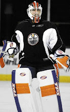
 Lots of emails on this. Martin Brodeur has had his mask repainted and Dwayne Roloson debuted his specially-designed third jersey equipment.
Brodeur is changing a mask design he hasn't touched in years while Roloson will wear a special mask paying homage to Oiler great Grant Fuhr.
There will be further coverage of both of these items at a later date. For now, discuss...


Reader Comments (14)
Are you going into the directory of the NHL website and looking up pictures that haven't been posted yet? Because that's very intelligent of you if that's what's going on.
Those both look awesome.
looks like fuhr's old equipment...but rolly will never be fuhr!
Grant Fuhr was also a great Buffalo Sabre. Along with the new ESPN hockey analyst Mathew Barnaby!!!!!
if anyone coud get pix of patrick lalime's new mask that would be awesome for all the sabres fans
Brodeur's mask should have been left alone, I think. It still looks good, but it was pretty much perfect before. Maybe I'll get used to it.
I love the Fuhr-style gear of Roloson. That's very cool. Can't see the mask too well, but the pads are great.
@ edaroshefski14:
Lalime in action:
http://sports.espn.go.com/nhl/players/photo?photoId=2049270&playerId=501
and the rest:
http://i441.photobucket.com/albums/qq131/photos4all_20XX/lalime1.jpg
http://i441.photobucket.com/albums/qq131/photos4all_20XX/lalime2.jpg
drury23 is credited with the original posting of the 2 photos which were snagged off of the sportslogos.net board.
here is a video that shows both garon's and roli's vintage masks for this season:
http://www.sportsnet.ca/video/popup/hockey/20081008_NHL_Oilers_go_vintage
What about Rick DiPietro? He got a new mask.
Also, Brodeur's new mask is a little strange IMO. Should've left it alone.
let's try this again. DiPietro's new mask:
http://i441.photobucket.com/albums/qq131/photos4all_20XX/08071280dc6decb73a7401bba0f0546b-ge.jpg
http://i441.photobucket.com/albums/qq131/photos4all_20XX/77d78a5813eb18f94ea723f187ea0b9c-ge.jpg
As a Devils fan, I think this change in his mask is really disappointing. It's all self-promotion. It's not like other goalie's who play off of nicknames or something, but he's actually putting his own logo, that of his website on his jersey. It screams "tool" to me. And part of the anger is simply that his old helmet was classic. Simple, not to flashy, but classic.
i agree with adam.
i think MB should have kept his same design that he has ALWAYS had...or at least did something other than promote himself on his helmet.
his helmet was classic...why change it?
haha, love that second picture of dipietro, pretty much sums up the islanders these days.
Brodeur should have had that design a long time ago. It is 1000 times better than that pathetic J he had that looked like a three year old drew. He should have spruced up the flames on the side too while he was at it.