Preview Matt's Sabres Rebrand!
 22 Comments
  Tuesday · Jul 1 · 2008 | 2:13 PM PDT
 Aw, you didn't really think I'd do a launch with nothing more than a post about things you already know, did you?
Icethetics partner artist Matt (aka GhettoFarmBoy) has been hard at work on his latest design in the Rebranding The NHL series. And today, as we launch the new blog, he's offering up a preview of his new Buffalo Sabres logo.
It's looking good. He assures me that the final design will be ready soon.
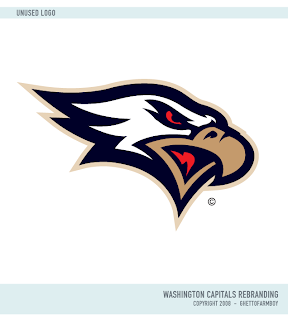
But just so you don't walk away empty-handed, he's sharing with us one of the logos that didn't make the cut in his final Washington Capitals rebrand.
So I hope it was worth it on moving day. And I've been reading some of the comments posted so far. Here's some quick responses. The logo at the top is not final. It's a placeholder. I understand you like/dislike the color scheme (we can hold a poll on that if you want). The center ice tournament will feature "natural" logos — no all-star or anniversary symbols. We'll get to the mascots but I wanted the first Icethetics tournament to feature all 30 clubs.
Think that answers everything so far. Got any other questions? Feel free to email me or leave a comment.
 concepts,
  fan art,
  matt,
matt,  news,
news,  rebranding


Reader Comments (22)
Only a sneak peak and already better than the slug.
Nice new look for the site too.
Coolio :) I can't wait!
WOO! sens signed Auld... lets see how this turns out!
Great, another buffalo on the jerseys of the Buffalo SABRES.
nice start chris and matt!! thx guys!
@ matt: looooove that caps rebranding!
That Caps logo DIDN'T make the cut? Wow.
Matt, The eye of the Buffalo should be red. The significance there is that the original white buffalo in the classic jerseys is seen as an albino bison which is considered sacred in Native American religions. There's another reason to hate the yellow slug, Buffalo!
Dont forget this is only a sneak peak. which means theres still more to be seen!
I don't care what anyone says the slug is the best buffalo logo ever, but this new one still looks better.
That Caps logo is better than the used ones. The they actually use is no pushover either.
I still would prefer the SABRES to have.. sabres on their jersey, for a change. Why don't they just change their name to the NY Buffaloes if that's all they're gonna put on their chest?
But anyway, nice to bring back a white buffalo. I think that when Buffalo went to the "slug" logo a couple years ago, they made it yellow because they wanted to incorporate the blue and yellow from their first jersey.
nice start chris..are you going to have the past banners on this site too??
go sens go: Don't get too excited about Auld. Big body with limited talent. A good back-up but not someone you want starting in net. The Canucks learned that the hard way. Anyway, that Sabres logo looks really, really good. And that Caps logo was pretty cool too.
to those complaining about the use of a Buffalo on the Sabres logos:
show me a solid logo consisting of only sabers, and have no Buffalo in there anywhere.
the Caps logo was pretty good and the sneak peak of the Sabres logo seems kind of iffy
That Caps logo would make an EPIC shoulder patch and a great third jersey chest logo....how did it not make the cut?
The original Buffalo Sabres logo is still the best the franchise ever had. It had the charging buffalo over the crossed sabres. When you looked at the logo, what did you see?
BUFFALO SABRES!
Simple is always better, folks.
Indeed Drew...I can already tell that the Bison acutally looks like a Bison and more than likely has all his appendages. I'm sure the finished product it will look great.
And Matt won't have to backtrack either once it is unveiled like Sabres management did.
how about rebranding the canucks logo??
Looking good so far. The first thing I noticed, though, was (as jimmy k noticed) that the eye was not red. Definitely make it red.
As for the sabres vs. buffalo debate, not only is it difficult to make a really good logo with just sabres (the red third jersey wasn't too bad), but it's also tradition in Buffalo sports to include a buffalo in the logo.
Flyersk27: you should wash your mouth out with soap for saying that ... ok, just wash your hands for typing it. ;-p
I don't mind the buffalo teams having an actual buffalo on them, but I think the primary should have a sabre component in them.
Never was a fan of the Red Thirds the Sabres had. I can't put my finger on it why, but it just seemed lame compared to the goathead i guess.
The rejected Caps rebrand is nice. Looks kinda like the Philadelphia Eagles, one of the better NFL logos IMO.
To The Kyle:...Believe me... Gerber (and Emery, but hes gone) is (are) the most inconsistent goalies in the league. A new goalie will be good for the team... even if hes consistently bad. AT LEAST HES CONSISTENT! SOMETHING ALL THE OTHER SENS PLAYERS CANT STINKING DO! that is all... if you read this and want to reply, don't do it here... email me @ floorcorn@hotmail.com
I really like that Caps Logo, hopefully someone from the re-branded teams catches wind of this site and uses some of the great ideas you have come up with!