Rebranding The Sabres
 64 Comments
  Monday · Jul 7 · 2008 | 10:30 AM PDT
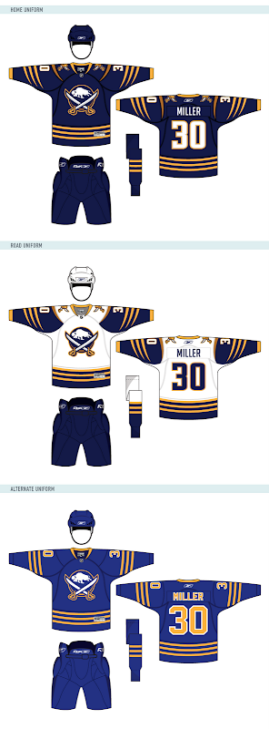
 As promised, today brings the unveiling of the 11th design in Matt's Rebranding The NHL series — the Buffalo Sabres.
And naturally, he's designed uniforms to go with these logos.
To me it seems like the best Sabres logo always revolves around the same basic theme — the original logo from the team's inception. Sometimes you just can't improve upon what came first. Or at least it's just difficult to come up with something entirely new.
Anyway, as soon as Matt tells me what team he's rebranding next, I'll tell you. In the meantime, let us know what you think of the new Sabres artwork. Leave a comment!


