Maple Leaf Sweater Concepts
 19 Comments
  Thursday · Jul 10 · 2008 | 3:59 PM PDT
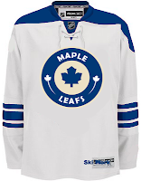
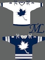
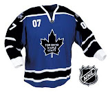
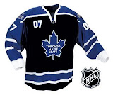
 Maple Leafs fans, yesterday I promised you some concept art and I'm making good on it. I've gotten half a dozen different jersey designs over the past few weeks and today I'm happy to share them with you.
The first one here is a take on Minnesota's home sweater crest. It's cool even if it's somewhat unoriginal.
But if originality is what you're looking for, see the graphic on the right. It's probably a little too awkward to make for a solid design what with the unbalanced logo, no striping on the white and too much striping on the blue. But maybe I'm just being critical.
These two are cool if Toronto were to add black to the color scheme. But obviously as a Lightning fan I would be somewhat opposed to that.
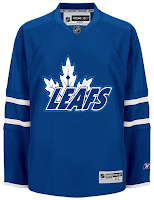
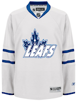
And finally, on the current jersey design is an interesting logo I've been waiting to see someone make — the CN Tower in the veins of the leaf.
It's not perfect but how cool is that?
You know what tomorrow is. Yes indeed, another Freak Out Friday is nearly upon us. Stay tuned for that.
 concepts,
  fan art,
  jerseys,
  logos,
  maple leafs



Reader Comments (19)
the wld looking logo looks neat, and i think they should someway work the cn tower into an alternate logo
in my opinion, toronto definately has to redesign their unis, but this is not the way to go. They should use the one they used from 38-67.
By the way when is this centre ice tournament going to start?
The CN Tower in the veins of the leaf is a pretty cool idea! They should use that on their real logo.
i wonder what the cn tower one would look like without the text.. just the leaf in the middle like the current logo
Gotta agree with poro27, it might look better without the words.
those jerseys with the black are pretty cool, although im pretty sure leaf fans wouldn't like the tampering of traditional blue an white. The sweater with the cn tower is pretty cool but i agree "leafs" should be taken out, but something has to be there or else the leaf looks kinda stupid. Maybe make the cn tower larger or something.
i'll have some cool leaf concept stuff to submit soon - nothing so radical as a CN tower in the crest, but a revisit to '67 or so.
these are okay - nothing stands out as great - the crest on those blacked-up duds is horrid.
The black/blue Leafs set is pretty neat, but not for the Leafs. I can't stand them, but they do have tradition and shouldn't be messing with their colour scheme. Maybe switch in white where the black is?
Mykl and Kevin thanks I worked a bit on that wild uni and i'm proud. Oh if you notice any of the concepts have a small text that says "ski work" I make it. Sorta a trade mark
The jerseys with the black and blue look awesome. However... The Leafs should only ever be white and blue in real life. Nobody should change their logo or colors.
Hey....get rid of the word Leafs and that last logo has something to it.
the shoulder patch logo on the leaf + hockey stick jersey is terrific
I like the execution of the leaf in the CN Tower logo, but would leave the word LEAFS off. It looks a little too minor league hockeyish. Center the leaf and you might have a winner there.
I like the last one. Nice blend of wordmark and logo. Seems like a third jersey concept though. Much to my chagrin as a Ducks fan, I am not a fan of the wordmark logos.
Hey Chris, the site got a shout-out on the Uni Watch blog today...didn't know if everyone knew, but figured I'd spread the word.
I love that last leaf's logo... awesome design.. .gotta say... I'm a fan of the wordmark as well... nice job. I'd like to see some more leaf art though... and i'm not trying to spark a debate... but there seems to be a lot of vancouver designs... not enough of the blue and white.
actually, not first set, just first jersey.
Leaf with CN tower is nice. DOnt mind first set either.
The Wild-themed jersey is very nice, just missing a waist stripe.