Freak Out Friday XXXIX
 20 Comments
  Friday · Jul 11 · 2008 | 1:41 PM PDT
 Today marks the debut of the Freak Out Friday on Icethetics. The series carries over from my old blog — NHL Tournament of Logos. If you're new to this, you might want to have a look at some of the ridiculous items that have been submitted to me over the past year.
Along with this comes a new name. The series was formerly called "Just To Freak You Out" — but it is more commonly known now as Freak Out Friday. And as you can see, this is the 39th edition since August of last year. Yeah, we've had a lot of weird and crazy artwork to post in that time. Remember, too, that is a biweekly feature so you'll only see it every other Friday.
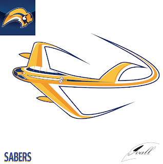
With that out of the way, let's dive in because there's quite a lot to get to. I'm beginning with Buffalo. The unveiling of Matt's rebrand of the Sabres this week was met with a rather mixed reaction — that spawned a lot of attempts to fix it. Now, there were some good ones (which I'm saving to post over the weekend) and there were some bad ones (which you will see now).
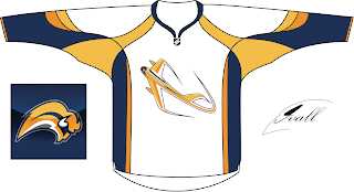
You may have to stare at that for quite a while to figure out what it is. Kudos to anyone who can figure it out without me explaining it. Naturally, there's a jersey concept to go with it.
Thing about the Sabres, though, is while there are a number of very vocal fans opposed to the "slug" logo, it just so happens that plenty of folks like it. So the trick because how to make it less about the buffalo and more about the sabres.
All from the same artist. Comments?
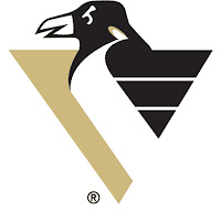
Let's move on now to the Atlantic Division where we have a number of Combo Concepts, as I think I'll start calling them. First is a current Penguins logo mixed with an old one.
There are some things we should just never have to look at.
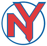
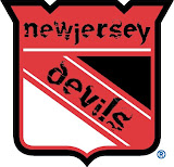
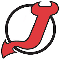
I'm sure you can figure out the relevance here. One more...
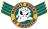
And now we move way out west for a simple concept based on the old Mighty Ducks secondary mark.
It has wings!
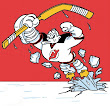
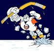
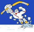
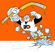
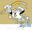
Speaking of Anaheim, if you remember back to the last Freak Out post, you might remember the series of logos based on the Mighty Ducks' old third jersey with the giant duck bursting through the ice. I'm presenting them one division at a time. This time it's the Atlantic.
You'll get another division next time but that's all for this week. Express your disbelief and hysteria in the comments area below if you're so inclined and get ready for No. 40 in two weeks!







Reader Comments (20)
it's an F-86 sabre jet, flown in the Korean War
took me a moment, but i got it. not a fan, it's way too Jetsons for my taste.
regarding the plane-esque buffalo logo, it's a brewster F2A Buffalo from ww2 with a sabre painted on the side, right?
either way, thumbs down on that one.
everything else is about as awful.
Haha. yeah i was just going on that people where tired of the reworking of the old sabers logo. This was totaly ment as a joke anyhow. LOL to me and im the one who made it i think it looks like a Giant fish hook. Hockey Week is right on the Plane It is a F86 Saber.
beat me to it ... F-86 Sabre. http://en.wikipedia.org/wiki/F-86
cool concept, but doesn't work as a logo.
nice work Mike. As I said, the concept is wicked; could totally work as a 3rd jersey logo or secondary mark, if it was simplified a bit.
lol nice joke, but no one would get it if it was the logo, but thats the top plane related concept ive seen not for a team called the jets!
Not sure if intentional, but the negative space of the airplane logo appears to form a charging buffalo. The tail fin of the plane is the horn on the buffalo's head that is looking to the your right. It is easier to see in the picture of the logo on the jersey (since it is at a different angle).
mike pho3nix, i think youve got serious talent and if you really work hard, you can be a very solid artist here on Icethetics and beyond. This, as you stated was a joke, but the designing youve done for this and the Blackhawks logo is top notch. The conceptual part needs work. The pieces are there, put them together. To the other stuff, its sorta bad.
The Sabres logos are scary. The Devils and Rangers logos aren't much better. The Ducks logos actually looks descent. (I always liked the Duck mask logos.)
I think the F-86 logo is a cool concept. It does need to be tweaked, but I think it could work as a logo.
Well i can tweek it to look a little better or go with a diffrent look to the Plane. Brian, thanks for your Kind words. Im not as good as sigma kappa or GFB and i try to think out side the box. Im learing alot more from doing all this too. Right now as asked from the Hawks post Im working on a Pens Logo and i hope i catch every ones eye with that one too. I was the one that also did the Leafs logo with the CN tower in the vains.
I agree with Bryan - mike pho3nix's stuff is cool, the Blackhawks one especially. Would totally love to see the sabres jet done seriously too.
There might be some Leaf stuff comming again i was lazy that night. so please dont mind them. plus i find the leafs are one of the hardest ones what can you do with a leaf? LOL
Yay I got something posted. My sabres logos got onto this weeks freak out friday, I was hoping for that. If anything of mine is ever not on a ff post I'd be surprised.
I love my buffalo slug butter spread version (third one), it cracks me up. Too bad I can't actually draw or I'd of put a peace of toast under it.
The slug cannot be salvaged, saved, or redeemed. It sucked when it was unveiled. It sucked when the drone-like fans were plopping down handfulls of cash for the merchandise as their beloved Sabres were winning the Presidents Trophy. It sucked when we missed the playoffs last year and the same drones still accepted managements table scraps and excuses. And it still sucks today.
There is no hope for it. Bring out the salt shakers and kill it before any more harm is done.
haha that reminds me of the time I was listening to the radio and the lady saying nhl scores said the "buffalo sab-rays" not say-bers lolol.
As good as his Blackhawks logo is, this one missed. I admire the imagination and talent to make stuff like this, though! Hopefully it continues with other teams.
Artistically, the F-86 logo is very well done. Definitely not a direction that I think they would go with it, but creative none the less.
The combination of the Penguins logos was a cool idea for a concept, but doesn't look as good as the serious penguin from the 1990s logo which I always liked.
freelance writer