Icethetics

via Blogger

Entries in freak out (5)

Friday
Oct102008

Freak Out Friday XLIII

Another short edition of Freak Out Friday is upon us. We'll dive right in, starting with the St. Louis Blues. Here's an interesting alternate jersey.

And what has the Detroit Red Wings' jersey been missing all these years? Wings?

I don't really get this one but someone obviously put at least 10 minutes into making it.

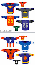
And finally, our buddy Dave Delisle from last time is back with more. What do all of these jerseys have in common?

Keep all your odd artwork coming so Freak Out Friday can continue!

Friday
Sep192008

Freak Out Friday XLII

Freak Out Friday is finally back! After taking six weeks off, everybody's favorite series is making its' big return today. For those of you who just joined us in the last six weeks, take a look at some past Fridays. Some of the best ones were on the old blog. Basically, I take the opportunity every couple of weeks to showcase some of the weirdest and craziest concept art that turns up in my inbox.

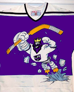
Now, we're starting back up with an easy one. What did we last make fun on Freak Out Friday and what do we make fun of the most? Could it have been the Mighty Ducks' mid-90s third jerseys? What if they mated with the Kings?
Sticking with California for a moment, imagine if the Sharks went in an entirely different direction with their logo design.
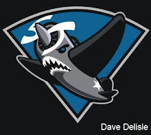
That's not even the best one, and you'll notice that the majority of today's Freak Outs come by way of David Delisle who, while doing excellent work, sure ends up with some odd stuff.

Last month I featured a blog that was holding a competition to design the best Hurricanes/Whalers hybrid jersey for the franchise's 30th anniversary.

That's so scary it's actually good. And to all of you who think the Hurricanes' logo looks like a toilet flushing... this logo brings back memories of when my first goldfish died.

The Flames will be our next topic of discussion.
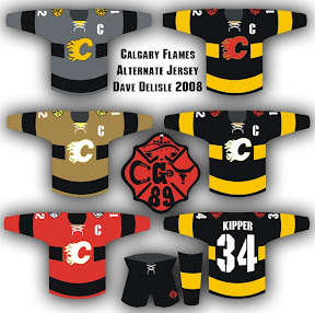
Check out that logo in the middle. The more astute among you will notice some things hiding in plain sight. The less astute will just be amused by this.

The Blue Jackets are next on our hit list. All this time and no one's ever made a concept showing jerseys that look like blue jackets. Until now.

How would that not get your team laughed off the ice?

Finally, a combination of odd designs by our new buddy Dave.

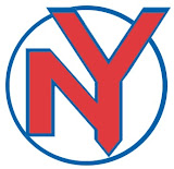
Yes, we get it. There are a lot of cabs in New York. By the way, the record needle on the end of a hockey stick is pretty funny.

One more thing, which isn't related to hockey but still funny. Kurt Snibbe of ESPN.com's Page 2 had some fun messing with NFL logos last week. I highly recommend a look even if you don't like football.

And that's all there is for this 42nd edition of the Freak Out Friday. I hope to be back in two weeks with a new crop of the ridiculous so make sure you guys keep them coming.

Friday
Aug082008

Freak Out Friday XLI

Another Friday is upon us and it's time to freak you out. I'm starting with a rather frightening rendition of a Senators third jersey concept.

Just look at those eyes staring back at you. Scary stuff.

We've been talking a lot about the Dallas Stars lately. Anybody want a real Old West theme for the uniforms?

If you did, I'm sure you don't anymore.

Stripes for the Sharks?

You know you'd buy that jersey. Don't try to deny it.

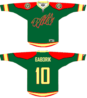
Here's a somewhat less freaky Wild concept sweater.

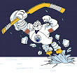
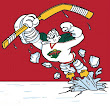
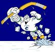
A new series within a series I started to FOFs ago showcased the infamous Mighty Ducks third jersey with the logos of other teams from around the league. We've done the Atlantic Pacific Divisions and today we've got the Southeast.


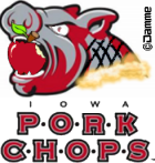
And while we're on this topic, under the heading of Other Things That Just Won't Die, the Iowa Chops are back for another round of mockery.

I don't think I need to say anything more. Just try to enjoy your weekend now that you've been freaked out.

Friday
Jul252008

Freak Out Friday XL

This is the 40th installment of the Freak Out Friday series. And the Roman numeral for 40 suggests I'd better have an extra-large helping of freaky hockey artwork this week. Let's hope I can deliver.

The biggest real-life freak out of the last couple weeks has been the public unveiling of the Iowa Chops along with their new logo. But someone's made an improvement.

(Apologies for the low image quality, but this is what was sent to me.)

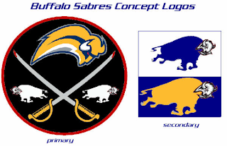
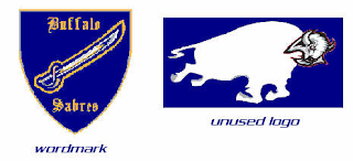
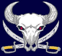
It seems that with the Buffalo Sabres, when it comes to fan made concept art, you either love it or hate it. I wonder what you guys will think of these.

But wait, there's more.

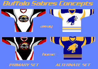
There have even been jerseys designed for them.

And more along the lines of Matt's recent rebrand of the Stars, check this out.

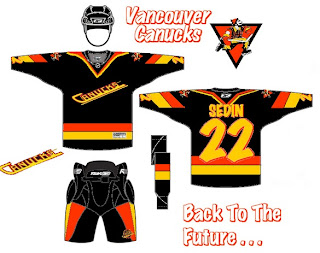
Something else I got this week that made me chuckle were concepts for the Vancouver Canucks.

Don't get me wrong, I appreciate the effort someone put into this but wow, you can't help but shake your head in amazement.

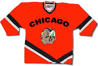
Here's a concept jersey for the Chicago Blackhawks.

Don't shoot the messenger.

Sometimes folks send in team-branding concepts that miss the mark a little.

I can only imagine the nightmares the children of Cleveland would have to endure.

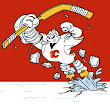
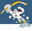
Speaking of nightmares, if you recall about a month ago I started a series within a series for the Freak Out Friday. One reader created 30 logos based around the Mighty Ducks' third jerseys from the mid-90s — one for every NHL team. Last week I posted the Atlantic Division and the week before was the Ducks' own Pacific. Today we're going to the Northwest.


Be sure to notice the half-stripes on the Oilers logo. Yes, all of these are based on last year's new Rbk EDGE jerseys.

And that's all folks. We're back with another Freak Out Friday in two weeks — assuming you get all your ridiculous artwork sent in! My big thanks to everyone who's submitted work — good and bad alike!

Friday
Jul112008

Freak Out Friday XXXIX

Today marks the debut of the Freak Out Friday on Icethetics. The series carries over from my old blog — NHL Tournament of Logos. If you're new to this, you might want to have a look at some of the ridiculous items that have been submitted to me over the past year.

Along with this comes a new name. The series was formerly called "Just To Freak You Out" — but it is more commonly known now as Freak Out Friday. And as you can see, this is the 39th edition since August of last year. Yeah, we've had a lot of weird and crazy artwork to post in that time. Remember, too, that is a biweekly feature so you'll only see it every other Friday.

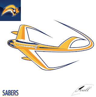
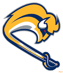
With that out of the way, let's dive in because there's quite a lot to get to. I'm beginning with Buffalo. The unveiling of Matt's rebrand of the Sabres this week was met with a rather mixed reaction — that spawned a lot of attempts to fix it. Now, there were some good ones (which I'm saving to post over the weekend) and there were some bad ones (which you will see now).

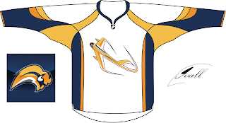
You may have to stare at that for quite a while to figure out what it is. Kudos to anyone who can figure it out without me explaining it. Naturally, there's a jersey concept to go with it.

Thing about the Sabres, though, is while there are a number of very vocal fans opposed to the "slug" logo, it just so happens that plenty of folks like it. So the trick because how to make it less about the buffalo and more about the sabres.

All from the same artist. Comments?

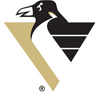
Let's move on now to the Atlantic Division where we have a number of Combo Concepts, as I think I'll start calling them. First is a current Penguins logo mixed with an old one.

There are some things we should just never have to look at.

I'm sure you can figure out the relevance here. One more...

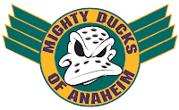
And now we move way out west for a simple concept based on the old Mighty Ducks secondary mark.

It has wings!

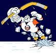
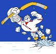
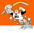
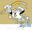
Speaking of Anaheim, if you remember back to the last Freak Out post, you might remember the series of logos based on the Mighty Ducks' old third jersey with the giant duck bursting through the ice. I'm presenting them one division at a time. This time it's the Atlantic.


You'll get another division next time but that's all for this week. Express your disbelief and hysteria in the comments area below if you're so inclined and get ready for No. 40 in two weeks!