The Sabres, Revisited
 16 Comments
  Saturday · Jul 12 · 2008 | 3:47 PM PDT
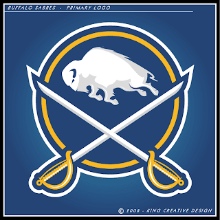
 Following Matt's rebrand this week, many of you have been hard at work on your ideas for what sort of logo and uniforms the Sabres should really have. Reaction was mixed with many people looking for something completely new...
...while others enjoyed the update on a timeless symbol. And there's more where that came from.
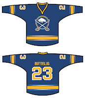
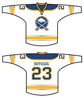
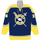
By the way, you've seen other work from this designer. He's quite talented. Here are the jersey designs that go with his logo.
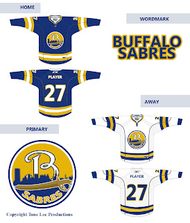
I've got another, more unique logo to share.
It has jersey designs as well.
In addition, I have more unrelated sweater concepts.
Interesting image. And this I believe is similar to concepts we've seen before, but it does tend to be one of the favorites.
I've got a big project in the works here at Icethetics. This goes out to all of the talented artists and designers who submit artwork on a regular basis: How would you like to brand an entire league? (And it's not the NHL.) Details to come.





Reader Comments (16)
all you guys dissing GFB abbout having nothing special, well sigma kapas looks nearly the same as his
if your a designer you relize its hard to come up with a sabers concept that people will like, that isnt based off the original
also i wanna see what the rebranding of the whole non NHl league, cant wait
whoops sorry it isnt sk its king crative design, whoops
They're all inferior to the slug.
FLYERSK27 WHAT?!?!?!?!?! How could any logo ever made be inferior to the slug. You are even demeaning it yourself by calling it that.
The second sabres rebrand is fantastic; the logos nice, but it looks even sharper on the jersey. His new Dallas logo is pretty sweet too.
I really like the first set of jerseys and logos. It's nice to actually see a Buffalo concept that revolves around the SABRES and not a buffalo with sabres in the background.
The rest of them are pretty much the same as everything else I've seen. (Except for the sabres stabbing the buffalo. That just looks weird.)
I really don't like the Red and Black logo on the gold and blue jersey. It just looks weird.
Also... I actually like the "Slug" and the "Goathead" logo. I never saw anything wrong with them. Given they aren't the best logos the league has ever seen but they aren't as bad as Buffalo fans think they are. I personally think Buffalo fans got spoiled with a really good logo to start out with and now they view the great logos that they have been given as crap because they aren't like they used to look like. Please stop... This is getting really old and annoying.
Hmm... no, no, no, no, no, no. Give me GFB's. :D
(I agree with mykl and kevin)
ahahah 'tone loc'. like as in 'juice' from disneys blank check? awesome.
The slug is way better and more modern than the original sabres logo, quit complaining about it. All it needs is an actual sabre as part of the logo too and it would be perfect.
The only ones worth taking a second look at here are the second and last jersey designs. It has a logo that's overused in the concepts, but I really like the jersey striping. And the last concept uses the logo that I see nothing wrong. The others are all kind of bad. The first one looks more like a vintage NBA logo than a hockey logo. And cody brown?, what are you talking about?
Now that first retro update I like!
Flyers2K, please. It sucks. You know it. I know it. Then again, you Flyer fans and your "streaking" P might find a "streaking" legless slug with horns more attractive than crossed blades and the symbolic white bison, that just so happens to encapsulate the team name (Buffalo. Sabres.) in one design.
Then again, you also boo when injured players get up off the ice over there. I guess we should be thankful Richard Zednik had his throat slit in Buffalo. Had it been in Philly, he'd probably be dead.
That poor buffalo. What'd he do to deserve being skewered like that?
"Then again, you also boo when injured players get up off the ice over there. I guess we should be thankful Richard Zednik had his throat slit in Buffalo. Had it been in Philly, he'd probably be dead."
Now i think that's a little harsh. Some of us Flyers fans are opposites of out buffoon counterparts, the beer drinkers and hell raisers(sorry, had to put that in there lol) I go to Flyers games to watch the Flyers play, not to boo an injured player off the ice. If i was at that game, i would be cheering for Zednik until my lung collapsed.
Some, maybe. Certainly not the majority. And certainly not the front office of the team itself. From this outsider's opinion anyway.
That bison is perfect in balance and proportion and would eliminate criticism of Slabyk's "puff ball" Bison.
Put this bison in the middle of Slabyk's crest and swords...10/10.
King Creative Design's update of the Classic primary logo and the jerseys are perfect. Maybe keep the classic nameplate and numbering fonts though. This is undoubtedly my top choice.
John Slabyk also has much better concepts than what the team actually uses.