Coyotes Logo Evolution
 12 Comments
  Sunday · Jul 13 · 2008 | 8:34 AM PDT
 I've been going though my computer to clear off a bunch of old files when I came across an interesting video clip. It was posted on the Phoenix Coyotes web site a few years ago when they unveiled their new (current) logo. As a person who comes from the video/animation world, I was fascinated by it and I thought I'd share it on this Sunday morning.
Now, just to be clear this video is property of the Coyotes hockey club and I have nothing to do with it. I'm just a fan and I wanted to share it with you guys. Someone obviously put a lot of effort into it.
But what sort of person would I be if I didn't also have concept art for you?
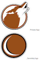
These two logo sets come from the same designer and I think they're equally cool.
This one I felt was confused. You're either using the moon as a C or not — you can't have it both ways without it being weird.
And to finish... this is something I don't really like to do, but I'm making an exception. Occasionally when I post a concept logo, I'll get emails from people with adjustments to that design. And I tend to not post them because I feel like it takes away from the original artist's work. Here, I believe it helps it.
Back on NHLToL, I posted this Coyotes logo set by designer Sigma Kappa. But one reader made some tweaks to the second logo.
I like this one just as much as the original. Both have their pros and cons but I figured I'd post it so you guys could decide which you thought was better.


Reader Comments (12)
Hey... did you change the comment box-thing?
I certainly did. Toying with some new features today, including a new rating system. So if anyone has any trouble with the blog today, that's why.
I really liked the old Coyotes logo...but the new ones have grown on me. Cool concepts but i still like Sigma's a lot
i like that edited secondary!.. it's def PRO worthy. good job to the artist and the person who edited it.
the 2nd logo concept doesnt load for me,
anyone else have this problem?
ok never mind its working now,,
i love that we see the artwork on the command box thing now,,makes everything easier
The edited shoulder logo with the coyote springing from the state of Arizona is pretty choice. Definitely pro-worthy. We certainly do have some talented contributors. Too bad none of them are doing any redesigns for the teams.
Isn't that concept art just a rip off of the Rouyn-Noranda Huskies logo posted a bit lower on this site?
http://www.huskies.qc.ca/accueil.asp
Some one has been spending too much time analyzing Q-League logos....
I just wanted to mention that I did the revised Coyote logo but the real credit should go to the originator. I just tweaked it a bit.
It will be interesting to see all the critics that appear on this site from time to time come up with a logo completely from scratch if the proposed 'fantasy league' happens. I personally think it is a fabulous idea.
I like the first alternate logo. I know it comes from the Phoenix Suns NBA alternate logo, but that design is just plain awesome. For those of you not familiar with the Phoenix area, originally the Suns and Arizona Diamondbacks of MLB were both owned by Jeffy Colangelo, which is why they both had the purple color on their uniforms and logos. Colangelo was also an important part of the Jets' relocation to Phoenix. The Coyotes and Suns both played in the America West Arena, which is literally a couple hundred feet away from Chase Field (formerly BankOne Ballpark), where the Diamondbacks play.
When the Coyotes changed their logo and colors in 2003, they moved to nearby Glendale, about ten miles away from Phoenix. Colangelo remained as owner of the Suns until 2004, shortly after the Coyotes moved to Glendale, while Jerry Moyes, co-owner of the Coyotes, is a part-owner of the Arizona Diamondbacks, which explains why the Diamondbacks changed to the color scheme the Coyotes currently have: red and white.
So basically, if things had worked out differently and the Suns and Coyotes shared the same owner, I could imagine the Coyotes actually having that design as an alternate logo. Unfortunately, because they have different owners, that won't happen for the Coyotes.
I personally cannot stand that firebird logo the Suns have. No way do I want the Coyotes adopting that. I like the Suns' primary logo that's been around for at least 15 years.
Out of all those concepts in this post, I just like the secondary moon logo by itself.
Very cool video. I remember it quite vividly when the Coyotes unveiled their new logos and colors 5 years ago this summer.