Want To See Philly's New Third?
 20 Comments
  Sunday · Jul 20 · 2008 | 1:24 PM PDT
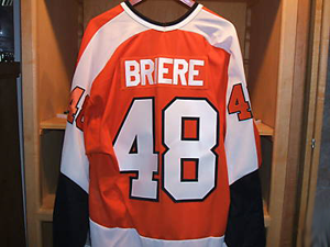
  An interesting photo turned up in my inbox this afternoon. It shows Daniel Briere's new third jersey hanging up in the locker room.
The Flyers haven't made anything official yet, but rumors have been floating around since March.
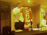
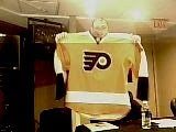
For what it's worth, my opinion on this photo is that it's legitimate or a Photoshop job too well done to be an amateur — though folks here do love their Photoshop. But seriously, I think it's an actual photo of a jersey. It doesn't differ much from the cell phone photos that surfaced several months ago. Here's another look at them.
The main difference appears to be the nameplate. On the March leak, it appears the orange jersey has a white nameplate with orange lettering. Here, it's switched to a matching nameplate.
Other than that, they look the same to me. So it appears we've gotten our first real look at what the Flyers will wear as an alternate jersey this season. Hope you guys like it.
UPDATE (7/21 2:25 AM): So it's definitely a photo of a jersey, it's just a vintage replica being sold on ebay. Kudos to Hockey Week for the find. I think we should probably expect to see something more like what's in the two cell phone pictures. As always, I'll try my best to keep you updated.


Reader Comments (20)
like it? try love it.
its very nice...but as a Sabres fan I think its hideous with Briere's name on it lol! but it really is nice to see the orange back in Philly. The black jerseys should be replaced.
Beautiful!
There is no RBK logo on the back of the jersey
Wow phenomenal job beautiful jersey
I always loved the orange jerseys better than the black ones.
I like the orange color, but I'm not crazy about the white shoulder trim. I think the orange and black they wore before converting to the black jersey full-time was one of their best looks, and I'd personally prefer a black trim to the white in this photo.
shoudn't the jersey have the rbk logo on the top above the nameplate? i noticed it wasnt there in the picture
shoudn't the jersey have the rbk logo on the top above the nameplate? i noticed it wasnt there in the picture
The actual jersey is likely not yet in production. This is probably more of a mock-up of what the final will look like — sans the Reebok logo at the neck. I could be wrong, but that's my take.
I think it's a very nice throwback jersey. Really looks sweet. I'd prefer wider white shoulder panels that run down the sleeves though. The Sharks did a horrible job with their previous set with the shoulders that way.
I love the Flyers jersey and hope that it's what they go with. Classic Broad Street Bullies look.
That is not the flyers new third jersey. Although, that is probably what it will look like. That is most likely a vintage flyers jersey made my mitchell & ness, which can be found on ebay & can be customized with any name.
Yeah, its probably just a mock up or prototype since there is really no RBK marking. The final one will indeed be orange but will be in the style of the current jersey template.
http://cgi.ebay.com/NHL-FLYERS-DANIEL-BRIERE-VINTAGE-JERSEY-ADULT-X-LARGE_W0QQitemZ150271890436QQihZ005QQcategoryZ24999QQssPageNameZWDVWQQrdZ1QQcmdZViewItem
no no, it's this auction. he has other briere flyers jerseys in the same locker-like background.
as he says in the description:
"BEAUTIFUL DANIEL BRIERE VINTAGE JERSEY!! #48 CCM VINTAGE JERSEY"
the CCM Vintage collection had the tags on the hemline just like the jerseys of that era.
briere has never worn that jersey (nor have the flyers since the early 80s), but that's probably similar to what we'll see this season. again, i say "similar".
remember, NOTHING made by RBK goes without that damned logo. Nothing.
no RBK logo as said about 100 times but there are many rumors about the vintage jersey as their third this year
no no, it's this auction. he has other briere flyers jerseys in the same locker-like background.
Nice find, Hockey Week! I like knowing that I can count on you guys to set things right when people send me stuff that isn't quite on the level. So while it may not be the actual third jersey, I'm sure it'll look something like that. Thanks for the comments!
*sniff* its...its... BEAUTIFUL!
White nameplates on coloured sweaters always looked odd to me, but they sort of reinforced the fact that the nameplates were afterthoughts in the 70s, and probably only produced once for both sweaters (exception: Quebec Nordiques, '72-'74 and Team USA '80, which had reverse-colour nameplates for both sweaters). It really does give that authentic "retro" look, which I love.
What other teams had that look in the 70s? I'm sure there were others, but none are coming to me at the moment.
Love it! It is a classic sweater. I would def purchase one. I attended alot of Flyers games last year and alot of fans were reluctant to purchase the RBK jerseys because they are so ugly. Go back to the old classics, white (away) and orange (home). Done!
The collar is not shiny: it's an old jersey. The RBK Edge collars are all shiny; the old ones are matte material. It's an old fake.