Rebranding The Stars
 66 Comments
  Wednesday · Jul 23 · 2008 | 2:32 PM PDT
 Your favorite Icethetics partner artist is back tonight with another concept for his series, Rebranding The NHL. I know you're excited! Matt is taking his shot at the Dallas Stars and it's quite likely one of his best yet. But first, read his explanation in his own words.
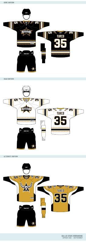
After my exhaustive research into the Dallas Stars, many of the Stars fans really like their new uniforms. So taking cue from that, I ended up removing green from the color scheme. Why? Because the time has finally come to put the North Stars days away for good. This is the Dallas Stars. Minnesota has their new team. Time to turn the page in Stars history and embrace their home.
The goal of this new identity is to embrace the new "Lone" Stars. The completely custom wordmark is styled after an old saloon sign. The new secondary logo is a much better attempt to symbolize Texas than the failed "Mooterus" from a few years ago. The striping on the home and away feature barb wire lining the jersey, and the alternate jersey design resembles the horns of a steer...
So here are the logos he created for the Stars.
As usual, it's truly great work and that secondary logo is just downright scary. Like a lot of you, at first I was concerned with the lack of green. But after reading Matt's explanation, I think it's perfect. A true, individual branding for a great team.
Naturally, he's done uniform concepts to go with it.
I'd buy that gold jersey in a heartbeat.
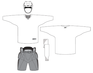
But for all the fans of Matt's work, he's donated a neat little surprise for. A lot of folks have asked about getting a copy of Matt's uniform template. He's now generously offering it for the first time. Enjoy!
So what's next? Matt tells me he's hard at work on a new rebranding of the St. Louis Blues. But he's a little stumped. He says, "The only thing is I have no idea how I can give them a better identity than the Blue Note. So I would like to call out to all Icethetic-ites for aid in coming up with ideas for Blues logos..."
For one thing, he needs help determining a secondary color. And who better to ask than the awesome readers of Icethetics? In the sidebar is a new poll where you can voice your opinion. Choose between navy blue, yellow and red to go with the primary color of blue.
And if you have any brilliant ideas for a new direction for the Blues' logo, you can post them here in the comments or contact Matt directly by emailing him at gfb_designs@yahoo.com. Voice your thoughts and get ready for an exciting new look for the Blues!


Reader Comments (66)
I hate the Stars, but I thought these were very nice...great logos, and an interesting premise in going away from green.
Now, for the love of jeebus, fix my Oilers.
Fresh, new and superb! Great work! I was to doubt of your skills since the Sabres new identity (jokes!) but this is simply great work!
Even if you don't like it, check the originality, the freshness and the technicals aspect of this identity and you just can't say this isn't great!
EXCELLENT!!!!!...............except for the mustard third jersey....I WONDER WHY
@ rugbysevens
Maybe I'm tired of everyone giving Texas teams a 'wild west' imagery
It's not just the Dallas Stars. There's the Houston Astros, Texas Rangers, San Antonio Spurs, and Dallas Cowboys. That just seems to be the kind of route that these teams go.
Now, I have to say that this is the best work I've ever seen Matt do here. A brand-new identity for a team that's been around for so long. Nice to see a design not revolving around green and yellow. One change I'd make (and somebody else touched on this point) is I'd swap the secondary and primary logos. I understand that most Stars fans quite like the new jersey with "DALLAS" on it, which I imagine led to the decision for that to be the primary. However, in this case the secondary is far too well executed to not get face-time (not a play on words because a steer's head is on the logo) on the primary jersey. But all-in-all, superb work. The best I've seen Matt do.
Well, actually I'm not sure that the Houston Astros is Western-based. But "Astros" is "Stars" in Spanish.. or loosely; that's what it's based off of, but the exact translation is "estrellas."
-sh,
i would say it's very likely he uses illustrator or freehand, but i would lean heavily towards illustrator. A cheaper alternative, but not one i recommend is coreldraw. If you look up the process for any logo creation, it should give you an idea on how the process goes.
I'm kinda in the middle on these, but I'm glad to see more of an actual "rebranding" with new themes instead of minor tweaks to what's already there. I'd like to see a team get totally new colours as well as logos one of these times. THAT is a rebrand in my mind.
Good work and keep up the imaginative stuff!
Is a star not a part of the Texas flag? Why can't they be called the stars?
I use Coreldraw. I think for beginners it would have an easier learning curve than illustrator. Most design professionals never gave Corel a chance when they started and now find it inferior. Having used both for the past 15 years there are still many cool features from Corel you can't find in Illustrator.
I think they look good, but I think they should have green. I don't understand why you are forcibly removing the history of the franchise. Like it or not, the North Stars are the Stars. We carried over their retired numbers. Their history is ours. I say respect the 'chise and put the green back in. Black and gold? Who are we? The Ducks?
I don't anticipate the Stars removing the green from their franchise in its entirety any time soon. But one of the things I like about "rebranding" is giving a team a brand new identity, something that doesn't exactly resemble what we've come to know as the Dallas Stars, or at least not in the same way.
I am curious as to how a total rebranding for a team would look like, changing the colors included. But I have to admit that when I asked myself what color comes to mind when I think of Stars.. of Texas, the Old West, gold was the only color that came to mind. It's just something that fits and can't be replaced.
I live in Canada and I have never been south of Coeur d'Alene, so I did see Dallas as a cowboy place. Since it isn't, these designs would be much better suited for Calgary, which is a cowboy place, at least moderately.
I have to agree with some of my native Texans, I would rather these be used for our new AHL team next season. I'm tired of the old west look. We don't all live on a ranch or hang out in saloons down here. Dallas doesn't even feel like "country" anymore because there are so many people here that aren't from here. I like the black jerseys but would rather they be thirds. I miss the green.
I love the new rebrand, but I miss the green. If the yellow were green it would have been perfection. I'd also swap the secondary and primary logos.
I must say I applaud(sp?) the new look for the Dallas Stars. Someone should send this into the Dallas Stars these would be great changes. I say it's time to move on from the green.
I agree to put away the North Stars. Eliminating the green is a way to go. However, Black and gold is so common, I'd like to see a Dark Brown and Gold scheme. Texas is so spread out, so focusing on the lone star aspect is right on line. I love the logos and the look, I'd just wonder what a Dark Brown, Gold and white might do. Matt...if you want to try, ,maybe a Uinversity of Wyoming Brown, maybe a little darker and with a Cal Gold. Again it looks great as is, I'm just now curious of the Dark Brown and Gold look.
What a fantastic rebranding! One of the NHL teams needs to hire this guy.
I never thought I'd see a gold jersey that looked truly awesome, but Matt did it here.