Thursday
Jul242008
Improving On The Chops
 11 Comments
  Thursday · Jul 24 · 2008 | 11:58 AM PDT
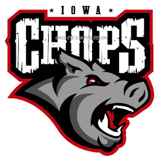
 Two weeks ago I posted the new name and logo for the AHL's Iowa franchise — the Iowa Chops. While the name remains an abomination, someone actually came up with a decent concept logo.
credit: Red Eye Graphic Design
This is a great example of how you can create a great logo even when saddled with a crummy name and overused colors. Too bad it will never see the front of a jersey.
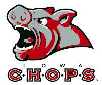
For reference, this is what the Chops are actually using.
Thanks to Charlie for the tip!


Reader Comments (11)
Awesome. They should just have a pork chop on a plate, it would have the same appeal.
Sorry to get off topic here...
To the person posting as Sukhraj: Can you do me a favor and stop posting links to IHA logos. I'd like to keep the designer pool untainted by waiting until the weekend to start releasing the designs people have come up with. It's nothing personal, I just want as much variety and originality as possible. Thanks!
http://joycedesignsinc.com/images/porkchops.jpg Iowa Chops idea
Wow, that's a lot better, but still... it's an angry pig. Ick.
i cant wait till you post the iha logos
I don't see much improvement, though I'm not sure anyone could given what there is to work with. At least with less red it doesn't look like it's covered in blood.
@ NHL News:
Glorious.
Fantastic!! You should send that logo to Iowa. A pork chop on a plate would be just too funny.
I don't have the photoshop skillz, or I'd do it myself, but you should put Brett Favre's head in place of the pig's. That would be great, given the latest news out of Iowa.
That would make a better NFL logo
God...the Chops little Guerrilla marketing campaign is ridiculous...Brett Favre? Can't keep up with demand for merchandise?
They are taking a page right out of the Sabres marketing playbook considering the initial negative reaction to their logo unveiling.