Blues, Blackhawks & Blue Jackets
 17 Comments
  Saturday · Jul 26 · 2008 | 2:57 PM PDT
 Hope you guys are psyched for the Center Ice Tournament. I've been busy getting that prepared but in the meantime I did promise you concept art. Today's theme is the Central Division.
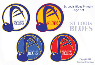
First up, the Blues — in an assortment of different colors.
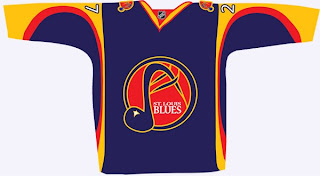
These logos have a very different feel to them as well because of the hand-drawn look. The NHL has never really done anything like this. Also, there's a jersey to go with them.
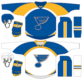
But back to a more simplistic approach, what about a striping pattern on the jersey that alludes to the Gateway Arch?
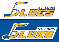
Here's an interesting wordmark.
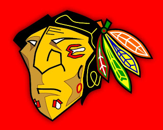
Next is my favorite subject, as you know, the Blackhawks. The designer tells me he came up with this logo around the time the Senators first introduced their 3Dish logo. You give the Indian head a quarter turn and he might look something like this.
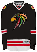
I like it a lot — maybe not as a logo, but just in general. Plus, remember this logo? Somebody put it on a jersey.
Not bad at all.
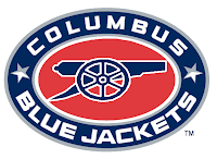
We'll finish things up here with the Blue Jackets. Here we're replacing the hat with a cannon on the secondary logo.
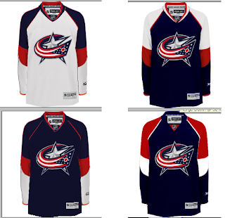
And here's a variety of color patterns for Columbus' jerseys.
Nothing really jumps out at me (in fact, it took me a minute to notice they were all different).
Don't forget, tomorrow you'll get your first look at some of the logos designed for Project: IHA. I can't wait to post them and get your feedback. Plus the Center Ice Tournament bracket will make it's debut. So there's a lot you won't want to miss.
 blackhawks,
  blue jackets,
  blues,
  concepts,
  fan art,
  jerseys,
  logos
logos 



Reader Comments (17)
The feathers look like they belong behind the head on that blackhawks logo and it either needs the yellow lines in the hair extended out into the all black part of the hair, or there should be no lines at all. I like the second home and away set of the columbus jerseys.
the blues ones with the hybrid note/arc are cool but it looks more like a logo for some music festival. great idea tho with a little tweaking it can be a sick logo
HEY my hawks logo lookd nice on that Black Alt Jersey. Im flattered buy it. Thanks who ever did that :) .
i think we should just give up with blues concept logos that don't include the REAL bluenote..
what happened with the thrashers today
as a blues fan, i have never seen an alternate logos for the blues that i thought looked good, which makes me nervous about the new third jersey
Those CBJ concepts are incredible. The one in the Bottom right is my favourite. Terrific job by whomever created them.
The Blues concept is interesting. At first i didn't understand how the arch would be incorporated, but that gives me a bit of an Idea.
thanks for the kind words. i did the cbj jerseys. my personal fave is the bottom left. but all i did was slap the logo on the philly template and recolor. i just think there are a couple of other teams that would look really good with that jersey design.
i made the cbj logo, i used the arsenal soccer teams cannon, it turned out pretty good. The blackhawk logo looks like it has down syndrome(sorry). i like the bluew script too
yeah Mike Phoenix, i did that alternate Blackhawks sweater... i really liked your logo so i put on an rbk edge jersey. thanks!
the blackhawks alternate sweater looks sick!!!!! good job to Mike Phoenix for making the logo and good job to Paul for putting it on a jersey!
For me, the only problem with the Hawks logo is that position of the circle holding the feathers. It looks too much like an eye in that location...
Toooo many colours(eh!) on that first blues concept.
i don't like the cbj concept jerseys too much, they remind me of that horrible edge template the flyers use. columbus came out of last summer with one of the better edge jerseys in the league, no need to resort to random color splotch templates
Ugh...the revised blues logo is awful and so is the jersey.
The classic blue note on the simpler jersey looks good though...but I'd have to see it actually on a player in a game.
The Bluenote is one of the best logos in the NHL...there is no need to screw with the logo itself.
I appreciate the effort on the Hawks concepts, but compared to the iconic indian head, they just don't hold up. And I'd actually prefer to see the bird design replace the WWW patch on the sweaters, but not as the main logo.
I like the Blue Jackets' cannon logo, though.
Seriously, there are some things that just shouldn't be messed with. The Blues logo is one of them, it's a classic. The Blue Note is simple, unique, and immediately identifiable; just perfect the way it is.