NEW Third Jersey Logos!
 60 Comments
  Wednesday · Jul 30 · 2008 | 6:52 AM PDT
 We're one step closer to getting to see what this season's crop of new third jersey's actually has to offer. I've gotten a hold of a handful of logos/crests to be featured on the new sweaters. I'm not naming my source for that person's privacy so don't bother asking. Let's dive in.
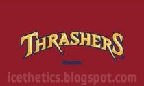
Thrashers We know Atlanta's jersey will be maroon with the team name arched above the player's jersey number on the front. What you see above is supposedly how the text will look.
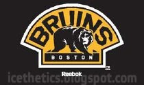
Bruins Boston will wear the shoulder logo from their home sweaters on the crest of their new black third jerseys. Nothing really new there but I'm displaying all the graphics I got anyway.

Sabres Buffalo will be wearing a vintage style sweater with the logo they donned for their first quarter century. This version of the logo appears to incorporate a lot of silver around the edges.
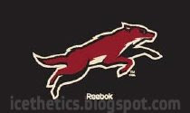
Coyotes One of the clubs that will be wearing an entirely new logo on their third jersey is Phoenix. Above is the leaping coyote we've been hearing rumors about.

Penguins This is another example of a logo we've seen before. Pittsburgh will be promoting last year's Winter Classic sweater design to third jersey this season. And that logo will stay on the front.
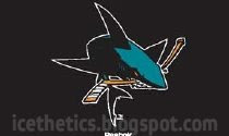
Sharks One of my wishes came true. I like the sound of a black jersey for San Jose but I was really hoping they'd go with the full-body shark logo and it turns out they will. This is one of the sweaters I'm looking forward to most.

Lightning Now for my team. I always call them the Bolts but I'm not sure how I feel about Tampa Bay wearing that nickname across the front of their sweaters. However, I am psyched about the blue sweaters! Above is what the text will supposedly look like on the uniforms.

Maple Leafs Toronto is nothing new. They're going with the 35-point vintage leaf logo. It'll be on a white jersey just like the ones they wore prior to the Rbk EDGE era.
As with anything, keep in mind that while I trust this source, I'm always wary about passing rumor off as fact. I believe these to be legitimate images but anything is possible. Take it for what it is and enjoy it!
The Kings, Senators and Blues are the teams with new logos/crests that we have yet to see. I'm told there was a note with these other logos that read "TBD" for them.
That leaves seven of the 18 new third jerseys unaccounted for in this post. Three will be wearing their regular primary logos (Hurricanes, Blackhawks and Flyers). Three will wear vintage logos (Oilers, Islanders and Canucks). And Dallas will have an inverted version of their black home sweaters — white with the word DALLAS in green text above the player's sweater number.
And that's that. Hope you guys are as excited about this news as I am!
(By the way, I apologize for the watermarking but I'm pretty sure I'm the only one with these graphics and I want to try to track who, if anyone, picks them up for posting elsewhere. By the way, I have no problem with anyone doing that. Just link back and keep the graphic intact.)


Reader Comments (60)
http://sports.yahoo.com/nhl/blog/puck_daddy/post/Third-jersey-images-leak-and-Phoenix-never-look?urn=nhl,97127
Congrats! looks like you're the official go-to guy for this stuff. and better yet, i found that link on McFarlane's sports board.
oh, and PDX pens, hockey is a game of heritage. you can trace why certain things are done to practices dating back 70+ years. We celebrate the Original Six era, we laud the Class of 1967, and we pass around the oldest trophy in North America, engraving names in it so that they will never be forgotten before passing the Cup onto the next team.
you don't like it, go watch NASCAR. nobody in the fan base will miss you. The National Hockey League will continue on, as it has since 1917 (before even the NFL, i might add), and won't miss a beat.
i HATE the Toronto Maple Leafs with an unyielding passion, but hockey's heritage should never be spat on. Ever. Old doesn't mean bad. If anything, old means time-tested and proven, and Maple Leafs is far better than any team name we've seen in the past few expansions.
you don't like it, find some league that's "new" and "hip" because you won't find it in hockey
i wish there was a caps alternate jersey and the jersey on frozen blog is a beauty but it looks better in navy cuz thats their third color
I like the Leafs design, and can't wait to see what the Flyers decide on. I honestly can't stand the numbers on the front of the jersey like the Sabres, Sharks, Stars, and Lightning already have, and soon to be the Thrashers. Is this the NHL or NBA, MLB, or NFL? Reebok and the NHL are trying too much to be like the other sports.
Sexual preference? WTF?
I wish the New Jersey Devils would get a 3rd Jersey, but lou is so strict with these things, I could see them just keeping the logo the same but instead of all red, make it all black with red and white trim, that would look sharp
I think the Sabres should use the current "slug" jersey as many have aptly named it as the third jersey and reintroduce the "old" logo as the primary uniform. I know many people in Buffalo would look forward to seeing the old digs. What I hope the Sabres do not do is use the old color scheme with the new pants...it just looks odd to have that distinction between the pants and the jerseys. I wouldnt doubt if they used the new midnight blue with the old logo.
I am going to do it, I really hope the league returns to the era of using white jerseys at home. I know all about logistics but if a team plans for a third jersey night and lets other teams know, then its less they have to carry.
What ever happen to the goalies selling ad space on their jerseys?
w00t! Totally supporting the rejuvenated Sabres' logo!... even though I'm a Canucks fan lol.
OK, so the Thrashers wordmark looks horrible and the "BOLTS", that's just an awful idea. I like the idea of the Sabres bringing the old logo back, same with the Pens. Personally though, I hope my Devils never make a 3rd jersey. I mean, every year someone has a new jersey or new logo or this or that. This is all a reflection of how unstable things are in the NHL right now.
I am a Thrashers fan and I agree they need a total overhall. The wordmark logo looks very late 90's (I guess it is actually). I've said this on another post, but the Thrashers need to go with a brown as their primary color, but have the blue and gold as secondary colors. Also I think it would be great if they have a sort of faux-retro look. Maybe have a somewhat realistic brown thrasher as the logo (ala Baltimore Orioles). There are very few brown teams and I think it is a great color. And it would also go very well with UPS being one of their corporate sponsors.