Thursday
Jul312008
IHA Poll: Pittsburgh Miners
 19 Comments
  Thursday · Jul 31 · 2008 | 7:22 AM PDT
Cast your vote and leave a comment about your decision. If you chose a non-finalist, tell us which one. Then tell all your friends to drop in and vote! The more voices heard, the more accurate the results!
By the way, I normally wouldn't do this but I feel the need to point out that the bird in Option #3 is NOT a penguin even though that seems fairly obvious.
Starts Thu Jul 31
Ends Sun Aug 3
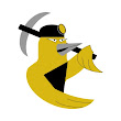
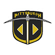
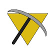
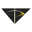
As promised, below are a handful of the logos that were submitted but not selected as a finalist. If you think one of these should be the Pittsburgh Miners logo, select "non-finalist" in the poll and tell us your pick in the comments.




Reader Comments (19)
I chose number one for the keystone shape (PA) and the triangle (Pittsburgh). The black and gold color are great, and even though the third option is NOT a penguin, it sure looks similar.
Wow. All of those Non-finalists are way worse, good pick of the finalists.
I chose #2 because it looks like a great secondary logo that can work as a primary, sort of like how the bruins primary logo is.
Had the third option been a canary, like the second non-finalist, I would've voted for that, hands down. As it is, I voted for finalist #1. I think finalist #2 was intended for and would make a terrific secondary logo.
I chose the number 2, I think it's nice. I had a great idea for this one but with my total lack of talent I couldn't submit it.
Number 2 is awesome, but I chose 1.
My reason? Well number 2 missed the mark with the pick and shovel, it would have been perfection if the shovel were a hockey stick instead. For that, I give my vote to number 1. Shame really.
Damn, I didn't even make the Non-finalists... That sucks. :-(
All these are pretty terrible, but number 2 is the best of those bunch.
I went with #2, the #1 option just seemed too familiar to me to think it was an original conept. That's not a dig onteh artist, just my thoughts onteh matter. The top 3 were deffintely way better than the non-finalists
I think number 3 is the best looking logo..
In my eyes finalist #1 and #3 were tied as far as design goes, but I just cant see #1 being on the front of a jersey (idk why, I just can't); it could be a nice secondary though.
Ogre, would this help?
http://i23.photobucket.com/albums/b394/johnious/random%20stuff/hockeyweekspittsburghminersmodeled.jpg
i voted no 2,
i think its a great logo,
i really like the design,
Excellent concepts all around. I voted option #2, but I'd rather see a P than an M (the Miner concept is already represented in the pick in the shovel, so give a nod to the city with the lettermark). But Option #1 is excellent too ... would make a terrific shoulder patch.
This whole thing has been a case of asking for too much, too fast. If there was more of a window for people to work on individual teams rather than rush them out the quality would be far superior to what we've been seeing so far.
I like the first one because of the triangle and the three dots representing the three rivers.
@ Hockey Week
Thanks, but actually that just made me more confident in my vote for #3. I still think #1 would be a nice secondary though, mostly because of the inclusion of all the meaningful symbols (keystone, triangle, etc).
Blah and ewwwww.
I been looking at the selections for 2 days.
Blah and ewwwww.
I will come back tomorrow and look again.
They are just plain ugly.
WWRSD.
Non-finalist top row right.
The one with "Pittsburgh".
Good night and thank You.
**Yes i know it is not night here (@10:29am), but somewhere it is*