NEW Third Jersey Logos!
 60 Comments
  Wednesday · Jul 30 · 2008 | 6:52 AM PDT
 We're one step closer to getting to see what this season's crop of new third jersey's actually has to offer. I've gotten a hold of a handful of logos/crests to be featured on the new sweaters. I'm not naming my source for that person's privacy so don't bother asking. Let's dive in.
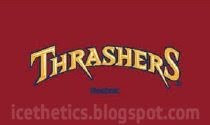
Thrashers We know Atlanta's jersey will be maroon with the team name arched above the player's jersey number on the front. What you see above is supposedly how the text will look.
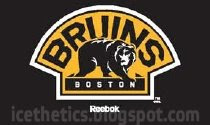
Bruins Boston will wear the shoulder logo from their home sweaters on the crest of their new black third jerseys. Nothing really new there but I'm displaying all the graphics I got anyway.

Sabres Buffalo will be wearing a vintage style sweater with the logo they donned for their first quarter century. This version of the logo appears to incorporate a lot of silver around the edges.
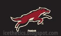
Coyotes One of the clubs that will be wearing an entirely new logo on their third jersey is Phoenix. Above is the leaping coyote we've been hearing rumors about.
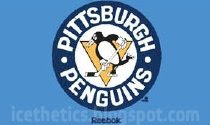
Penguins This is another example of a logo we've seen before. Pittsburgh will be promoting last year's Winter Classic sweater design to third jersey this season. And that logo will stay on the front.
Sharks One of my wishes came true. I like the sound of a black jersey for San Jose but I was really hoping they'd go with the full-body shark logo and it turns out they will. This is one of the sweaters I'm looking forward to most.
Lightning Now for my team. I always call them the Bolts but I'm not sure how I feel about Tampa Bay wearing that nickname across the front of their sweaters. However, I am psyched about the blue sweaters! Above is what the text will supposedly look like on the uniforms.
Maple Leafs Toronto is nothing new. They're going with the 35-point vintage leaf logo. It'll be on a white jersey just like the ones they wore prior to the Rbk EDGE era.
As with anything, keep in mind that while I trust this source, I'm always wary about passing rumor off as fact. I believe these to be legitimate images but anything is possible. Take it for what it is and enjoy it!
The Kings, Senators and Blues are the teams with new logos/crests that we have yet to see. I'm told there was a note with these other logos that read "TBD" for them.
That leaves seven of the 18 new third jerseys unaccounted for in this post. Three will be wearing their regular primary logos (Hurricanes, Blackhawks and Flyers). Three will wear vintage logos (Oilers, Islanders and Canucks). And Dallas will have an inverted version of their black home sweaters — white with the word DALLAS in green text above the player's sweater number.
And that's that. Hope you guys are as excited about this news as I am!
(By the way, I apologize for the watermarking but I'm pretty sure I'm the only one with these graphics and I want to try to track who, if anyone, picks them up for posting elsewhere. By the way, I have no problem with anyone doing that. Just link back and keep the graphic intact.)


Reader Comments (60)
when you watermark an image it's supposed to go over the image. Im sure if you put your watermark over the logo's we'd still see them just fine. On most of the images you can just photoshop the watermark right out of there.
when you watermark an image it's supposed to go over the image. Im sure if you put your watermark over the logo's we'd still see them just fine. On most of the images you can just photoshop the watermark right out of there.
I understand but I didn't want to detract from the logo. But I'm not that anal about it. If you really must Photoshop it out, who am I to stop you? I just thought I'd give it a shot.
i like most of those logos and I'm totally with chris on the sharks jersey, it's going to look great imho. but i was hoping the thrashers would use a more neutral font, maybe a bit like dallas on their home sweaters
I for one am glad nobody is trying to do exactly what dallas has done. That thing looks awful. It's hockey, not basketball!
I like the thrashers script myself...
Leapin' Coyotes! I'll reserve my judgement for when I see it on the shirt, but it doesn't really have that pro sports logo appeal that you would come to expect from teams these days... except for maybe the Pork Chops.
I sure do like the Thrashers text though... that'll look good on a jersey. Also like the Bolts text as well... should be pretty sharp looking.
That Thrashers text has potential.
So anxious to see the Sens third jersey, sad to see they seem not kind to bring the gold color back but if the jersey is nice I will forgive them.
I like Tampa's design and I'm very anxious to see what the full uniform will be like. Any word on when you'll get you hands on the full jersey pictures :)?
OK, The Bolts is awful. T.O. is classic. Buffalo is classic, I just hope they don't put the number in the top front right. San Jose and Pheonix are pretty cool, can't wait to see it on a jersey. The Thrashers is pretty awesome, but I don't like the big numbers on the front. If the Thrashers did what the Halifax Mooseheads did with their 3rd and 4th jersey's it would be awesome. http://bp0.blogger.com/_o9XB5QhOgIc/R_Gk8AfRosI/AAAAAAAAAQs/jfY2KEw2wuI/s1600-h/PJ+Corsi.jpg it is Halifax angles slightly up and then the number uner the end of the word. Boston has way to much black on that jersey/logo. The Pens is pretty cool. Nice to see a third jersey can be totally different in colour and still look good. I can;t wait to see my Sens.
Are the Hurricanes really using their primary logo rather than the Hurricane flag, or is that a typo?
Are the Hurricanes really using their primary logo rather than the Hurricane flag, or is that a typo?
Recent rumors are suggesting that the primary logo will be used on a white triangle. Obviously we'll wait and see but that's what we're hearing right now.
Ughhhh, I hate wordmarks. RBK and it's continual attempt to ruin every NHL jersey. The wordmarks for logos are just terrible and unappealing. It's going to be all like the NBA in a few years. That sucks. I wish the Lightning would have done better, that BOLTS thing without the logo really sucks.
Ugh they are ruining my Lightning!!! Err, i suppose its really "our" lightning eh chris? *sigh* Bring back the 1996 3rd Jersey.
Why didn't they call the team "The Bolts" in the first place? I'm a Montreal fan and I couldn't picture them wearing a jersey that said "HABS". That nickname trend is awful.
ugh, way to get me excited for the blues logo.. oh well the rest are cool. i like the coyotes, that's sharp
is there any chance of you getting the rest of them or is this all the guy had?
the pens should use that logo on their centre ice
OK there's the logos... next we'll see what bizarre ugly sweater patterns reebok forced down our throats through their brand monopoly.
is there any chance of you getting the rest of them or is this all the guy had?
Anything is possible.
To American,
Whether you like to admit it or not, the teams DO have a final say in the designs of their uniforms. Did New Jersey change w/ the EDGE change? No. Because the team stood up and said no.
San Jose's is pretty sweet.
glad to see the Pens sticking with the Winter Classic style logo.
Coyotes FTW!
I think the Penguins should use the logo they had in their initial season...the penguin with the scarf around its neck. Almost like Chilly Willy, but without the snow cap.
So is Howard Berger getting in trouble or is the NHL and RBK glad he kicked off the Alternate Jersey Viral Marketing Campaign?
they look good but since when does Reebok not call themselves RBK or just show the logo. The "reebok" writing below every image leads me to believe this are fabricated.
i can't believe how close i came in my mockups to some of these. i knew i should've used those goofy R's in my thrashers one. I wish you had the Blues one, that's what i'm really curious about
Is there any rumblings on the regular pens jerseys? Meaning are they adding shoulder patches etc to it? I am waiting to see if they tweak it at all before spending alot of cabbage on one. thanks
no one has made this comment yet so I'd bring it up. i'm a fan of all sports and all jerseys. the thrashers third jersey looks very similar to this team (http://www.threshersbaseball.com). Though one is the Thrashers and the other the threshers, too similar for my likes.
they look nothing alike
How dare you taunt us Sens fan with this post and then NOT have the new text/logo!!!
Of this bunch...
Best logo: Bruins - that bear looks tremendous.
Worst logo: Coyotes - lame lame lame.
I just had a thought. As long as other teams are going retro, what would be wrong with my Sharks going back to their original jersey design for a third? Any thoughts?
To see it, go here:
http://www.nhluniforms.com/1990s/199192.html#
Umm no... coyotes logo is way better drawn that that clipart bear the bruins have. I still like those two the best (coyotes are better though :P).
The Thrashers is a lot better than I thought it would be. The Bruins is awesome. The Sabres are OK. The Coyotes is OK. The Pens is awesome. I thought the Sharks were using the first logo they had, but I am glad they aren't. The Lightning and the whole nickname thing is terrible. I am glad the Maple Leafs are using the vintage logo, but I don't understand why their jerseys will be white. The Kings and Sens scare me. I am worried the Blues will be similar to the Wild home jersey logo. I was really looking forward to the Canes jersey, but now I'm not. The Blackhawks, Flyers, and Oilers sound good, but I am not sure about the Islanders. And I am still not sure which logo (the original or modernized) the Canucks are using. I would prefer it to be the latter.
ill admit,the Yotes one is starting to grow on me.
the Tampa one is just .....wierd.
Bolts??? I think this is the first time a teams "nickname" has been used for a logo crest.
whats next?
Pens
Habs
Caines
Oil
Preds
B's
Hawks
Wings
btw....the Thrashers need a complete uniform overhaul with all new colors.
they are god awful.
hands down the worst in the league.
Could it be possible that the triangle in the Canes logo is referring to the one in the secondary logo? Cause I thought some guy in the Canes organization or something confirmed that they would be using said logo on their thirds.
ugh, that coyote logo bugs me. Its back leg is WAY off perspective. How is the leg that is supposed to be further away bigger than the other?!!?
wow, the sabres managed to mess up the classic logo now. i'm going to withhold final judgement until i see a better pic, but I don see how the logo is improved, its just more cluttered now.
The Bolts logo looks stupid enough to be true. Par for the course!
I hope those disastrous Thrashers and Lightning logos will materialize... That will make me appreciate the Ducks logo at least a bit... :D
I like the Yotes logo... Let's see how it looks on a jersey...
charlie.aikenhead, Reebok is changing their logo, it is no longer RBK, they are know known as Reebok. The logo in the pictures happen to include Reebok's new look. It has already appeared on some of their new products, and website.
charlie.aikenhead said...
"they look good but since when does Reebok not call themselves RBK or just show the logo. The "reebok" writing below every image leads me to believe this are fabricated."
Actually, all the uncrested rbk edge jerseys have that "reebok" logo with the full word right front and center (i wish they didn't even put it on there):
http://www.hockeymonkey.com/rbk-edge-gamewear-uncrested.html
QUOTE:
"Ughhhh, I hate wordmarks. RBK and it's continual attempt to ruin every NHL jersey. The wordmarks for logos are just terrible and unappealing. It's going to be all like the NBA in a few years. That sucks. I wish the Lightning would have done better, that BOLTS thing without the logo really sucks."
I agree on all counts. For those teams using wordmarks on the front, haven't they learned anything from Dallas? Vancouver? The one team that can get away with this would be the Rangers (pre-RBK). The Lightning's is flat out brutal.
I'm excited to see what Phoenix and San Jose have to offer, but I'll have to see the Coyotes jersey before I pass judgment. I'd rather see their primary logo on the front instead.
And why cannot teams like Ottawa, Atlanta, Dallas, Los Angeles, Vancouver and especially Tampa Bay just use their primary logo? Just change the base color of the jerseys. Betcha the Lightning wearing their primary logo on the front, but simply on a blue jersey would work much better than this ugly "BOLTS" on it!
I still think "SENS" and "BOLTS" (especially) are really stupid.
I didn't think it was a good idea when I first heard that Phoenix would be adding a third. Their regular set is nearly perfect, don't mess it up by adding something of lesser quality. I can't judge fully until I see the finished product, but so far it looks like my first thoughts were right, sadly.
Is it just me or does Buffalo's look a bit cramped? It seems like everything got thicker and now the buffalo is stuffed in the circle. Not bad at all, and worlds better than the slug, but why mess with the old one at all?
Tampa's is pretty bland. I guess that's better than terribly awful and blindingly ugly, though! Bright side!
Atlanta's reminds me of a Hulkamania t-shirt.
I think we all know the Pens @ the Winter Classic were the team to break this whole third jersey thing (again).
"I just had a thought. As long as other teams are going retro, what would be wrong with my Sharks going back to their original jersey design for a third? Any thoughts?"
T: one word for you - Teal
It's not a color, it's a sexual preference.
Boy,
that Toronto logo is god-awful. What 2nd grade art class did they pull that from? Seriously, it's an old ass logo. Actually, when you think about it, Maple Leafs is about as stale of a name as I can imagine.
"Please welcome your 'Indianapolis Insurance Agents'" (crowd roars)
Oh, did I fail to mention the Anaheim Ducks amongst the teams the Lightning could've learned from that a wordmark logo as the crest just doesn't work?
OMG! The Thrashers on eis as bad as I feared, and this is coming from a true blue Thrashers fan. I hope the rest of the jersey helps make up for that hideous wordmark. Side note: Chris, I've been doing searches on the old intertubes here looking to find any leaked images of the upcoming 3rd jerseys and pretty much every other source quotes this site and uses the pictures you had up first, congrats on being the apparent rumor mill of the NHL!