Red, White & Blue
 13 Comments
  Friday · Jul 4 · 2008 | 4:14 PM PDT
 I don't plan on blowing anything up tonight. It's not really my thing. Instead, you guessed it... concept art. And what NHL team is quintessentially red, white and blue? If you're Canadian, you might say Montreal, but then they're actually bleu, blanc et rouge, aren't they?
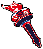
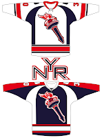
No, I'm speaking of the New York Rangers. And one reader has submitted some rather unconventional designs.
Doesn't really scream New York Rangers to me, but I see where he was going.
Another red, white and blue team is the Washington Capitals but that's a recent development after they spent more than a decade in navy and bronze (which I always loved, by the way).
That's a rather simple design and, if I do say so, not entirely worthy of this club. I've also been sent a peculiar design for a blue third jersey.
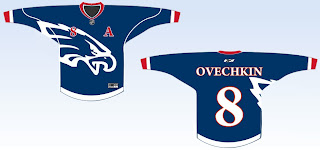
I'm not sure where they eagle came from, but it just feels unoriginal. It's a simple design but not in the good way.
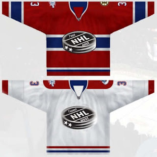
And finally, I hate to leave out our Canadian friends, so with the next all-star weekend being held in Montreal, enjoy this set of concept jerseys for the big game.
American folk: Enjoy the fireworks tonight. Try not to blow off any appendages and we'll consider it a success. Canadian folk: Carry on as usual with your Friday night.


Reader Comments (13)
the eagle on the Ovechkin jersey is the Philadelphie Eagles logo. lol
Exactly what I was thinking ringthealarm408. You had to beat me to it :].
Aside from the first Capitals set, this looks like a Freak Out Friday post!
ya none of these are that amazing+
i appreciate your work, love your site. BUT you've got to have enough traffic to get a proper domain and web design by now?
i appreciate your work, love your site. BUT you've got to have enough traffic to get a proper domain and web design by now?
Yeah, I'm not really sure what you mean by that. I've never had any intention of spending money on this blog. If someone would like to donate a domain, that's one thing, but I see no real need for it. And what's wrong with the site design? I like simplicity.
I welcome any suggestions.
I think this is an improvement. The black bg was kinda tough on the eyes.
Chris what's your opinion on the Extreme Makeover: Lightning Edition? Sharks took all the old, and gave them a bunch of new.
And happy 4th of july everfybody
I don't get why you post material you don't even like, especially when you're only like 5 posts into your new blog.
I mean, filler already?
Chris what's your opinion on the Extreme Makeover: Lightning Edition? Sharks took all the old, and gave them a bunch of new.
I'm a little concerned about the lack of experience on the blue line now. Boyle was one of my favorite players. Richards was my favorite. This isn't really looking like my team anymore and that worries me.
That being said, as I look down the roster it's hard to complain with names like Lecavalier, St. Louis, Stamkos, Craig, Halpern, Malone, Prospal, Roberts, Vrbata, Carle, Kuba, Ranger, Kolzig and Smith. So we'll see how things go. I'm staying optimistic.
I don't get why you post material you don't even like, especially when you're only like 5 posts into your new blog.
I mean, filler already?
First, just because I don't like something doesn't mean no one else will. (The Blackhawks are a perfect example of that.)
Second, I've said this before. It's merely an extension of the old blog so I can only post what's been submitted to me. The other option is to post nothing at all.
And lastly, I wanted this post to fit a certain theme and sometimes that limits me. I guess it's easy to be critical when you're not the one writing the blog.
Thanks for the comments, all!
I was just a bit disappointed, pal. You do an unbelievable job with this blog. Gotta love the themes.
and anyways, what is up with your team?! The Lightning are just STACKED! It all looks great on paper but can it hold up on the ice?
Chris, what's wrong with the design of those Caps jerseys? They actually look like hockey jerseys with the horizontal stripes, unlike most of the RBK Edge crap most teams are trotting out these days. The only way to improve on those jerseys is to remove the wordmark the Caps use for a logo and replace it with their current secondary logo.
I absolutely love the All Star designs. As it is in Montreal, and they are having their 100th anniversary, the league would do well to honour them in the jerseys. Of course, it is the NHL so we may have another year of teal and purple or collared crap or who knows what ...
TX_Flame - Caps fans love the word mark. The shoulder patch is a shoulder patch. It won't work for a primary.
The white Caps jersey looks good - I'd buy it.
The red one would be FANTASTIC if it had a white shoulder bar instead of the blue - if only to harken back to days of yore.