Reworking NHL Uniforms II
 14 Comments
  Thursday · Jul 3 · 2008 | 1:41 PM PDT
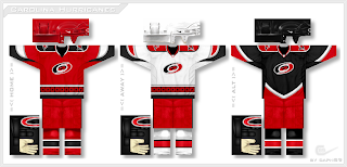
 I'm sure many of your remember a new series we started last week from an artist under the moniker capn89. He's been redesigning the uniforms of each team league-wide, doing so without drastic changes to the colors or logos. It's been amazing work and while he began the series in alphabetical order, we're going to step out of that pattern for today's post.
We're starting with the Hurricanes.
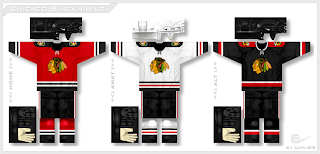
Again, he's only making slight adjustments, mainly to the striping and design patterns on the sweaters, but in some cases that can make all the difference. Next up, my personal favorite as you well know, the Blackhawks.
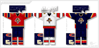
It's amazing how the addition of a shoulder yoke suddenly changes my mind completely about these uniforms. For some reason it even makes the logo look better! I might be going crazy though. Finally, we have the Panthers.
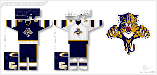
And just for good measure, he wanted to see what the Cats would look like without the red.
I'll keep these posts coming as long as he continues to submit his artwork. I expect to have a post tomorrow but with it being the 4th of July, I may be out so don't hold me to that.
 blackhawks,
  concepts,
  fan art,
  hurricanes,
  jerseys,
  panthers


Reader Comments (14)
this guy has some really good ideas. some of them are kinda "out there", like the incomplete stripes, but hey, it doesn't take away from the idea.
i REALLY like the blackhawks ones, but i can't imagine them changing that classic design...though i'd take any one of those as a third jersey.
and you know sabres fans would lose it if there was ANOTHER blue and gold team, lol
but i'd like to see some of these designs mocked up on a player. anybody good with photoshop who has some free time should give it a try. sometimes designs look great on paper, crappy on ice (SEE: Sabres current, Penguins edge jersey, Oilers edge jersey, North Stars 80s double-stripe jersey)
Way to ruin Chicago's uniforms....other than that everything is SPECTACULAR.
WOW i love the panthers without the red,
I really like the Panthers with out any red. I am not sure why so many teams must be red, red is a color that works for some teams but the Panthers Red, White and Yellow never did it for me from day one. Good job artist!
The black shoulder yoke on the blackhawks home redesign makes it look a little too much like NJD's home sweaters..
panthers need to do something about their colour scheme... goalies have had trouble matching their pads/mask ... the home jerseys look red and navy, but the away jerseys look red and white... theres really no other choice than white with hints of colour (like vokoun)
It's absolutely incredible how much a difference such a small addition such as the shoulder trim can make. I like the Hurricanes jerseys, but I might be biased since I just love the red/black combo. The Panthers jerseys look too similar to what they wore before they went to the RBK Edge system, but they still look pretty good.
But the Blackhawks jerseys are absolutely stunning. Unfortunately a change isn't likely because they're an original six team and we haven't seen any real changes in any of their jerseys for some time, but adding that trim makes the jersey stand out, especially that home jersey. Again, the red/black combo. I've never been wild about the black Blawkhawks jersey (ironic, I know), but the red trim makes it look incredible.
This is one of the saddest days of my life. Naslund a Ranger? That's disgusting. And considering the amount of Nucks fans that look at this site I'm surprised these comments haven't been flooded with Naslund comments.
On Topic:
I think the Panthers should drop the red from their colour scheme and always have. The Blackhawks jerseys are good but it's a step backwards from what they have right now. And the Hurricane is pretty meh. Felt like I've seen it a hundred times now. Not the alternate though, the alternate jersey is pretty cool.
Hey, I like the new site, but it should definitely include the banners of the old NHL ToL site. When a team builts a new arena, it always transfers the banners to the new one, right?
can't say I don't like the panther's unis without the red... but I gotta agree with hockey week... I don't think another blue and gold team will work... just like black and red are getting overused.
Wow, like Florida without the Red. Good job.
Someone please tell the Panthers to look that this great design immediately, if not sooner. The red on their jerseys was always one color too many. Well done!
i like the jerseys, but they don't really line up very well with the styling of the edge jerseys. does anyone else feel this way?
so while i do really like the concept work, i have a hard time imagining them as something an nhl team would eventually go to.
...just my two cents. keep it up!
As a Blackhawks fan I was leary about even looking at these once I saw a newer pic posted with an updated Chief Blackhawk. Now that looked ridiculous.
But the revamped unis looked really cool. I am not sold on the black third with the red shoulder boards, but the home and road jerseys look great. I like the changes to the socks too. My favorite would have to be the White set up, it breaks things up a bit and adds some flair. The last major uni change was back in the forties and I always wanted to see something that could pay homage to some of those different looks.