Sens, Wild Sweater Art
 29 Comments
  Wednesday · Jul 9 · 2008 | 2:08 PM PDT
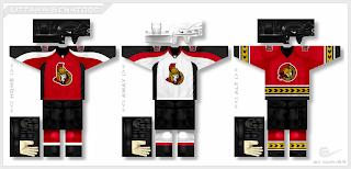
 Remember that video I posted over the weekend teasing the new Senators jersey designs from capn89? — a guy named Paul, actually. Anyway, the final designs are done and ready for posting.
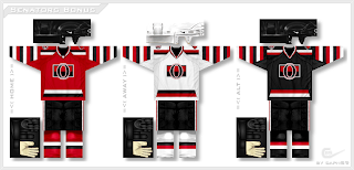
You can't deny the awesomeness of those. I personally love the third jersey. There's even a set of three with lots of crazy stripes.
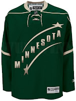
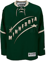
I have some more stuff you need to think back for. About a month ago I posted a bit about what the new Wild third jersey might look like. A reader submitted a few designs based off of what was seen at the event.
And just for good measure, there's even this one.
Short post today, I know, but you've got wallpapers too. Maple Leafs fans, I've got some great stuff for you tomorrow. And don't forget, this Friday brings another edition of the Freak Out series — not to mention the new iPhone 3G. I think it's about time for me to upgrade my $15 cell phone. Don't be surprised if you don't hear from me over the weekend. It'll be because I'll have a new toy.


Reader Comments (29)
Nice stuff! They're very green, but I like the Wild concepts, especially the one on the left.
WOW the first sens set is amazing, Can someone paint it on a player?
Those Sens jerseys are awesome. The Minnesota ones are cool but they're too green.
i would love to see the sens play in the oldschool rugby-style striped sweaters from 1919. they have an appeal that is very much like the habs' red sweaters - they simply look **different** from every other sweater on the market.
That first sens set would be epic with the third jersey in Black.
I can and will deny the awesomeness of those Senators jerseys. Better than the current stuff, though.
The Sens jersey's rock and I'm a Flames fan. Don't really care for the Wild ones. They need to stay away from the stars concept. Dallas owns that now. They need to stick with the wild animals
I'm a fan of the first third jersey. That should be their primary jersey in my opinion.
I like the idea of the second set as the third jersey.
lol i like how the gloves and helmets are always square ... those are sweet sens jerseys tho and i hate the sens ... the wild one with the stars reminds me too much of the stars..
Nice Wild jerseys, but lose the shooting stars. Or at least pick above or below, but not both.
love the away jersey!
thats what the 3rd jersy should look like
booyah to the sens kits, in general - and thats from a leaf fan.
too many stripes.. TOO MANY STRIPES!!!
i once heard a senators fan say of jersey ideas: "if it doesn't have the barber pole stripes, it sucks."
this is one of the better executions of it i've seen. I like that black 3rd a lot.
the Minnesota on the left is very nice, idk why, but i don't like the right as much. i think the two stars are very necessary, too, you can always say they're for the twin cities of minneapolis and st paul, but idk if you thought of that. Try adding some red, on the arms, where the green is on their current reds. you might get a better jersey out of it.
by the way, what templates are you using for these? are there links to blank ones? if not, there should be.
I was looking at them again...and the second set is really nice. The barber poles give it a nice unique flavour.
No matter what, I think the Sens jersey SHOULD have either the barber pole stripes or the gold laurel stripes.
In fact, the third jersey of the first set is pretty much perfect, If I was Melnyk, I would use that design in a minute. The third jersey in the second set would be my pick for their alternate.
We need to see the back of the Sens socks to make sure there are no lines down the calf.
At the risk of sounding like Randy Jackson, I wasn't feeling those Sens jerseys. The alternate was nice but the home and away were just kind of plain. And the vintage jerseys were just ugly in my opinion. Nothing seemed right about it.
I just skimmed through the pictures and I thought that Minnesota concept was for the Stars. Either way it's a simple design that's not hard on the eyes and looks sorta cool.
I want to see a wild rebrand! haha im sick of christmas every game
The Sens jersey with the yellow is absolutely superb, i've always loved that style.
Count me as a fan of the 1st set of Sens jerseys! Awesome. I'd wear one of either of the 3 and I'm a die-hard Caps fan.
so i guess revamping the NHL jerseys in alphabetically order went out the window. will there be videos every time Paul gives you his latest work?
btw, the home/away jerseys in the first set are missing some gold.
As a Sens fan I hate the current jersey's. There was a set similar to the third in the first set with the gold laurels on this site as a concept before they were launched and I figured that the jersey would be that. Those jersey's with the gold are much to good not to be the Sens jersey. The old school O logo is a great third. The should patches should be the O on one shoulder and the Peace tower and maple leaf on the other. Great job on the concepts!
I love both concepts for the Sens jerseys. Too bad they won't go with either style. I really like the red alternate and the striped versions.
I like the green for the Wild, but don't like the shooting stars on the jerseys. I do like the green for them, that looks good.
I don't like any of those Sens jerseys, especially not the first set, and I've always hated that gold stripe with the black pattern. Yuck.
And I like the idea for the Minnesota ones, just needs to brighten up a bit.
Eastern Washington University's team wears barber pole stripes.
check out the pics
http://www.ewuhockey.net/team/pictures/nationals_06-07/pictures02.htm
pretty sweet
Since those Minn. mockups are based on the candidates for the 3rds next year, I really hope they abandon the stars idea. Minnesota Wild Stars??? Doesn't quite work. But the general use of green is nice.
First Sens set is nice too. I don't think the gold is necessary though.
The Wild had their chance to keep the Stars in the early 90's and lost.
They're not the stars anymore and they need to realize this.
complaining about Norm Green on the internet isn't going to pick up the stars franchise from Dallas and plant it back in Minnesota.
the sooner they stick with their "wild" name the better.
Ok... My idea of a sens 3rd jersey... I'm a horrible artist so i cant make it but heres what i think it should look like: barber pole stripes exactly like in the 1910's (or whatever) BUT with the gold trim with the triangles (like the trim on the 3rd jersey of set 1 by "Paul") and as a logo... A Gold "O" in the middle... maybe with the "triangles" in it... I'd have to see... If anyone likes the ideas then go ahead and make it... I give you full permission...if not then oh well.
Only bad part on there was the alternate jersey in the first set because that new 2D logo is horrendous. But the other five for the Sens were all sharp jerseys. I like Paul's work.