Overnight Art: California Style
 14 Comments
  Thursday · Aug 7 · 2008 | 9:46 PM PDT
 It's late and I feel like you guys got shortchanged today with only an IHA Poll being posted. So I'm sitting here and I feel like writing up a pretty big concept art post — all about California. We'll start in Anaheim.
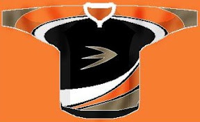
Here's an unusual idea for the Ducks — get rid of everything in the logo except for what's inside the D.
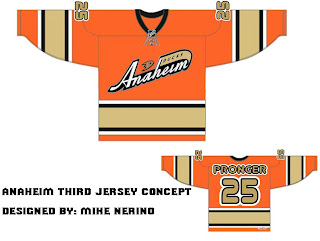
Or, to be more conservative, I've got an orange third jersey that's pretty sharp.
And an orange third jersey based on a purple one from the old days.
We could just go an entirely new route and find ourselves with a unique, new logo.
But maybe we'd better not. Continuing our California trip, let's head to L.A.
Same logo, two drastically different uniform designs. This next one loses the color altogether with a callback to the Kings' Gretzky days.
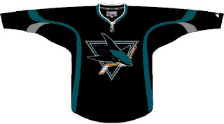
Now we head north to San Jose where we start with a new logo for the Sharks.
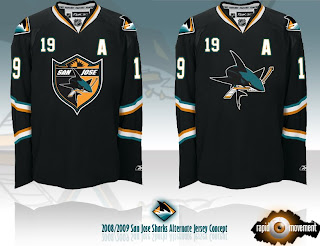
Notice the complete lack of orange. I always thought it was a nice accent. But that's why we have the one on the right. Though comparatively, those sweaters are a bit boring.
One designer suggested the team keep the shark of their current logo with the triangle of the old days.
And this last one was forwarded to me, I believe, from a message board somewhere. If anyone's got the link, I'd be happy to add it. (Update: See the original post at HFBoards.com.)
I like both but the shield logo is my personal favorite.
Happy now? Go get some sleep. (And if it's morning where you are when you're reading this, have a nice day.)


Reader Comments (14)
That third LA jersey is niiiice.
Despite being an East Coaster (yeah, it's almost 2 a.m.), I appreciate the work done here. I like the Gretzy-era colors LA jersey and the logo on the first Sharks jersey.
I'm not sure what I think of the grey pants for the Kings. That's an interesting way to break up the black over-load that those uniforms had.
The kings jersey of the kelly hrudey days is awesome! The sharks couldnt go wrong with either of those jerseys on. personally i prefer the one on the left but it does need a little something to fill the bottom half of the jersey
Chris,
I originally saw, the last Sharks jersey post of this blog, on Chris Cremer's Sports Logos Community located in this discussion topic on page 12 (you might need to scroll down a bit):
http://boards.sportslogos.net/index.php?showtopic=59903&st=220
In addition, I've seen other posts that have shown new text and secondary logos for the third jerseys for Phoenix and Boston, on page 13 and 19:
http://boards.sportslogos.net/index.php?showtopic=59903&st=360
http://boards.sportslogos.net/index.php?showtopic=59903&st=240
The story goes that one user has the new logo sheet from the NHL with all the new changes (its the first post in this topic).
** Note: If you don't have a CCSLC account, the links will not work.
The kings should probably just adopt that grey and black jersey. It's phenomenal. The away jersey could be the old white jersey from the 90s.
I hate the new Kings logo no matter what jersey its on. It looks fragile, like the players that wear them. The Gretzky days had the better logo and jersey design for the Kings. Every time I see it, I realize how nice it is. They should just make a slightly updated version of that logo with the black colors. I don't mind the purple now but its not as solid.
The Sharks alternates are awesome! I love the shield logo, the bottom shape of it matches well with the collar.
I have a feeling that Anaheim is just doomed to have terrible logos and jerseys for the rest of time. Honestly the best logo they've ever had was the duck-shaped goalie mask with the crossed hockey sticks. I'm not sure why they abandoned that.
& I think when it comes to Kings jerseys, the more purple, the better!
Guess Chris doesn't have a CCSLC account.
Resist, post direct links to the images, that should get around any accounts necessary.
in case you don't know what i'm talking about:
right click on the image, click properties. copy the URL and paste it here.
we should be able to then click and see just those images, because i know i want to see them
Emo: They can't use it anymore because the logo is owned by Disney and Disney sold the Ducks. The logo is from the movie Mighty Ducks.
Now when you think about... It was a great logo. They really need a new one, but how can you make a cool logo from a duck, again?
The Kings' black jerseys here look pretty good, and this is coming from a person who is dying to see a purple primary jersey.
Although with all the trade rumors in the Ottawa Sun, any Kings jersey with "KOPITAR 11" on it is a great look to me.
i LOVE that phoenix secondary logo! i hope they use that on this 3rd jersey.
it's simple, it's realistic without being complicated, it represents the name of the team incredibly well, and has a vintage feel to it without feeling old. great logo!
for reference:
http://i158.photobucket.com/albums/t113/AsM2931/Picture4-13.png
Chris, i think you're going to need to do a post on these, i hope you're reading these comments. Thanks Resist the Machine.
I really think the best bet for the Ducks would be just using the D as a primary. It's not ideal, but it's still TONS nicer than the wordmark.