Sun's Silly Sens Sweater Surmising
 8 Comments
  Saturday · Sep 13 · 2008 | 8:22 PM PDT
  All right, rarely will you catch me taking a newspaper to task but a recent story appearing on the Ottawa Sun's web site is laughable! I think it's fair to say that I've probably been paying almost as much attention to the new third jersey releases as the NHL marketing gurus actually doing the job. So try to understand my position as I write this.
The following make up the first four paragraphs of the article in question, written by Chris Stevenson.
The Senators will have another new look on the ice this season.
After a year's absence, most of the teams in the NHL, including the Senators, are expected to unveil another third jersey to complement their home and away duds this season (never mind that for many of the clubs these new jerseys will actually be their seventh or eighth versions over the last few years).
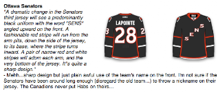
According to an image obtained by Sun Media and believed to be approved by the NHL, the Senators' third jersey could look something like this: Black with red and white trim and the word "Sens" climbing up from the right to left on the chest.
"I've seen a sheet that had the third jerseys on it and it was stamped 'NHL Approved,' " said a source. "That's the Senators jersey I saw."
The "image obtained by Sun Media" is this.
It was created by JerseyDatabase.com as part of a series of concepts based off of a report by Howard Berger back in July. I wrote about the concepts last month. See the next image, a screen grab from the original JerseyDatabase.com blog post.
Then a "source," which is a roundabout way of saying "anonymous poster on a message board," is quoted as saying he's/she's seen it on a sheet stamped "NHL Approved." Ok, my sides are sore from all this laughing.
Since when do legitimate news-gathering organizations quote blind sources on something this ineffectual? That's usually left to the likes of blogs — like Icethetics. I quote blind sources like it's my job, here.
By the way, I'd love to see this "approval" stamp and witness this 1950s bureaucratic process in action.
Anyway, sorry if my reaction came off as a little over-the-top, but I got a few emails linking to this story and I just wanted to offer my take on it. I'm all for "leaks" and such but let's call a spade a spade. This is just funny.
While the image above may be a close representation of what actually is the Ottawa Senators' new third jersey, this article doesn't have me convinced. What do you guys think? (Keep it clean, please.)


Reader Comments (8)
It's all funny business, because hockey news has been pretty dry of late. Yawn!
Next!
The Ottawa Sun is a pretty trashy rag of a newspaper. I wouldn't put it by them to write a news story coming off information they found on a napkin thrown into the trashbin outside a Tim Horton's.
That said, Ottawa's supposed third jersey design is so offensively bad that poor sales will have to put an end to it. The entire centurian theme needs to go. It's embarrassing to have that 3D face on uniforms (of poor design as well). It's even worse on the farm club. Take a look at their red uniforms.
Now, that third jersey petition that's floating around, that thing is high quality. I think many Senators fans would rather take the O design and make a full uniform set out of it. I would, and I've been a Senators fan since day one.
That fan jersey concept was sweet- only one issue with it,the stripes didn't go all the way around. They can do that, look at the Habs.
If I was in charge of the Sens, something like that would be their primary uniform.
if that is really the layout of the sens new thirds, looks like the 'c' and 'a' are going to be on the right...like detroit.
oh, did i mention that this design is pure crap? in fact, most of the 'leaks' have been a disappointment.
The Ottawa Sun is the same newspaper that falsely reported the Kings were interested in trading Anze Kopitar to the Blackhawks, a rumor that GM Dean Lombardi vehemently denied every time he was asked about it, including last Saturday's "Breakfast with the GM".
So that makes it hard for me to believe any hockey news somebody "sources" in that newspaper. The only credibility to this report is that all the reports have said that this is the design they'll have.
That might be one of the worst jerseys ever.
SNES?
Super Nintendo Entertainment System?
If it will in fact have "Sens" written diagonally upwards, I'd expect it to look more like "East" & "West" were on last years All-Star unis, not reverse Rangers style.
Two comments:
1) I'd like to point out the verbal description was 50% wrong about the Hurricanes jersey: there are no stars or white stripe at the bottom.
2) I looked at the Ottawa petition and I didn't sign it. It would be one of the most boring jersey-logo combos in the league. IMO.