Overnight Art: California Style
 14 Comments
  Thursday · Aug 7 · 2008 | 9:46 PM PDT
 It's late and I feel like you guys got shortchanged today with only an IHA Poll being posted. So I'm sitting here and I feel like writing up a pretty big concept art post — all about California. We'll start in Anaheim.
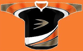
Here's an unusual idea for the Ducks — get rid of everything in the logo except for what's inside the D.
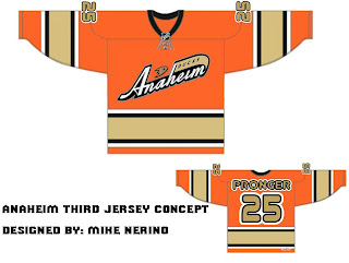
Or, to be more conservative, I've got an orange third jersey that's pretty sharp.
And an orange third jersey based on a purple one from the old days.
We could just go an entirely new route and find ourselves with a unique, new logo.
But maybe we'd better not. Continuing our California trip, let's head to L.A.
Same logo, two drastically different uniform designs. This next one loses the color altogether with a callback to the Kings' Gretzky days.
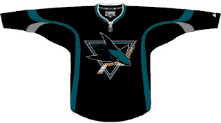
Now we head north to San Jose where we start with a new logo for the Sharks.
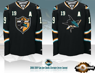
Notice the complete lack of orange. I always thought it was a nice accent. But that's why we have the one on the right. Though comparatively, those sweaters are a bit boring.
One designer suggested the team keep the shark of their current logo with the triangle of the old days.
And this last one was forwarded to me, I believe, from a message board somewhere. If anyone's got the link, I'd be happy to add it. (Update: See the original post at HFBoards.com.)
I like both but the shield logo is my personal favorite.
Happy now? Go get some sleep. (And if it's morning where you are when you're reading this, have a nice day.)


