Flyers Unveil Third Jersey!
 Tuesday · Nov 18 · 2008 | 5:26 PM PST Comments Off
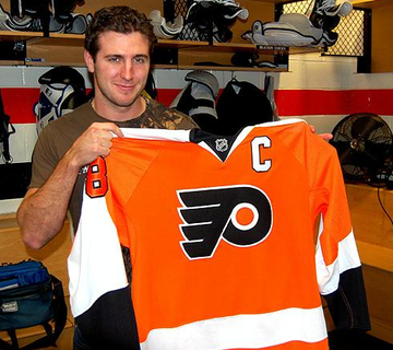
  The Philadelphia Flyers became the 12th team to unveil their new third jersey for the 2008-09 season. They did so before season ticket holders tonight in Philadelphia — and then later on their web site.
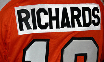
The unveiling confirms Icethetics' previous leaks. The Flyers will go with an orange retro-style alternate sweater with a special white nameplate on the back. Even the striping pattern of the sweater is modeled after the classic '70s uniforms.
Along with the above picture, the Flyers posted a special tribute video on their web site. The throwback jerseys have caused nostalgia to run rampant! And I don't know any fan that isn't loving it.
Great video even if you're not a Flyers fan.
And another great third jersey to look forward to.
 Chris
Chris
The Flyers have added some photographs from the event they held tonight for season ticket holders where they unveiled the new sweater.
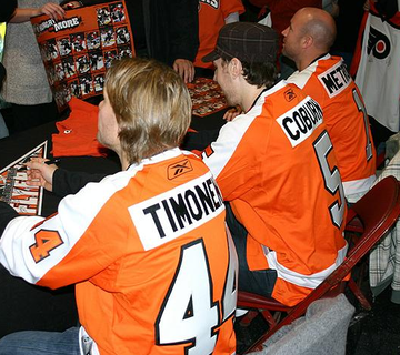
There you can see captain Mike Richards proudly posing with his new orange sweater. And here we have Kimmo Timonen, Braydon Coburn and Glen Metropolit signing autographs.
Other pictures in the gallery show Marty Biron, Antero Niittymaki, Luca Sbisa, Ossi Vaananen and Jeff Carter were also meeting with fans. These pictures will all be added to the Flyers gallery at Third Jersey Central.


Reader Comments (41)
Absolutely perfect. The Flyers now own the best jersey's in the league.
PERFECT!!!! I CANT WAIT TO GET MY MIKE RICHARDS THIRD JERSEY
Well, when all is said...it's just the time to applause the Flyers to bring back their best jersey in franchise history. Nothing beat the orange in the flyers history. I'm still wondering why they ever change orange to black. Lindros era? In my book, the flyers are orange, and it will always be that way.
Can't believe I missed the meet tonight. Wow! I'm lovin' those jerseys. Would've liked to seen them tonight, but oh well. Great video by the way and congratulations on the NHL article Chris. Things are looking up.
Maybe the best third jersey so far,
I love the Flyers
I love that jersey
I have tears of joy
Absolutely love them!
Totally agree with all above, especially Sephiroth. Too many teams use black. Orange is very distinctive and it works well, even if I hate the flyers.
Great video.
It's official. The throwback jerseys are so much better than any "new" designs. And the Blood Orange Flyers jerseys are the best I've seen. I can't wait to see them live.
Perfect. Now make them the regular home jerseys and ditch the black.
Love the white name band
I'm a die hard Pens fan since 1980 and I love the fact that the Flyers went back to an orange jersey(now hopefully they get rid of the black jersey and go with the orange one full time). I grew up with a love to hate the flyers attitude and this brings it all back. Congrats Flyers fans
wait a minute now....i dont know if you can say BEST jersey...cause lets face it, the sabres already own that crown for new 3rds....
none the less, it is a great jersey..and i think should be their home sweater soon...ive always connected the flyers with orange..
Went to the reveal tonight. It was bad ass, got autographs from Luca Sbisa and Danny Briere, the new threads are beautiful. It's great to be back in Orange. Brighter than i thought it'd be but I still love the Orange! I say make it full time! I sent pics to you Chris, check em out. GO FLYERS!
You guys! Just wanted to remind you where this site got its roots.
nhllogos.blogspot.com
freaking awesome! cant wait til they bust these babies out for the first time and i cant wait to order mine tomorrowwwwwwww!!!!!!!!!!!!!!!!! best third jersey in the league along with the oilers. cant go wrong with vintage....especially when theyve hoisted the hardware with them =D
I love it!! The white name plate is awesome! This has to be in the Top 3 best third Jerseys for me.
i am no where close to a flyers fan but these are nice...i really like the different color nameplate....it just pops...
does anybody know the name of the song playing?
Why, why, WHY DID WE NOT DO THIS SOONER?
I do not understand in the slightest why the Flyers went back to black when they released the redesigned jerseys last year. I mean, look at that video. Orange is such a part of our history, and I am so glad it's back (even in a 3rd capacity).
Please let them ditch the horrid black trend and go with this as their primary. It's retro done sexily right.
10/10 A++ Would buy again
Just. Plain. Gorgeous. I love them.
I'm going to the 1st game that they will wear them on the day after thanksgiving and I'm going real early to get one customized at the fan shop to have it to wear to the game.
Can't wait.
my top 5 fav 3rd jerseys:
1. Philly
2. Edmonton
3. Buffalo
4. Vancouver
5. Pittsburgh
id have to say the top 5 are:
1. Buffalo
2. Edmonton/Philly
3. Vancouver
4. Islanders
5. Penguins
I don't like the white name plate but other than that it's great. I'm a bit confused about the numbering on the sleeves, though. The previously leaked images looked like the numbers overlapped from the white onto the orange. Richards' jersey looks to be that way, but all the others aren't. I hope they're all un-Richardsian and his is just a prototype or something. The overlapping is sloppy looking on an otherwise great jersey.
Gizmo,
The song is called Excalibur. Search for it on YouTube.
http://www.youtube.com/watch?v=6YXdoWVbB2w
Agree with everyone here. These are beautiful; they should always have been the standard jerseys. That someone thought those ugly black monstrosities were a good idea simply defies explanation.
The Flyers have the best third! Hands down, I have to say I've always identified the Flyers with that jersey. Much like the Whalers did with the green.
In response to some earlier comments, I have to admit I don't fancy the Canucks "new" third. It's the same as there last third, with exception to the Jonny Canuck logo. It is also far to similar to there current home jerseys. I will give the Canucks points for losing the horrid Vancouver text over the logo. Also, I've found the comments about "all these teams wearing black" a little odd. Currently, let's exclude the thirds from this, only 7 teams use black as there primary jersey color at home. With thirds in question, that brings it to 11 teams. And remember, the Kings and Bruins are already in black. I personally find that red is sometimes overdone, seeing as 9 teams use it as there home primary color full time.
I'd like to see more teams employ unique colors such as the Thrashers home unis, the Flyers orange or the Coyotes brick. However, at times, this can be a dull sport for such originality
Best third jersey, PERIOD!! Can we retire the two rags we got last season now?
@GIZMO122 - Song is Carmina Burana by Carl Orff
AWESOME!!!!!!!!
I don't hate the black jerseys as much as everyone else, but I will say that I absolutely love the return to orange. This is infinitely better than the crazy alternate with the silver-ish logo released a few years before the lockout....that thing was hideous! I hope they either use the orange as the standard home jersey and keep the black on as an alternate, or at least use the orange jersey in 15 or 20 home games next season.
Great looking jersey! I love when teams go retro EXCEPT the Islanders, I like their current jersey much better than their retro.
As a true-blue hockey fan, I have been waiting for the Flyers to bring these beauties back for years! The black Flying P looks so natural on an orange background. This is the kind of sweater that makes the Flyers look like an Original Six team. My sincere congratulations to all true-blue and die-hard Flyers fans!
Scarecrow, as a Canucks fan, let me explain the Canucks' thirds. What the Canucks have is a modified version of their vintage uniform. The Stick 'n Rink is more bold, shows the C better, and the blue and white aren't inverted, which makes the crest stand out a lot more. Also, the white stripes are thicker with blue spacing between the green and white. I understand what you're saying about wearing something too similiar to the current home sweaters, but this was SUPPOSED to be the Canucks full-time look last year. However, due to earlier licensing issues over the Johnny Canuck trademark, the team decided to evolutionize their Orca uniforms by merging the Orca logo with the actual vintage design. The "Vancouver" wordmark was added to "tone down" the Orca. If the Canucks were able to get the Johnny Canuck trademark in time before last season, what the Canucks have as a third would be their full-time look and then Johnny Canuck, either the V version or the full-body version would be on a green sweater.
Those are beautiful! Whoever hated the white nameplate: It really doesn't matter, it's just at the back of the jersey, and in my eyes it doesn't seem to affect the jersey much. I hate Philly with a vengeance as a Canucks fan, but I think that their fans are really lucky to get these back. This jersey definately "stands out", unlike some other thirds we've seen...
cough black cough
Didn't they just have orange jerseys like 3 years ago...? It's old, it's been done before... It's boring... And the white name plates really are awful...
They did have orange jerseys pre-RBK...but they were absolutely hideous. I think these jerseys are great...absolutely great...and the white nameplate gives even more throwbackiness than an orange nameplate with white letters would...and who cares if you don't like them if your not a Flyers fan...go gripe about your teams 3rd jersey, not that there are any better ones than this one.
its a little bright but i like it the black should be our third not orange look at the fans before this jersey hits stores you got to a game and though alot of people didnt like the other orange jersey from a few years ago most people bought those because orange is the flyers not black were the orange and the black not the other way around
While I applaud the return to orange -- I thought the black was ugly when it first arrived, and still do -- please don't think the nameplate style is something new. Most of you are too young to remember this -- but the nameplate style dates from the early 1970s when the NHL was on NBC, and no one in the NHL except the Rangers had names on their sweaters. NBC wanted names so new fans could identify the players, and while other teams (Bruins, Blackhawks, Red Wings, etc.) that appeared on NBC sprang for different name plates on home and away jerseys, the Flyers were too cheap to do so, and created just the one on both white and orange sweaters. In 1973, it looked like a bunch of guys in a beer league. Today, it looks "retro." If you say so ... some of us remember the originals.
rich, it's better than the black garbage they have as a home jersey right now. I think their black jerseys prove that orange should stay in the Flyers identity and fans of this jersey are only too happy to get it back. Besides, the white nameplates could be changed a few years down the road....
Alex, why do you hate punctuation?
that's a hockey jersey.