New Sens, Kings, Sharks Third Leaks!
 Tuesday · Nov 18 · 2008 | 10:41 PM PST Comments Off
 The leaks just keep coming. The big news tonight is that I can now provide you guys with pictures of the actual jerseys that were leaked during Icethetics Live Chats over the past several days. And I know you're excited about that.
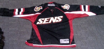
We'll start with the Ottawa Senators. A new photo I have of a replica more clearly depicts the text on the front as well as the striping on the sleeves. You can also make out the tie-up collar.
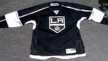
Next, the Los Angeles Kings, whose leak was the most difficult to discern details from. This photo clearly shows the prominence of silver in the sweater design, especially the new logo.
It's obvious the Kings had their Gretzky (and for that matter Melrose) days in mind when when putting this one together.
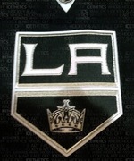 In the image to the right you get a close-up of the new crest. Silver is all over it, trimming the banner as well as the LA. You can even find some in the crown.
Surprisingly, the silver really helps to keep this jersey from looking boring. I think it would've looked very flat just in white. Wait until you see the Kings on the ice with all the bright arena lights reflecting off the silver. They're going to look good.
If you can't make it out well in the picture above, there's silver piping running the length of the sleeve from the collar to the wrist. It's broken up however by a broad white stripe that wraps around the elbow. That stripe is trimmed in silver. And the thin stripe at the base of the jersey appears to be silver as well.
Overall, I think the Kings really got one right. It looks nothing like what they're wearing now, but it totally looks like the L.A. Kings.
Finally, let's have a look at the San Jose Sharks.
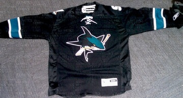
It's a little plain if you ask me. But that's no different from their previous black third jersey. I will say that I'm a huge fan of the full-body shark on the front. That's what needs to be on the regular jerseys. In this picture you can see the teal, white-trimmed stripes around the elbows and the lack of striping at the base.
Another thing to note is the absence of vertical piping that some of us thought we saw. Can't say for sure it's not on the back since we can't see it, but I highly doubt they'd do it on the back and not the front. Symmetry seems to be a common theme on these new sweaters.
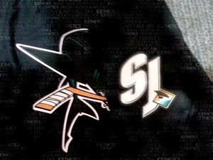
The last thing I want to show you is the shoulder patch of this Sharks jersey. There was some question as to whether the SJ-fin logo was in black and white or color. Now it appears we have our definitive answer.
The SJ is in white and the fin is in color. Glad to see that logo make it onto the uniform. And in case you're confused by what you're seeing, the sleeve has been folded over the front of the jersey in this picture which is why you see the full shark logo.
I'll have the unwatermarked images in the Third Jersey Central galleries at some point in the next few days. And don't bother asking where these pictures came from. You know I'm not going to say. But when have I ever failed you?
So that's it. You've seen them all; pictures of all 18 NHL third jerseys. I'm glad to have been of service to you guys all this time — scratching that jersey itch. And I plan to continue doing so. I'll have complete coverage of each official unveiling through the Bruins next week. Technically, we still have six teams to go.
By the way, I'm still waiting on confirmation that the Coyotes are doing their unveiling during their game on Saturday. Look for more information on that right here tomorrow morning.



Reader Comments (64)
I really am becoming a huge fan of this Kings jersey. And this is the exact reason why a picture is worth a thousand words, and why you can't go solely by the description. I'm actually looking forward to them wearing this.
Could anybody possibly work on that jersey and try to make it purple? Just for comparison.
i like the kings the best.
The Coyotes released a news story on their site saying:
Coyotes to rival 3rd jersey Nov 22; The reveal is scheduled to take place during the first intermission at approximately 5:30 p.m. MST
sens will look awesome on ice. as will kings. but the sharks is way to black.... and i like black.
Well, as a long-time Sens fan, I can only help but wonder what could have been. While not terrible, these new thirds are not great either, and definately not on my Christmas list this year. The whole text thing on the front is the identity of the New York Rangers not the Senators. Now, I'm no marketing major or anything, but I can honestly say that if the team were to unleash a vintage "barber pole" jersey with the classic "O" logo currently on the shoulders, they would sell like hot cakes. Heck, when I see people at the games wearing the actual wool sweater version, imagine how much more comfortable it would be to have it in the edge cut? Long story short, Sens belong in black NOT red, get a vintage jersey as their new 3rd (maybe in a few years?) and to the ones responsible for designing this new jersey, ask yourself this....."Would I actually want to wear that?"
great pics!! that really improves my opinions on the kings and senators. i was already sold on the sharks. glad i came to check for an update at 2am....
That new SJ Sharks Jersey is SOLD SOLD SOLD! Once I save up enough cash.
the sens are just extraordinarily busy. i thought the sabres had too much going on in the underarms, the sens have found a way to make it work. elements of it are good...the hemline, the sleeve stripes, the IDEA of underarms...but the execution has fallen very flat. The wordmark, as cool as it might look, is the dumbest idea in hockey jersey history. i hope, like the cooperalls and the crazy vertical striping that is slowly disappearing, this phenomina dies off.
Chris, i think i have to agree with you on this one, LA has created a great third jersey. Like St Louis and the Wild before them, they have created a vintage look. they have some modern pieces, like the sleeve piping (i like, but not love, it) and the pit-stain-patches (dumb, but tolerable), but it has some very conventional things (the stripes) and a different yet familiar logo. I suspected there'd be silver all along, and i'm glad they're using it. can't wait to see a clear image
sharks have an rbk yawner on their hands. I imagine that the jersey had hemline stripes on the bottom that matched the sleeve stripes, but like the amerks said, rbk talked them out of it. it's boring. the sleeves are conventional, the logos are good, and the rest...is blank. it's like turning in a 3 page paper when the assignment was 7-10.
overall, we got jerseys all over the spectrum: from great jerseys that make me wonder when the edge system will die so i can end my boycott to ones that make me lose faith in hockey.
great new jerseys: st. louis, buffalo, carolina, los angeles,
great throwbacks return: pittsburgh, edmonton, toronto, philadelphia, islanders,
good jerseys based on older ones: vancouver, chicago
disappointing incomplete jerseys: boston, san jose,
lacking jerseys that have some potential: phoenix, tampa bay, ottawa
jerseys not meant for hockey: dallas, atlanta,
the top is a lot heavier than the bottom, something i couldn't have said about the original RBK edge changover. bravo NHL, you're learning, and i like it.
I was kinda hoping for that subtle piping on the sharks' jersey. Seems to lack a little bit of color, in my opinion. Maybe a teal border on the bottom of the jerseys would've helped.
Anways, congrats on being mentioned on nhl.com, Chris!
http://www.nhl.com/ice/news.htm?id=393099
It's a huge testament to how great this website is.
Thanks!
Thanks, just about to sleep but looked on my RSS feeds and saw this.
Chris, I don't know how you do it, but keep on doing it! This view of the Kings jersey has got me sold. They're going to look killer when they hit the ice in these. The silver makes the whole thing come together, and yes, it's very LA without just being what they currently wear. Great point. I'm really glad this site exists to satiate my artistic and hockey itch at the same time.
Thanks so much Chris! All of your hard work was appreciated. From all of the leaks to all of the Live Chats, it was an incredible journey. I can't wait for the site to get even better and for all the other projects going on right now as well as the third jersey poll coming soon.
Can't wait to do it again next year. =D
Thanks again!
P.S. I think I ended up being the closest to San Jose's with my original submission! Ha ha.
Oh man, you never dissapoint.
Great job.
I think my Sens Concept was not to far off. i still dont see how the Picture of Alfey has the Sens main logo very far down on this sholder. I still think there is going to be a slight change to that unless it was put where the numbers are going to be just for that tease only? I honestly think the sharks will have the piping on the back i think dans was the closer one on that. but anyhow thanks for all this, and i cant wait for all the concept art to come back.
Out of the 3 posted, the Kings have the best jersey but even that is not saying much. Is anyone else tired of the color black as a third jersey?
Sens = Fail!
I see what the Kings were going for, but I don't think the execution looks right.
The Sharks look like they didn't even try.
0-3 on this round.
That Senators jersey is uuuuuuuuuuuuuuuuuuuglyyyyyyyyyyyyyyyyyy
Chris -- Thanks again for your hard work. Keep it up. I, too, like the Kings. Black and white (with silver) is effective and screams LA Kings. I think it will age well, and people will come to really like it. An effective jersey carries one color (in addition to white) like the Coyotes (many would disagree), Red Wings, Leafs, old Whalers comes to mind. Ideally, you'd go white on black, but the silver accents are perfect and hearken back to the old days as well. The one downside -- purple, a great, unique color -- is probably on the way out. I can live with this as a primary and the current road jersey (White with the purple) staying put to keep some of that nostalgia for the purple/ yellow gold days back.
The Sens, I'll be fair, to me, are a black team. They're just not a Red squad. Red looks great on them. I think it's a bit sad that they don't, like the green in Dallas and now the purple in LA, that they don't take advantage of that gold. Be bold. Be gold !
The Sharks -- always love their jerseys. They have a smart, smart design team. This one is OK. Maybe I'll draw the line on black with them. Teams should be DIFFERENT. Black works with the sharks; I get it. But...how about utilizing that burnt orange . (How about you, Ducks, doing the same????). Some teams are blessed with these great accent colors or stripes or whatnot, and they don't make full use of them. The Sens and B Hawks are perfect teams to do a little barber pole theme to give a nod to the old days. Couldn't experiment on a third? Ducks won't try an orange on a third? THe fans wave orange towels for crying out loud...isn't that part of their spirit?
Again, they should have just used the Gretzky jerseys. It wouldn't be so bad without the silver piping. Having that with elbow stripes breaking it up is really weird. I don't get the need for the white armpits either.
San Jose's is plain but not offensive at least.
Ottawa's is hard to judge laying on the floor since it's got some wacky striping to it. I need to see how it all sits on a player.
As I said yesterday, I'm a King's fan and the jersey is actually a little better than it may seem on first glance. Most noteably is the crest. The crest is a throw-back look, that shape is how the logo looked from 1967-82 on the original gold jerseys. The crown has been re-done inside to match the current crown. That's the salute to the very old jersey with a touch of the modern.
The black and white with silver trim of course harks back to our Gretzky days.
So they actually seemed to do a decent job of having the old elements back. That being said if if they just brought back the old 1990s black uniforms I'd be happy too...
I like the edgy (no pun intended) design of the Senators jersey, but I think the "Sens" stitched across the front doesn't work nearly as well as the Lightning's third jersey. I think that the King's jersey will look sharp on the ice and will definitely stand out when placed next to, not only other third jerseys, but the regular uniforms as well. The Sharks... Might as well not... eh, I could care less what the sharks are wearing.
WHY OTTAWA?!1!!??!??!?????!??!??!???? SO.... UGLY!
The flyers, kings, leafs, Canes, Oilers, Sabres, pens, and Blues hit home runs with their jerseys. The Sharks have an aggressive and very sharp looking jersey as well but could use striping around the waist. The sens missed the mark as did all the wordmark jerseys but the sens should've incorporated the Traditional striping and O logo. I will give their arm striping and piping credit though very sharp. The Blackhawks should have updated their barbershop striped jerseys from the 75th anniversary season. The Thrashers should have gone forwardw ithout all the contrasting white, four colours on a jersey allows for too much flash and the wordmark is just awful. Dallas dropped the ball as well. They should've wnet with a green jersey and the star logo. Moved their black jersey to 3rd status. I realy wish the Bruins would go with more colour for their third instead of the black. The Coyotes should avoid the Colour blocking and opt for stripes. Either way the NHL jerseys have become way too pricey to even consider buying anymore but you do get more jersey for your buck then the NBA and NFL.
I'm going to be sick. Sens isn't even a word. So disappointing.
The Senators are a mess, nothing can fix that abomination. The Kings need to decide if they want stripes up the arm or across the arm. Having both just does not work. Plus the white "Armpit stains" is just too much in my opinion. The Sharks just need minor adjusting, as for the most part, they got it right. I would put thin black striping between the teal and white arm stripes, then do the same around the waist. With no contasting colors around the waist and the same color pants and jersey, they can look a bit like pajamas.
Ottawa should've written "SINS" on their crest... because that's what their third jersey is...
The other two are boring... Maybe they'll look different in action and on a player, we'll see...
I like the full body shark though... but adding some horizontal stripes at the bottom of the jersey would've helped a lot in the Sharks case...
I am totally surprised in how good the Kings looks. and i knew the SENS would be ugy from the teaser, but this just proves how ugly it really will be.
Kings jersey looks good! Big fan, big fan of the jerz! I really like the outlines of the Ottawa jersey but not a big fan of the SENS on it. I would've love to see the 2D senator logo. San José's jerz is nice but never liked that second logo.
Ah man, Ottawa's marketing department needs to be fired. All of them! Just brutal!
A little disappointed they did not go with the teal piping on the Sharks jersey. I also think a couple of orange stripes on the arms would of given it a little more color as well. Overall, I love the full Shark on the front. You have to assume the numbers will be only teal and white as well. Considering how busy their regular white and teal jerseys are, this is the direct opposite of those. Looking to get one in my Christmas stocking this year. I hope to be able to number it with "09 Champions" once the season is over.
Yikes, that Senators jersey is disgusting. Instantly my least favorite of the 3rd jersey's. San Jose could have done better, the black is just beat to death at this point. And LA's logo looks like it should be a shoulder patch, not the main logo. But whatever, the Flyers did it right and that's all I care about right now.
I think the Kings need to ditch the purple and go with this as their full time home jersey...It is amazing!
Reebok had a surplus of black fabric this year.
The white under the armpits of the kings third look too small and awkward, if they extended further down it would look better (but thats my opinion without seeing it on a player). Sharks is too plain... it needs some stripes or at least something below the logo. I love the sens jersey, but hate the wordmark. If they used the same jersey with their update of the original senators logo (http://sportslogos.net/logo.php?id=x8dxgo0eh0zensmq7icp) on the front and maybe used a sens wordmark going down one sleeve (like atlanta) instead of having their primary on both shoulders (even though I know everyone hates asymmetrical jerseys I think it could work if they used a nickname like sens instead of a whole city name).
Senators missed a chance to bring the "O" logo back, ugh way to go. I agree the San Jose jersey is kind of plain, and I loved their last black one, I just wanted something different. The Kings jersey is decent, I'm in the minority when I liked the Burger King logo.
Those Kings jerseys are awful. One of the worst thirds I've ever seen. UGH.
The SENS jersey has actually grown on me and I don't mind that font they used. I would have rathered a logo, but I still like it. The striping is unique and an interesting blend of old and new.
It seems that third sweaters have hit a huge speed bump. Ottawa's is terrible. Black may suit the Sens, but why not have that sharp-looking new2D logo on the front?
San Jose's black sweater is incredibly dull. The full-body shark looks good, but the black would look a lot better if it were designed like the white and teal sweaters. Having more teal trimming on the shoulders and around the bottom would look far more respectable.
The LA Kings' third has got to be the BIGGEST disappointment. Why the heck couldn't they go back to their roots and come out with a 1960s/70s version of their purple road uniforms with gold and white trimming and the classic crown? Purple and gold go as well together as Buffalo's blue and gold or the NY Islanders' blue and orange. The Minnesota Vikings of the NFL have worn purple and gold for generations and football is just as tough, if not tougher than hockey.
I love the new SHarks logos. I thought it would look a little bare, and I was dying for a little piping, but once the numbers go onto it, it should be a classic for the ages. Not too gaudy, not too plain.
I was expecting the Super Nintendo jersey to be an abomination, but isn't as bad as I thought it would be. Sure, the logos are kinda lame, but overall it's a pretty solid jersey.
My feelings on the Kings jersey is basically the same as Ottawa, except of all the places to accent with white, the armpits? I hope they're lined with ShamWows. Eheeh.
The Senators jersey isn't nearly as bad as I expected, it is actually really nice. I really dig all the action around the sleeves. I give it a 4/5
ha, Delayed Penalty, I read that as SENSes Fail.
i really like that kings jersey...way way better then i had thought...it will look amazing on the ice....as for the rest...the sharks is ok...and i just dont like the sens jersey at all...not a big fan of wordmarks on the front, but if your gunna do it....do what tampa did...that at least looks ok...
The Kings third will go down in History as one of the worst jersey's of all time. It looks like a practise jersey gone bad!
I've said it before on this blog and I'll say it again, BLACK is over done. Ironically you leaked 3 black jersey's all in the same day. If you watch a game and you see black jersey's you don't know who the heck is playing. The teams now with a black jersey are; Ana, Bos, Car, Chi, Dal, LA, NJ, Ott, Phi, Phx, Pit, Sjs, TB. That's 12 out of the 30 teams!!!!!!!!!!!!!!!!!!!!!!!
HORRIBLE Senators Jersey! Isn't "Sens" a mint or gum or something?!? U-G-L-Y
sorry thats 13 of 30 teams with a black jersey. counted wrong
The Kings jersey looks good. And for those of you saying that black is overdone, I would agree. But the Kings were the first to put their stamp on black in the NHL. It was one of their primary colors for years, and not just some color they threw in there because it looks good. If any team deserves the black, it's them. If you want to bag on black jerseys, bag on the other NHL teams that have copied the Kings over the years. But leave the Kings out of that argument.
I'm pretty sure with all the silver and the trimming involved, I'll be able to tell the Kings. That is easily the best of these three, and as far as NEW jerseys go, I think it's the best of the crop.
This is a post on the senators website on why they went with some of the features on the jersey, although they don't say why they went with SENS on the front. But it appears the players love it.
http://senators.nhl.com/team/app/?service=page&page=NewsPage&articleid=393240
Love the kings jersey. Sharks looks like crap. You need a bottom stripe of some sort on a black jersey-otherwise there's just nothing to contrast. It looks flat and awful, especially if you wear it with black pants- which is Why even as a Carolina Fan I've started to dislike our third. Watching on TV it looks like crap without red pants. I've heard it looks good in the arena, but being 900 miles away, That's not too important to me.
Sens looks like somebody was wondering how many weird elements they could fit on one jersey, and somehow it looks half decent. The Wordmark is at least logoish, it's not just block letters (Looking at you Dallas....) Rangers get a pass, at least on their whites.
It seems like most teams have done something decent though. Good for them.
And so it ends.Been fun.
NJ has no black jersey, in fact they've never even had a third jersey at all.