New Sens, Kings, Sharks Third Leaks!
 Tuesday · Nov 18 · 2008 | 10:41 PM PST Comments Off
 The leaks just keep coming. The big news tonight is that I can now provide you guys with pictures of the actual jerseys that were leaked during Icethetics Live Chats over the past several days. And I know you're excited about that.
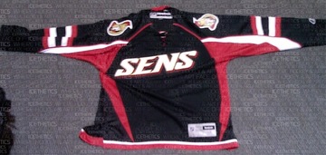
We'll start with the Ottawa Senators. A new photo I have of a replica more clearly depicts the text on the front as well as the striping on the sleeves. You can also make out the tie-up collar.
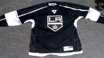
Next, the Los Angeles Kings, whose leak was the most difficult to discern details from. This photo clearly shows the prominence of silver in the sweater design, especially the new logo.
It's obvious the Kings had their Gretzky (and for that matter Melrose) days in mind when when putting this one together.
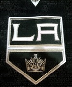 In the image to the right you get a close-up of the new crest. Silver is all over it, trimming the banner as well as the LA. You can even find some in the crown.
Surprisingly, the silver really helps to keep this jersey from looking boring. I think it would've looked very flat just in white. Wait until you see the Kings on the ice with all the bright arena lights reflecting off the silver. They're going to look good.
If you can't make it out well in the picture above, there's silver piping running the length of the sleeve from the collar to the wrist. It's broken up however by a broad white stripe that wraps around the elbow. That stripe is trimmed in silver. And the thin stripe at the base of the jersey appears to be silver as well.
Overall, I think the Kings really got one right. It looks nothing like what they're wearing now, but it totally looks like the L.A. Kings.
Finally, let's have a look at the San Jose Sharks.
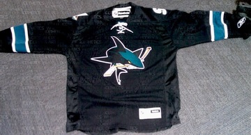
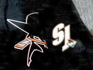
It's a little plain if you ask me. But that's no different from their previous black third jersey. I will say that I'm a huge fan of the full-body shark on the front. That's what needs to be on the regular jerseys. In this picture you can see the teal, white-trimmed stripes around the elbows and the lack of striping at the base.
Another thing to note is the absence of vertical piping that some of us thought we saw. Can't say for sure it's not on the back since we can't see it, but I highly doubt they'd do it on the back and not the front. Symmetry seems to be a common theme on these new sweaters.
The last thing I want to show you is the shoulder patch of this Sharks jersey. There was some question as to whether the SJ-fin logo was in black and white or color. Now it appears we have our definitive answer.
The SJ is in white and the fin is in color. Glad to see that logo make it onto the uniform. And in case you're confused by what you're seeing, the sleeve has been folded over the front of the jersey in this picture which is why you see the full shark logo.
I'll have the unwatermarked images in the Third Jersey Central galleries at some point in the next few days. And don't bother asking where these pictures came from. You know I'm not going to say. But when have I ever failed you?
So that's it. You've seen them all; pictures of all 18 NHL third jerseys. I'm glad to have been of service to you guys all this time — scratching that jersey itch. And I plan to continue doing so. I'll have complete coverage of each official unveiling through the Bruins next week. Technically, we still have six teams to go.
By the way, I'm still waiting on confirmation that the Coyotes are doing their unveiling during their game on Saturday. Look for more information on that right here tomorrow morning.




Reader Comments (64)
I don't understand all the wordmarks on the thirds!??!
Thanks a lot Dallas!
As a fan of the Ottawa Senators and Graphic Designer, I have to say that this new Jersey looks like visual sewage. They almost had it right with the underarm details, when they added that horizontal stripe to the vertical graphics, it was an instant fail. They would have done better to create the same type of piping on the cuffs of the jersey as they did with the waist and it would have looked a ton better already.
Then there is this "SENS" thing? We are the Ottawa Senators, we have a proud history. We have the Ottawa "O" that they are now using on the primary jerseys. As a marketing team, that is trying to create a coherent brand, what are they thinking? We now have 4, count them, 4 elements to this brand, when two would suffice. The "O" should have been used on this third Jersey. They other two logos or identity marks, the "SENS" and the 2-D "Spartan" should be discarded right now.
The Senators, and Other NHL teams should think about getting new marketing teams. They should hire designers that are actually hockey fans and think like hockey fans, then maybe we wouldn't be seeing this visual garbage, we've been seeing.
My honest opinion.
Dylan
The Sens jersey is absolutely horrible looking. By far, the worst third jersey in the NHL. It even makes the Thrashers third jersey look half way decent.
Are the Sharks expected to wear teal pants or black?
If they wear teal, then at least there is a break between the jersey and pants. I'm not sure what they are going for. The Maple Leafs dropped the bottom stripes so that they appear blue from head to toe. I'm not a big fan of that.
Kings jersey is okay but I don't like the piping on it. At least they are black/silver/white. They will look better with numbering.
The Ottawa pic makes it hard to tell how the jersey will look. I think its a nice design and you won't see the underarm colors as much when a player is wearing them. It is similar to their current pattern but with more detail. I like the stripes on the arms as a tribute to their past jerseys.
Wow... The Sharks jersey looks horrible. They could have used some stripiing at the bottom to make it suck a little less. They messed up big time.
LA's looks like a long-sleeved soccer uniform.
I love the Kings jersey, but the rest are horrendous
GREAT JOB AGAIN!
Love that Sharks 3rd.. i know some people are saying its boring but i think its going to look amazing on the ice..
walked into one of my favorite sports shops today before work and the guy behind the counter was saying he's seen it and its this and that with piping.. and he saw it in person..
i dont know why i shop there anyway..
but amazing job chris! THANKS!
I have changed my mind on the Kings new third jersey. It is actually quite nice, even with the armband on the sleeves breaking up the piping, it still is a sleek jersey. Besides, as a few other readers have said, the Kings did have black in as their identity in the past. Even if it looks a little jumbled up front, we should wait until it gets on the ice. The Snes jersey, looks ok, but I would have preferred the "O" logo instead. As for the Sharks, the bottom of the jersey, is a little.... lacking.
I'm liking that Sens jersey. It would have been nice to go with the O logo, but at this point, I'll just consider myself lucky that they didn't use that 2D abomination.
Man, it looks like someone vomited stripes all over that hideous Senators jersey. And the atrocity is only accented by the simplistic beauty that is the Kings' jersey. What even more wonderful is that the Kings can claim Black as a primary colour so they definately don't fall into the same category as Chicago, Carolina, San Jose, et al who simply throw their crest on a black jersey for no other reason than, 'Black is Bad-Ass.' I can't wait to see those LA jerseys on the ice. On the other hand, I am definitely not looking forward to the kaleidoscope that is Ottawa's third hitting the ice. I sure hope they don't unleash them against my Habs.
With the Sharks, it begs the question: "How much blacker could it be?", and the answer is "None!". Sorry for the Spinal Tap reference... At least I didn't use the "Shark Sandwich" review...
There are too many white jersey......all 30 teams have one.....let's stop complaining about less than half the teams with a black jersey...thats an old excuse. If you hate it you hate it. Look at all the teams with blue or red......
that sens jersey is brutal