Around the Minors
 Friday · Jul 17 · 2009 | 8:47 AM PDT
  8 Comments
 I've actually got a lot to talk about on this Friday, including a few minor league-relating items.
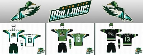
We'll begin with a shoutout to PuckDrawn, with a first look today at the new uniforms of the IHL's Quad City Mallards. Icethetics first took you "quack to the future" with the unveiling of the team's new logos back on July 1. Now see them on the jerseys.
 Mallards unveil uniforms (via PuckDrawn)
You can see the home, road an alternate sweaters being modeled here. A little shockingly, those neon greens are not the third jerseys. So they're going to see a lot of ice time this year. The Mallards also made available the lowest quality images ever of the designs.
Typically, we like these images to be larger for the purpose of seeing the detail of the design. But we'll live. One thing worth noting is that the green in this image and the actual green of the jersey look nothing alike. I like the one shown here better.
It also appears that the alternate sweater in the photo is dark blue while seeming to be black in the following image. Not sure which one is playing tricks on my eyes.
Next, we move on to another obscure minor league — the SPHL. On Wednesday, the Pensacola Ice Flyers announced they have sold enough ticket packages to be able to field a team this season. Now it's time for a real web site. But that also means they need a logo.
This morning I checked back in on the poll being conducted by the Pensacola News Journal. Much to my disappointment, SixZero's design (Logo 3) has fallen behind option 4. After 2,776, Logo 4 is ahead with 35% of the vote, just three percentage points ahead of SixZero. Normally, I'd tell all of you to get over there and get voting, but this isn't for us, it's for hockey fans in North Florida. If that's what they want, that's what they get.
However, the poll, which began on July 17, indicates no end date. Therefore, there's no way to know when the Ice Flyers club will make its decision with regard to the team's logo. So I will keep an eye out for that and keep you all updated.


Reader Comments (8)
That's a bummer about Six Zero's design. But, since the poll is just for entertainment purposes, perhaps smarter heads within the organIZEation will prevail.
The Mallards third Jersye doens't seem that bad, to be honest.
SixZeros design is the only one ofthe four worthy of being on a jersey. It is very professional, unique, and appealling. I would buy that jersey even though I could give a crap about that team.
As the only prohockey "kind of" in Iowa right now, I have got to say those Mallards jerseys are butt ugly. The blackish one is not too bad, but the green is terrible and the logo on the home & away is lame.
is it just me or does the new mallards logo look like the anaheim ducks concept logos that were posted on here some time ago?
I absolutely despise those neon green pants on the third jersey.
They might as well paint their skates to look like crocs as well...
Of course they look like the concepts posted here awhile back.... I wonder why that could be??? ;)
The Mallards alt is supposed to be a dark shade of green.
I personally think the uniforms just have too much going on for a fan's eyes to watch for 3 hours during a game.