Entries in sphl (9)

Wednesday
Sep042013

Minor League Anniversaries

It's been a busy summer with a lot of changes in the NHL. While I work on the next edition of NHL JerseyWatch, how about some new anniversary logos to hold you over? The AHL alone has at least four that I know of. Let's take a look at them here.

The Syracuse Crunch will mark their 20th season after arriving in upstate New York in 1994. (The franchise was actually founded as the Hamilton Canucks in 1992.) This logo was unveiled Aug. 14.

Also in 1994, the Springfield Falcons joined as an expansion franchise. So this season marks their 20th in the AHL as well. Although, I don't know what to say about this logo, which was released just last week. There's just too much going on and none of it good.

Fifteen years later, a couple more teams arrived on the AHL scene. The Abbotsford Heat are celebrating their fifth anniversary with this neat mark. It was unveiled almost two months ago, back on July 11. This is what most anniversary logos should be, actually. It cleverly incorporates an aspect of the team's primary logo with a unique type treatment for the number.

Here's what not to do. The Texas Stars are also marking five years, but in a much less interesting fashion. Hey, it's an anniversary logo. They can't all be winners. It was unveiled way back on June 28.

I'll wrap this up with a league anniversary. Can you believe the Southern Professional Hockey League has been around for almost a decade? But I think an intern made the logo. (Does the SPHL have interns?) Regardless, the execution is poor even if it's not a bad concept.

See any minor league anniversary logos I missed? Drop me a line and I'll update this post.

Tuesday
Aug062013

Blaze Become Bloomington Thunder

Central Hockey League forced name change

Back in May we learned the Bloomington Blaze were leaving the Central Hockey League for the Southern Professional Hockey League beginning next season. Seems that may have ruffled some feathers because the CHL's lawyers said the club would have to give up the Blaze name.

For that reason, according to the Pantagraph in Bloomington, Ill., the franchise renamed itself the Bloomington Thunder in late July. The move also helped the team align with the local youth hockey organization, also called the Thunder.

These teams are not to be confused with the Bloomington PrairieThunder which formed in the International Hockey League in 2006 and joined the CHL with the league merger in 2010. A year later, the PrairieThunder dissolved and a new group brough the Blaze to town in 2011.

I'm not sure why the CHL is so tied to the Blaze moniker considering the team only existed for two years. Unless they're just being petty because the team decided to switch leagues. This low-level minor leagues can be interesting. But nonetheless there's another new logo in the hockey world so it gets a place here on the blog.

For now, I'll leave you with a last look at the old Blaze logo.

Monday
May202013

Rivermen, Raiders Unveil New Logos

Peoria's new SPHL team reveals logo, uniforms

On Saturday, the latest incarnation of the Peoria Rivermen franchise — now a member of the Southern Professional Hockey League — officially unveiled its logo and uniforms.

Peoria Rivermen new uniform designs (via Facebook)

I briefly went over the history of the Rivermen in Friday's post. The new look came just a day later via the club's new Facebook page, where they also posted the progression of Rivermen logos over the years.

Rivermen logo progression, 1984—present (via Facebook)

The branding efforts are an attempt to capture history and tradition of the Rivermen franchise which has existed in some form for nearly 30 years. That's quite a run. For a deeper look, I recommend this article from Dave Eminian of the Peoria Journal Star. The write-up mentions that the logo and uniforms were designed by Carie Hanawalt.

The old Rivermen franchise of the AHL was recently purchased by the Vancouver Canucks and will no longer play in Peoria. So there will be a new name and a new location for the team at some point but nothing has been announced yet.

WHL's Prince Albert Raiders start "green movement"

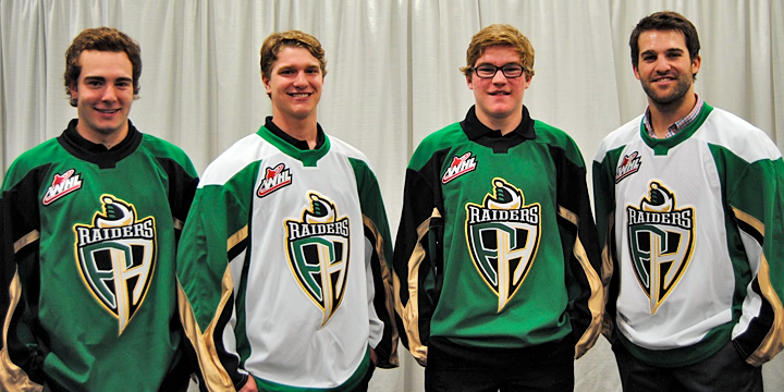
The other big logo unveiling last week happened in the Western Hockey League. The Prince Albert Raiders decided to highlight their green and introduce all new logos and uniforms.

New jerseys modeled at Raiders unveiling (via Facebook)

Take a good look at those jerseys. They're Reebok Edge, but a brand new template we've ever seen. Factor in the colors, and what are the odds we're looking at the next Dallas Stars uniform with a different logo on the front? It was an IceHL GM, Mike Kelly, who first mentioned this via Twitter. And I have to agree.

Then again, it would be surprising for a couple of reasons. First, if Reebok is going to go out of its way to generate an entirely new sweater template, why would they do it for a junior league team. It's more likely that it'd be for an NHL club — like Dallas. But then if all that is true, why allow the junior team to hold its unveiling first — three weeks before the NHL club?

It could be a simple solution, like maybe Reebok works up new templates every year — some of which may or may not end up in use in the NHL. It could just be a way of expanding their own product line. In any case, it's something worth talking about.

What's your take? Both on the Raiders' new look as well as the possibility that they're a preview of the Stars' redesign. And how about the new Rivermen?

Friday
May172013

May Minor League Report

All this work on the IceHL's 13 Weeks of R&R project has kept from doing my real job on Icethetics — updating the blog with actual news. In other words, there's a lot to catch up on.

Hartford Wolf Pack officially return to AHL

Well that didn't take long. After playing parts of three seasons as the Connecticut Whale, the Hartford Wolf Pack identity has made a glorious comeback — thanks to their NHL parent club, the New York Rangers.

The Wolf Pack were established in 1997 when the Binghamton Rangers moved to Hartford. Then in 2010, Howard Baldwin happened. His effort to recapture Hartford Whalers failed miserably with the rebranding of the franchise as the Connecticut Whale.

Connecticut Whale, 2010—2013

We applauded the judicious use of green but not the name or the terrible logo. Within two years, Baldwin was gone — which probably says more about his management style than his taste in sports branding. But we're all grateful nonetheless that the Pack is back.

And not for nothing, but the New York Rangers' AHL affiliate is now operated by the parent company of the Philadelphia Flyers, is it not? Global Spectrum is running things these days and it would seem they have two masters. Interesting.

The Rivermen are dead, long live the Rivermen

Speaking of the AHL, some craziness took place on Monday. The Vancouver Canucks who recently acquired the Peoria Rivermen franchise from the St. Louis Blues, announced the team would not operate out of Illinois next season. They don't know where exactly yet. Just not Peoria.

So it seemed the end of a brand that has existed for nearly 30 years. But the Rivermen are plucky. They won't go quietly. After 12 years in the IHL between 1984 and 1996, the franchise transferred to the ECHL for about a decade. Then in 2005, they got the upgrade to the AHL. In 2013, they move down — way down — to the SPHL, that's the Southern Professional Hockey League. (It exists!)

The SPHL is home to teams like the equally plucky Columbus Cottonmouths and the Pensacola Ice Flyers. And now it's also home to...

Bloomington Blaze switch from CHL to SPHL

The Bloomington Blaze are jumping the sinking ship that is the Central Hockey League for the equally crummy SPHL. A lateral move at best. But one they apparently feel is necessary.

The Blaze were founded just two years ago after the folding of the IHL's Bloomington PrairieThunder. (All these minor leagues you've probably never heard of.) They begin play in their new league this fall.

Now that we're on the CHL, we might as well talk about their newest expansion team.

Brampton gets Beast to replace lost OHL team

Earlier this year when we learned the OHL's Brampton Battalion were moving to North Bay, Ontario, it seemed like the good people of Brampton would be without a team. But that's when the Central Hockey League jumped in, expanding into Canada for the first time.

On April 27, the Brampton Beast were revealed to the world. Along with a very vanilla CHL-like logo. I won't pass judgment too hard since somebody was obviously trying. (I just don't know what they were trying for.) In any case, the Beast begin play in the fall. Like Peoria, hockey fans of Brampton won't miss a beat.

For the record, the North Bay Battlion also begin play in the OHL this fall. They will keep the same logo they had in Brampton.

Friday
Jul132012

Pensacola Ice Flyers Get Revamped!

For three years, they were the team with — unquestionably — the worst logo and uniforms in all of professional hockey. That all changed on Thursday.

The Pensacola Ice Flyers unveiled a brand new identity that's millions of miles beyond the monstrosity they entered into the world upon joining the Southern Professional Hockey League in 2009.

If you're struggling to remember said monstrosity, allow me to remind you. It was terrible. Objectively terrible, if that's even possible. I'm not sure that thing could actually be considered "design" as we know it. But now it is no more, I'm happy to report.

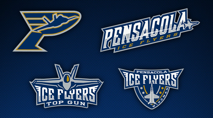
The Florida panhandle team still has a pretty awful name, but it has meaning to the people of Pensacola and, heck, these phenomenal logos just make the "Ice Flyers" moniker look cooler, if nothing else. This is a definite win in the minor league logo design department. And it may well be the best logo in the SPHL at this point — which, to be fair, isn't exactly saying much.

I'm very excited to see this team recognize the need for a revamp and hire a pro to make it happen. Incidentally, I haven't been able to track down the name of the designer or creative firm. If anyone knows, I'd love to be able to add a link to this post.

Here's a look at the new secondary marks designed for the Ice Flyers.

Certainly playing up the Top Gun theme. I sense some specialty jersey nights in the seasons ahead. All of these elements just look great — at least in comparison to their predecessor.

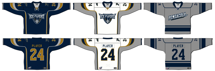
Anyway, enough gushing from me. Time for you to weigh in. While you put your thoughts together on this new look, I'll leave you with Pensacola's new set of sweaters.