Salmon Kings New 3rd Launched
 Saturday · Jan 2 · 2010 | 8:28 AM PST
  17 Comments
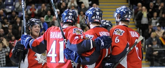
  This news may be a few weeks old, but the ECHL's Victoria Salmon Kings recently launched brand new third jerseys for the 2009-10 season. I just came across a couple of pictures in the ol' Icethetics archive and thought I should share them.
First, some background. On December 10, the Salmon Kings announced the unveiling of a new alternate sweater as a tribute to the 2010 Olympics, which will take place in their backyard. It then hit the ice for the first time the following night against the Las Vegas Wranglers.
 Salmon Kings old thirdGone is Victoria's old third jersey, seen to the right. I believe it was introduced for the club's fifth anniversary in the ECHL and was only worn for one season.
It's got a clever double meaning, for those who missed it the first time around. V being the Roman numeral for 5 and also the initial of Victoria. Anyone feel dumber for my having explained that?
So anyway, that's what they were wearing. White and boring.
This season they're going in a new direction by implementing red Reebok Edge jerseys as their new alternate. Here's their official statement:
The Salmon Kings’ new third jersey will be the second alternate sweater design for the organization in the past two seasons. This year’s design will replace the “V” logo jersey that was used last year.
“The inspiration for this jersey comes from the upcoming Olympic Games in Vancouver,” President Dave Dakers said. “This is a great sweater that combines our pride for the Salmon Kings as well as our nation.”
 Salmon Kings new thirdThe classic fish logo is pulling an Alien by ripping through the skater's chest. But beyond that, the red really stands out and is very Canadian.
Red is new territory for the Salmon Kings and while the color does appear in the logo, they're definitely aiming higher. Go Canada!
Anyway, I apologize for not getting to this sooner but part of my new commitment to Icethetics is getting news posted even if it's just for archival purposes. I want Icethetics to be the reference for all things jerseys.
I can dream.
One last look at Victoria's new thirds before I leave you to share your own thoughts on it.

By the way, happy new year!


Reader Comments (17)
From the back, it resembles Ottawa's home jersey.
Of course, it helps that the "alien tear" is in the shape of a maple leaf.
The salmon isn't "pulling an alien" it's sitting on top of a maple leaf.
The V sweater is a thing of beauty this new one is too much!
I think the "rip" is supposed to be a maple leaf. That would make a little more sense.
Since switching to the new thirds, they have won 10 games in a row. Not sure if they'll take them off until they lose a game.
It looks to me like it's just a silver maple leaf behind the fish logo, not the fish ripping through the chest of the player. Are there any better photos of a close up on the jersey?
Thats pretty cool, but that doesn't look like the salmon ripping through the skaters chest to me. It is tough to see in these images but it looks to be the salmon logo over top of a maple leaf.
It looks like the rip is in the shape of a maple leaf
Is it just me or does the rip in the jersey look vaguely like a maple leaf.
it is a maple leaf! red jersey and a maple leaf not hard to find the tribute to canada there!
maybe ill get to see these suckers on ice one day since i am moving there
I doubt anybody else realized this, but the rip is actually a maple leaf...
The jerseys are nice but those logos are terrible. There must be a better way of representing a salmon.
On a unrelated side note- are you go to make a retros gallery similar to the alternate jersey gallery? I'd love to see pics of the Habs and Flames retro jerseys.
Pulling an alien=like the scene in the movie "Aliens" where the alien jumps out of a guy's stomach.
The one downside to the current commenting system... half a dozen people all say the same thing and don't even realize.
Carnwell, I think the "V" was scrapped because it was a third jersey honouring Victoria's milestone 5th season in the ECHL. It is meant to represent the Roman Numeral for 5, now that they are in their 6th season change was needed.
Hollow, a designer on Icethetics did a rebrand a long time ago for the Salmon Kings. I do agree that someone needs to step forward and send SKings brass new logo concepts though.
red jerseys look really good! also like the "V" logo but they could have made the whole jersey look sooooooo much better