


The Elusive Penguins Jersey
 44 Comments
 A couple of things happened over the weekend. First, the Capitals officially unveiled their Winter Classic jersey. Second, I got a sneak peek at the Penguins' jersey.
Despite my previous post, which would indicate otherwise, I am now prepared to say with some certainty what the Pittsburgh Penguins 2011 Winter Classic jersey will look like. In the past I've only been able to offer up a text description. Now I have something visual.
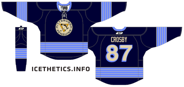 This is a rendering of the Penguins 2011 Winter Classic jersey.
There you have it. Your first look at the sweater everyone's clamoring to see. This is as close as I can get without having an actual photo of the unreleased jersey. I've left off the Winter Classic logo on the chest as well as the numbers on the sleeves, but otherwise it's right on the money. What do you think?
It's just what UniWatch first reported and very close to the concept that Hockey Week did based on that description. The only difference being vintage white rather than real white. (Also, I may have gone a little thick with the powder blue stripes.)
Also to help this rumor along is a picture that was posted on the Penguins' official website today. Remember about a week and a half ago when I wrote this:
...the story does say the new sweater will "resemble uniforms worn by Mario Lemieux's son's local youth team."
 Mario Lemieux's son's hockey teamEvidently, they won the local championship and that was enough to get their photo posted on the team's site.
The photo isn't the highest quality but you can see how it resembles the jersey design above. Just swap out the black with navy blue and gold with powder blue in your mind.
Looks like all these little bits and pieces of information are finally coming together. We still have to wait for an official unveiling to be sure, though. Can't tell you when that's going to be. But I'll bet money it'll be closer to Black Friday!
By the way, for those of you paying attention, I did promise a Kings post. That is on its way, but I thought this was more newsworthy at the moment.

Reader Comments (44)
Hey chris.
Hopefully you did go a little overboard on the stripes, because their is hardly any space between the stripes and the logo. Why do they need 4 stripes. I think less is more in a situation like that. Just my opinion though.
BOOOOOO, not another blue jersey, BOOOOOO
It's terrible. It should have matched a terrible towel. Heinz field is black n gold. Not blue!
Don't like it. Looks like the Florida thirds. I'll be buying the Caps Winter Classic jersey instead.
I don't know, I'm still partial to their previous powder blue winter classic jersey. I really think the Pens should have gone black/gold with their look for this go-round in the Winter Classic.
I'll have to reserve final judgment until we see the actual uniform on someone's body, but based on that pic, the so-called "vintage white" just wrecks the look. All it does is make me want to hit that logo with a jug of Clorox.
I gotta say, if that's the final product, I'm not impressed. Actually disappointed.
i hate the Penguins with a passion, but this sweater is classic (pun intended). the powder blues are better though
This is a way better jersey than that powder blue mess that has been floating around. The look is solid and will look great on new year's day!
that pens jersey looks sharp, better than the powder blue one for sure.
I think the new jerseys look great. They are different enough from the current blue 3rd jersey that people will want one. I know I will want to purcase one. Lets Go Pens!!!
They look good, but not quite as awesome as the powder blues. The penguin with a scarf is a nice touch.
Any jersey in Pens history > current black and tan ugliness
Not great. But at least it is better than the powder blues.
I think both teams need better looking WC jerseys. I feel bad for the people that are willing to pay for such horrendous looking things. They should update those yellow, black, and white alternates from the early 80s.
Dislike. Even though it features a classic logo and vintage white trim, this is the first of the winter classic jerseys that doesn't look very classic. Its a fairly modern, and too dark. I am a fan of the powder blue throwbacks myself. The Penguins have sported some pretty snazzy navy blue/powder blue jerseys in their history, and I was hoping that the winter classic jerseys would resemble one of those.
Stripes are pulled from the 67-68 jersey, which I think I'm a little more partial to, with "Pittsburgh" across the front instead of the logo. I'd like to see th 67-68 jersey w/ the color combo you have above as a third jersey.
I don't know... like the Rangers, it borrows heavily from past uniforms (the navy blue of the late 70's, the font (YES!) of teh inaugural season 1967, as well as the 5 sleeve/hem stripes from that jersey). I'm trying to remember where the Penguin with the scarf came from, or was it just a promotional logo that never saw the front of a jersey? So, while I'm kinda sad this, like the Bruins' Winter Classic jersey, is a "Franken-jersey" of sorts, because I like to see real classic jerseys worn for this event (like the Capitals), it's a great idea for a Third jersey, which I'm certain will be this jerseys' destiny. I want to see a real one soon; I think it's a winner.
Ya, its pretty terrible. I think that the powdered (baby) blue should leave hockey forever. Also, get rid of that disgusting "vintage" white. It looks like its been soaked in beer for ages. Just terrible all around.
The jersey looks nice, and I'm glad they're using the early number style, because it is a unique look. I find it ridiculous that the Pens overlooked the marketability of black & gold since they're playing at Heinz. The 1985 gold jerseys would have been the best choice; what a look it would've been with the color of the Heinz seats! As a Pittsburgher, I can say black & gold rules all. If the Pens change their identity back to all blues in the next few years, they are seriously going to alienate their main fan base...
but, when the money is right...
they won a invite tournement hosted by the tampa bay lightning, it wasn't some local thing. On the main page of the pen's website, they have a pic of the team wearing a white jersey with this striping pattern, which looks pretty sweet. And, it is much better than this. I'd still consider getting it though.
Haha, hosted by the Lightning? That's ironic. Well I apologize for getting it wrong. My concern here was more to do with the jerseys than their tournament.
I love the new jersey look! Love the blue too! Not a fan of the old black and yellow-gold... we are the pens, not the steelers
So dissapointed that they are going to wear another blue jersey. I was really hoping for the yellow jersey's they wore in the early 80's with the yellow helmets. I would have bought one of those for sure, but no chance in heck I'll be buying that thing. On a brighter note, the Caps went with exactly what I was hoping for.
Nice, I like it, but the logo looks out of place with the yellow in it.
The kids version looks way better. Sick of blue springing up everywhere. Blue is the new Black!
That is one drab looking uniform. How do the Pens go from one of the best throwbacks to this? Prediction: This is the beginning of the end for the Winter Classic. The NHL has overexposed the product and the game has lost it's magic. Meh.
@ Derek
If you from Pittsburgh then you should know that Pittsburgh is black and gold. Nobody cares what they pens first colors were. All of our good history came wearing the black and gold colors (including the vegas gold). 99% of Pittsburghers want to see the Penguins in either the colors they have now or the Lemieux era colors. The steelers are the steelers and the pens are the pens, nobody is going to get confused if the have the same colors.
The jerseys could have been SOOOO much better! But dark blue isn't bad, I just hate the striping. What happened to using an element from the Lemieux era? Since their apparently hell bent on using blue, then they should have gone with this colors cheme with the cup winning jersey style with the current WC logo on the front.
@ Derek, Dude how long have you been a Pens fan/Hockey fan?? The Pittsbugh Pirates Hocky Club (circa 1925-1930) were the FIRST Pittsburgh sports team to sport the city's Black and Yellow gold colors. The Pirates Baseball team wore red/white/blue and the Stillers weren't born until 1933. So Black and Yellow gold is also for the Hockey Club
any idea if the pants will be the monochromatic navy that was in the hockey week mockup? is it just me or would that shade of navy look great with old-fashioned tan pants (a la the flames for the heritage classic)?
I love the jerseys. And to what Dallas Hicks said, the logo was never used on a jersey because the original owner thought it looked too dumb. Apparently not. To What Derek said, don't get me wrong, I love the black and Vegas gold, but the old black and yellow needs to come back because we are Pittsburgh. It's the same yellow used by the Steelers and the Pirates.
Inaugural template with the navy and powder flipped and the inaugural logo that never made it on the ice before they changed it. I'm digging it. It's interesting and new, but still faithful to a legitimate period in their history and could very, very easily have been something that was actually considered in that initial period.
Much better then Boston, which invented a brown, gold and cartoon monstrosity that supposedly represented many time periods but was faithful to none, or Philly, who just pulled those nameplates out of a place where the sun don't shine, ignoring any and all sense of why the contrast nameplates on the oranges existed in the first place.
Other teams should take note. If you're going to create a mashup, this is how you do it.
I would have preferred black and yellow myself. I think it would look much better on the ice with the Caps obvious choice of jerseys.
I actually prefer the black one the kids wear.
fauxbacks have now ruined the winter classic. it should be full on THROWBACKS ONLY. when chicago did it it was acceptable, then boston did it and made a MINOR improvement, then the flyers ruined their white jersey, then came the flames who now look like griffindor from harry potter and now comes the penguins with this crap.
Myself, I like these...a lot! Like the nod back to the original 1967 striping and the rounded number font with drop shadow, which the original sweaters also had. For the person who asked, the logo on the front was never used on a uniform, but was the original team logo used in advertising, on stationery, even on the 1967-68 game pucks. It was changed the next year to what is on the front of the current thirds (and is basically the logo today). I know lots of people wanted them to wear the 1981-85 gold home sweaters (which I have one of...not the current vintage model but a 1985 one), but you see so many of those in the building and on the street (and on the overseas fake websites) that they probably feel that they wouldn't sell as many of these as something brand new.
It's hideous!
me wants to see the Kings jersey!
I think they're great. I love the five-stripe pattern from the 67-68 sweaters, and the rounded numbers are awesome. Like the dark blue as well.
Nice as black and gold might've been, it was NEVER on the table. Lemieux wants to play down his profile as a player and the great early-90s teams in favor of letting today's team have its own identity. If it's good enough for #66, it's good enough for me.
Thumbs down. If you're going to wear a throwback, then wear an actual throwback. Don't mix-n-match several elements from different years, throw them all together, and call it a throwback. Besides.. what classic Penguins history is there from the blue years? You think Penguins, you think their glory days.. Lemieux, Jagr, Francis, Barrasso. What did they wear? Black and gold. Or today's Penguins with black and tan. I don't get the obsession with the blue throwbacks. Throw on the 84 jerseys already!
I'm in accord with most of the rest of you guys; just another cream-for-the-sake-of-being cream-colored jersey. I'm pretty sure hockey jerseys were washed back in the day too... The original powder blues actually fit in with Pens history. This jersey overtly tries to be vintage.
No more blue! The blue on blue is hideous! Heniz field = black and gold; how hard is that to figure out?
I've heard Mario Lemieux say that he wants the late 80s/early 90s era jerseys to stay retired because he wants the current group of players to create their own identity...even if it apparently involves elements from the 70s era Penguins.
powder blues much better. this design has too many stripes. Ilike the penguin with the scarf however.
I don't know if the stripes are right or not, but the color and logo definitely are. Went to a Pens game a couple of weeks ago and they are selling the dark blue with this logo on shirts with the Winter Classic logo.