


Kings Unveil Vintage Jersey!
 30 Comments
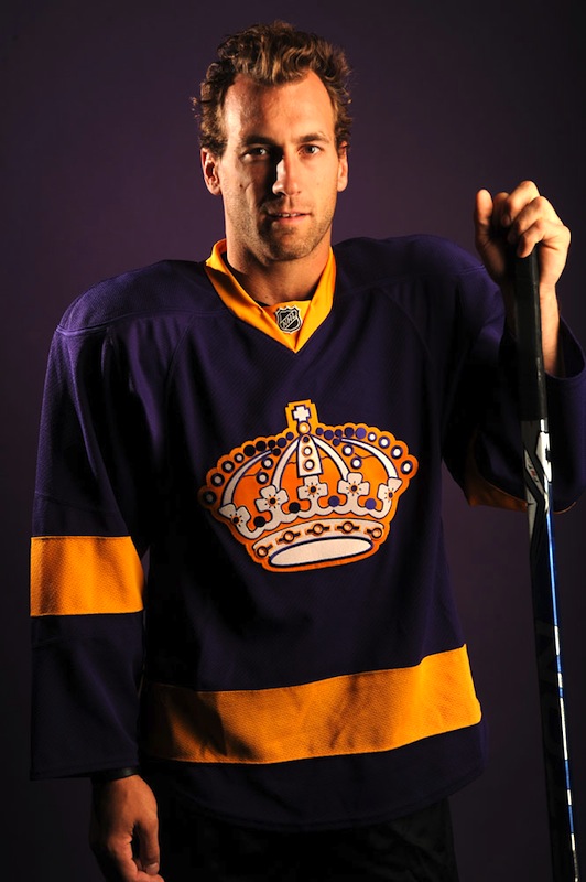 Kings' throwback sweaterWithout a lot of fanfare, the Los Angeles Kings today unveiled the throwback jersey they will wear occasionally during the season.
The new uniform was revealed via the team's website this afternoon. Unlike the retro gold jersey we saw the Kings give to their first round draft pick in June, this one is purple.
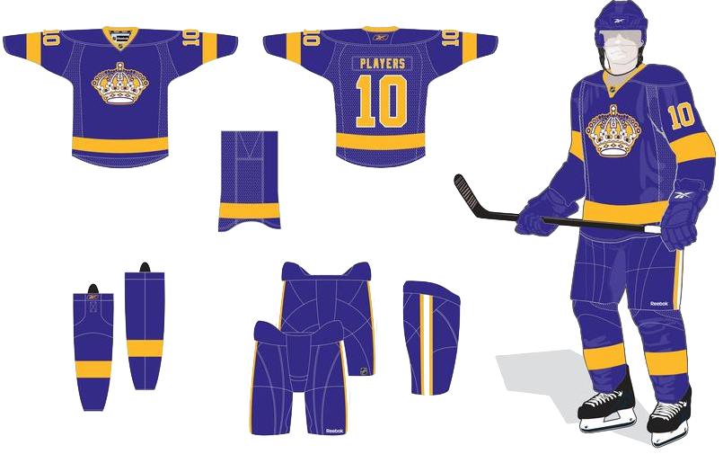
The sweater's design is simple, a replica of what the club wore during the 1970s. It features a single heavy gold stripe around the waist and sleeves along with the classic crown on the chest. Click here for a rendering of the full uniform.
In their press release, the team acknowledges the throwback jersey is being used on Saturday to commemorate 40 years of competition with the Vancouver Canucks, who entered the NHL in 1970. This year is the Kings' 44th.
The release also confirmed the jerseys would be worn again at home during the season:
Saturday’s game at Vancouver will also help kick-off off a special “Kings Legends Series” planned for later this season at STAPLES Center. As part of this series, the Kings will again wear their special vintage jerseys on three future home dates while honoring three distinguished former players. Legends Series dates and honorees will be announced at a later time.
For more pictures of the jersey, including photos of players breaking in their purple and gold gear at practice, make your way to the Kings' website. You can also find a page on the Kings' uniform history.

Reader Comments (30)
I like it... not anything new, but something we haven't seen in a while. Nice.
meh.. i was hoping for the gold ones they wore from 1980-88.
this needs to be there primary jersey!
LA Rockin the Royal Purple one more. A shame that LA can't make a modernized version of this as a Third Jersey. Gonna be really cool seeing this and the Canucks' 40th Unis when I tune in for the Canucks Home Opener Saturday.
Now i'm not one to like the color purple used in sports, but the old purple and gold just work. I love the unique vibrant they pull off. Bright colors on a simple design attract my attention way before a bunch of odd reebok seam striping/paneling. It's far superior to their current threads.
Will they still have the black and silver alternates?
ooosh now that is not good at all. the only worse thing they could do would be wearing the gold counterparts.
Yeah! Those vibrant colors will look great on an HDTV.
Well done, Kings; now let's make these the full-time unis.
Now THAT'S the Los Angeles Kings. Not that silver and black Gretzky crap. Give me purple and gold anyday It's a 70's style too. Outstanding.
Not as nice as their early 80's version, but got to hand it to them for for replicating their inaugural jerseys, it's better that then all these newly concopted vintage looking designs, such as the new Rangers 3rd.
The BEST Kings uniform of all-time, period. This classic look puts this jersey in the same league as the Red Wings, Blackhawks, Sabres, and Flyers. The purple and yellow-gold look great together. This should be the primary look for the Kings. Purple at home, gold or white verson away, and Gretzky era black and silver for an alternate.
I was kinda hoping for the all yellow look for the sheer horribleness, but this will look very nice. It's a nice jersey and a good look for them. And I suppose I can't fault them for going with the nice look rather then the trainwreck look.
Can't wait to see 'em on the ice.
Yep. That's still a Queen's crown. Always has been. Always will be. Nobody in the Kings' organization has ever played a game of chess? Ever?
I'm with SW and Andre: ABSOLUTELY AWESOME. Nicely done! This is their inaugural uniform, and the past retros never really addressed it (the last purple retros for sale were based on the 80's style yellow and purples with the stripe down the sleeve). There's nowhere near enough purple in the league, and this is the sharpest jersey to feature it I've ever seen. I will definitely buy one!
God is that ever ugly. Same as it always was.
Now that's SHARP. I'd love to see the Kings wear the purple at home and the yellow on the road full time.
Really a "love it or hate it" thing with this one... but then, a lot of unis seem to inspire that.
Personally, I'd have preferred to see some version of the 80s style, like the one at the draft, but using the original design makes sense - they've done it on a couple of occasions before. Plus, it suits the throwback game with the Canucks on Saturday, as they'll be matched in uniform designs from the same era. Of course, it'd be just a little more period-accurate if the Kings went without NOBs for that game...
Gold would have been nicer but a fine job
Wow, that looks great. Can't wait to see Canucks-Kings.
Am I the only one expecting a spike in sales for Crown Royal after this weekend?
fantastic!!!!!!! any chance of them making these primaries?
So the Canucks' opener should be a really good looking game.
Remember when the Kings handed out that gold jersey at the draft and everyone speculated that it would be worn this season and I told you all that they would be wearing this instead?
I told you so! This is the same uniform that the Kings wore when the Canucks played their first game.
This is the only vintage purple Kings uni I like. The yellow is too gaudy and the next generation is just ugly. This is simple and classy. Should be a third with a black and white regular set.
This needs to be their primary jersey! I'm really glad they are bringing it back - I hate the "gansta" look of the current 3rd and the chevy/faux raider black and white look of the Gretz era. I mean they are the KINGS! Need to ditch the black and white versions...no matter what Luc likes!
@ EL
I totally agree with you on the original purple uniform. However, I do disagree regarding the gold jerseys. First of all, the home team should wear the lights at home anyway and darks on the road. Second, yellow/gold gives the light coloured uniforms a unique alternative to the more traditional white. Being a Vancouver fan, I ALWAYS loved the Canucks' home yellow uniforms. With teams wearing whites on the road, it gets boring seeing white all the time. Team Sweden also wears yellow as its light colour. The only blimp(and it was a big one) was the use of gold pants in the late 70s.
Love it. When do they go on sale?
Something i noticed about this purple jersey is that never in their history have they worn a jersey quit like this. For if you notice, the yellow stripe is a couple inches above the hemline like the yellow counter part of this era, however the purple one this Jersey is mimicking, the yellow bottom stripe is actually from the hemline up. just a subtle difference, but still very cool. I cant wait for this game though. Should be a good season this year for the Canucks.
Go Vancouver
I think the main reason for having purple below the gold stripe is so as to maintain the straight-line appearance of the gold, rather than have it be an ungainly bulge because of the Edge shirt-tail cut. Yet another reason to go back to the traditional square cut, IMHO...
By the way, just checked out the game on the CBC, and the Kings are going NNOB!
this jersey is not very good. It might be a throw back but there third jersey right now is so much better it needs more detail like a number in the front like buffalo and san jose
is there a schedule for when the kings will use them? and more importantly, when do they go on sale???