


CHL Third Jersey Fever, Part 1
We have to be nearing some kind of record: New posts EVERY DAY since Sept. 15. And some of those days have seen multiple posts. I can't remember the last time Icethetics was this busy. But there's no sense in slowing down now. I promised a look at some CHL third jerseys before the week was out. Unfortunately, there are too many for a single post.
We'll begin with the Western Hockey League. The season kicked off a couple weeks ago and already we've got several new sweaters hitting the ice.
 Kamloops Blazers 3rd jersey
 The Kamloops Blazers have added a blazing orange blazer. It's not the color but the front of this jersey that is its downfall.
I hate to start on a bad note because last time I discussed Canadian Hockey League uniforms on this blog, it was with great acclaim. I said the NHL should take a page out of their book. But it looks more like the Blazers have taken a page out of the Dallas Stars' book. And the Stars' book is terrible!
The dawn of the Age of Reebok ushered orange out of the NHL. But prior to that, only the Islanders and Flyers used it for their third jerseys. Philadelphia then brought it back in 2008 as an alternate. Only now is it finally a regularly-used color again.
So despite the terrible lack of any sort of crest design for Kamloops, you won't find a more colorful hockey league and that by itself should be applauded.

 Kelowna Rockets 3rd jerseySpeaking of colorful, the Kelowna Rockets have barely worn their regular home and road sweaters this season.
On Sept. 25, the Rockets debuted a new red third jersey with silly-looking dragon face on the front of it. Say what you will about it, but how many teams have ever used this color combination? Certainly none in the NHL and the closest one I can think of is the Detroit Vipers in the old IHL.
But that's not all. The Rockets also wore their pink-ribbon jersey recently for (I'm hoping) Breast Cancer Awareness Night. To save space, I'm linking to it rather than displaying. Plus, you've seen one pink jersey, you've seen them all.
Rather ironically, their home and road sweaters are black and white. Still, the fact that they're willing to take advantage of their color scheme, even if only on a third jersey, is good enough for me. More NHL teams need to get a little creative.

 Kootenay Ice 3rd jerseyThe Kootenay Ice have a new blue third jersey in the pipeline.
And here's another example of an awful NHL fad creeping into the CHL. Stop with the mismatch nameplates. Philly did it first with their third jerseys to replicate a past design quirk. That's all right. Now stop.
Setting that aside, this is an otherwise perfectly nice hockey sweater with great colors and a slick design that manages to also feel retro.
In a web release, the team credits the jersey design to Jack Santos of Visible Means Design in Sherwood Park, Alberta.

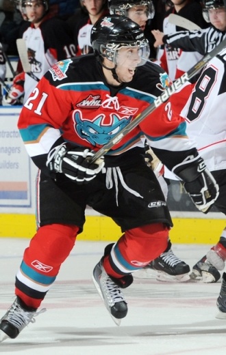
 Red Deer Rebels 3rd jerseyI recently mentioned the unveiling of the Red Deer Rebels third jersey. Now we can see it on a player in full gear.
The photos I have were sent in by Jorden Clarke. One thing he did point out was the poor visibility of the black numbers on the maroon stripes on the back. That's kind of a shame and easy to fix.
Despite that, however, I still believe this to be among the best new hockey sweaters in the world this season. I just wish they could get the WHL logo off the front.
This jersey made its debut last week on Oct. 2. My thanks to Jorden for these photos from the pre-game skate.

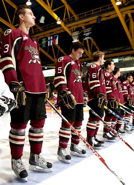 Chiliwack Bruins' 3rd jerseyAlso making its first appearance that night was the Chilliwack Bruins' new third jersey.
This is an instance where I think the team would be better suited to just adopt their third jersey as the new standard. As Reebok-ified as the sleeve striping may be, it's still a great looking uniform as a whole.
I don't even think changing the logo would be a bad thing. Not every team called the "Bruins" has to have a spoked letter as their primary mark. (Yes, that's you too Providence.)
By the way, most of the uncredited game photos in today's post, this one included, and many more can be found at WHL.ca and their online photo gallery. Also this next one...

 Vancouver Giants' anniversary jerseyThe Vancouver Giants are celebrating their 10th anniversary with a special jersey.
The most notable feature of the sweater is the 10th anniversary logo placed front and center. The ECHL's Florida Everblades did something similar for their decennial in 2007-08. But they actually put the 10th year logo on the home and road jerseys all year.
For the Giants, they've just taken their standard white jersey and swapped out the crests. Might've expected a little more creativity from these guys so it's a tad disappointing.
Maybe we'll get something better from them next season. Last thing today then I'll leave you alone...

 Lethbridge Hurricanes' 3rd jerseyAccording to blogger Scott Wasilewski, this is the Lethbridge Hurricanes third jersey.
This photo appears to have been taken on a store shelf last Friday and I haven't seen anything on the team's website about an alternate sweater, so maybe you guys could help shed some light on this particular subject.
It looks like a frightening fusion between the Washington Capitals and Carolina Hurricanes. Scott isn't sure if he likes it. I'm pretty sure I don't. And heck, while we're talking about bad Lethbridge jerseys, they've announced plans for Pink in the Rink Night on Nov. 19-20.
More new sweaters from the OHL and QMJHL this weekend. Also new stuff in the AHL and ECHL as well. Check back for updates.
 Chris
Chris
There is now a follow-up to this post: CHL Third Jersey Fever, Part 2. It features the Tri-City Americans and Edmonton Oil Kings from the WHL, Halifax Mooseheads from the Q, and the OHL's St. Mike's Majors and Soo Greyhounds.

Reader Comments (42)
MAN the Giants jersey is soooo ugly
Loving the color schemes, even the Kelowna jersey. At least its unique, there are enough black or navy jerseys out there.
The Kelowna jersey's crest is of Ogopogo, which is a sea monster that allegedly lives in Okanagan Lake, which Kelowna is next to. It's similar to the Loch Ness monster. It's an icon of the city to the point where there are statues of Ogopogo littered throughout the city. Definitely not some "silly-looking dragon face."
Why would the providence Bruins want to have anything other than a spoked crest? They're Boston's farm team!
Agree on the Blazers. The text logo is boring.
Always loved the Rockets third jersey colour scheme.Red black and teal green are a great combo.
Gotta disagree on the Kootenay ice. That is the one nameplate that really works! I'd maybe simplify the numbering colours but otherwise that is sharp and original looking.
Maroon with black and cream accents is the ultimate old school colour. Like the rebels, but not 100% on the bruins. Put that on an old school template with a decent logo and its a winner.
The Giants and hurricanes are awful looking.
That's not a dragon, thats Ogopogo, Kelowna's own Loch Ness monster.
http://en.wikipedia.org/wiki/Ogopogo
Is it just me or is anyone else sick of all the patches and numbers and logos that clutter the front of jerseys these days? Should be limited to the crest and captaincy patch. It's starting to look like euro leagues.
HurrJcanes?
Loch Ness monster... dragon... what's the difference?
Was at the Chilliwack home opener where they wore their thirds. Worked well with the First Nations Night theme for the game. I like the jerseys except for "Chilliwack" written over the top of the logo.
--
I suspect the Hurricanes will be wearing those red ones at the home opener tonight. I'll be shooting photos, so will send some in if they are indeed wearing them. I haven't heard anything from the team about it, though, so I don't know for sure.
Also of note for the Hurricanes, they added a jersey number to the front of the sweaters for this season.I can't find a picture of it right now, but will have some photos soon. This is something I suggested last year because of the proportions of the logo, but now that I actually see it, I'm not sure that I like it.
Nice work Red Deer and Kelowna. As for the rest, I'm not quite sure how they could all be so consistently horrible. Let's hope the rest of the CHL doesn't follow suit.
Are you planning to do a USHL series like this? I'll try to get pics of the 2010 30th Anniversary DM Buccaneers jerseys next time I'm at the arena. I would have snagged them Wednesday during my league, but left my iphone in the car.
Glad the photos could be of use ;)
I just wanted to comment on the Hurricanes jerseys. They already use recolored Caps jerseys for their set (a blue and a white one) so the red makes sense as it's their other colour. The shoulder patches appear to be a 20th anniversary version of a previous logo. I kinda like it.
http://www.hockeydb.com/ihdb/logos/whl/lethbridge_hurricanes_2003.gif
Plus as seen here the Hurricanes have a history of wearing basically Washington Jerseys...
http://www.caldercup2000.com/images/6-f.jpg
Otherwise I do like all of these except for
1. The front of Kamloops, I've always been a believer you need a logo on the front of the jersey.
2. The off colour namebar in Kootney. While I was hoping the Rebels might do something with on of those (glad they didn't after seeing the backs anyway) I don't think it works with Kootney. The shoulders are already busy enough.
I understand the historical significance of the Ogopogo on the Kelowna jersey, but it's just a silly logo when your name is the Rockets. Kelowna is one WHL club that needs a logo that falls in line with their name. Anyway, the Kamloops jersey is lame. Nice red color, but please stop pulling a Dallas Stars with the name on the front. The Kootenay Ice jersey is much better than their primaries, which are a disaster. I love the Chiliwack jersey because it lets them stand out on their own rather than looking like a Pittsburgh Penguin affiliate. The Red Deer jersey is really nice, love the cream color. Lethbridge is another disaster. They had a cool logo with the twisting hurricane so why get rid of it? Plus, they need to come up with their own identity and not borrow the Capitals look. Same thing goes for the Portland Winterhawks, who have a cool name so come up with a unique look and stop copying the Chicago NHL franchise's look. Vancouver, ugh, I have never like their jerseys for some reason.
uggghh for most of those chl jerseys!!! chilliwack is about the only half decent design.
anyway, bring back the ccm jerseys, the rbk ones are just terrible.....
The Chilliwack jerseys are simply re-coloured Ottawa Sens thirds.
the PROVIDENCE Bruins are the affiliate of Boston, the WHL's CHILLIWACK Bruins, are not affiliated with anyone.
EL... the post has nothing on the Boston Bruins farm team. What you see is the Chilliwack Bruins, a WHL team in BC, with absolutely no affiliation with Boston.
Tthat Lethbridge third's wordmark definitely looks all sorts of wrong.
Ahh, the Vipers... memories of seeing them out at the Palace, winning the 1997 Turner Cup... and those eggplant jerseys. Red was constrained to stripes, logos, and the numbers on the white uniforms on those. And I acutally do own a set of Bauer replica Vipers jerseys (one of each)! Yeah, though, the Rockets' look is somewhat reminiscent....
The Blazers have such a great logo too. Why would they not use it?
The Giants do actually have a better 3rd jersey then the one posted. They brought back the black alternate from a couple of years ago. They are using the Flyers current template and in the collar, they have put the 10th anniversary logo.
This isn't the best picture but check it out
the sudbury wolves well release there third jersey tonight
Hurrjcane? What the hell is a hurrjcane?
Ogopogo or Naitaka (Meaning Lake Demon!)
Now that would be a cool name for the Rockets.
Kelowna Lake Demons! ohh the logo posibilities....
I managed to buy one of those CHilliwack jersies (there was a silent auction at the game, got the jersey off their back at the end of the game). Definitely a fan favorite!
Whatever it is... it looks like it's constipating!
k its HURRICANES guys, the caps did the EXACT same thing and its not CAPJITALS
giants 10th anniversary logo as jersey crest is gross. I hate when teams do that, it just looks tacky. A shoulder patch is ok, crest isn't.
I don't get the chilliwhack whatever thirds.. those are a rip of the sens thirds basically, wouldn't you think they'd rip the bruins thirds or WC jersey?
Chris mentioned the Providence Bruins in the blog. That's why I commented.
That Kelowna third jersey is actually a close modification of their third jersey they wore up until the RBK switchover in the CHL. I have one a Tyler Myers one and the colors are sweet...red, black, bronze, and teal. What a strong and unique colorway.
The owner of the Kamloops Blazers is in talks to possibly buy the Dallas Stars, so there might be something more than just copying the jersey here. It is still an awful jersey to look at. As for Kelowna, this is bringing back their old 3rd jersey from back when they won the Memorial Cup in 2004. I think it is a beautiful jersey.
Hurricanes didn't wear the reds tonight and they still aren't stocked in the team store yet. I did see one in the crowd, though. Here's the current blue sweater, now with the numbers on the front
Red Deer is easily the winner of this bunch of thirds ! ...Planning on doing a CHL Third Jersey tournament someday ?
So am I really the only one who likes the Stars/Blazers script & number combo? What's wrong with something a little simple and understated in moderation?
Note that I didn't include the Thrashers' thirds. I can't think of a justification for them at all.
Chris... I'd say the difference between a dragon and the Ogopogo is the context of design. You have to practice what you preach. Being from Kelowna, the Ogopogo's everywhere. TV crews from around the world show up to do stories on the possibility of a monster in our lake. So... please rephrase as such: "Silly looking lake monster." I hate that logo.
Yep, Ryan you are the only one. The Blazers have been around for so long with the Blazing B it would be almost like Detroit coming out with a "Detroit" jersey. Simply unethical.
While the Hurricanes jersey does seem a little "much", remember that their original identity was based ENTIRELY off of the Washington Capitals. And, in keeping with that theme, they've taken the current Capitals template, and used it (with some colour modifications) for their current home/away set. Now, they're simply paying homage completely to the team they've shared an identity with since the beginning. Whether that's right or wrong... well, that's up in the air. I like the idea - but I'm not entirely sold on the execution.
FYI - Here's the original red 'Canes jersey
WTF!!!!!!!!! Why would you combine the Craps and the CANES!!! They are rivals!f
my opinion of the lethbridge hurricanes third jersey: "why..."
"it would be almost like Detroit coming out with a "Detroit" jersey. Simply unethical."
As a home or road? Sure, unethical is not too strong a word. But remember, we're talking about thirds here, and if Detroit were to recreate the 1927 Detroit Cougars sweater as a third, then I could live with that every so often (as an aside, that's the sweater I'd been hoping they'd wear for the 09 Winter Classic).
As for Dallas, what would you all really rather see them wear - the script & number...or the Mooterus?
Ryan, this is hockey not football, Dallas` jerseys are absolutly awful and so are the Kamloops ones. the only good jersyeys here are Kelowna and Red Deer`s.
PS: Detroit`s would be ok just because that a classic uni...
Hi Chris. Excellent job of keeping everything up to date. I love this site.
I agree the Kamloops Blazers new 3rd Jersey is ugly.