


Flames Bringing Vintage Back
 18 Comments
 Olli Jokinen #21The Calgary Flames have officially stated their third jersey intentions for the 2010-11 campaign. And it's all about bringing retro back.
The Flames made the announcement via Facebook today. Here's an excerpt:
The Calgary Flames announced today their third jersey for the 2010-2011 season will be the Flames Vintage jersey. In celebration of the Flames 30th Anniversary season this vintage jersey was worn five times in games versus the other five Canadian teams.
The new third jersey for the 2010-2011 season will feature Vintage jersey striping and colours on the new innovative fabrics and cut that was introduced by Reebok for the 2007-2008 season. The Edge Uniform System was introduced to better complement today’s game and to help improve player performance.
The third jersey will be worn up to 15 games next season.
The release also mentioned that tonight was the final time the Flames would wear the vintage jersey this season. After the game, the jerseys were handed out to a couple dozen lucky fans, selected at random.
So, what's changing? The biggest thing is that it will be a Reebok Edge jersey next season. It wasn't for the five games in which it was worn this season. Also, Olli Jokinen won't be wearing it, it's probably safe to say. But most importantly, Flames and throwback jersey fans alike will get to see more of it!
Now if only they could put that flaming "A" on the front, that would really take us back.
The Flames have also posted an article on their website about the third jersey. It has no new information. However, there is this cool locker room photo.
 Calgary Flames vintage locker room
The only thing disappointing about this announcement is we won't be anticipating a big unveiling of a fresh new jersey design. In fact, it flies in the face of what Flames president and CEO Ken King said some time ago. That being they were in the process of designing a black third jersey with a brand new logo.
He said it would've been "a different look" for the Flames, and I always think that's cool to see. But it looks like they'll be putting that off for a while. Maybe we'll get a look at some of the prototypes one day. Fingers crossed.
Coyotes Go Green for Charity
I'm glad that news came today, otherwise this next bit of info would've been by itself at the top of Icethetics for a while. And that would have been sad.

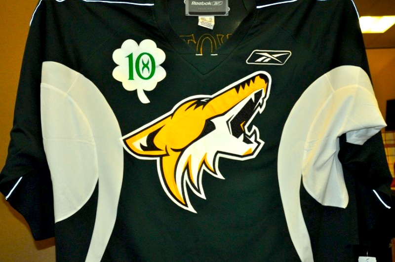 Coyotes go green!The Phoenix Coyotes will be auctioning off another set of special edition, autographed practice jerseys — this time to celebrate St. Patrick's Day.
I know I mocked them the last time they did something like this, and it didn't go over well. But this time I'm keeping my mouth shut. Is it silly? Yes. Is it for a good cause? Yes. Let it be.
Here's what the Yotes say about the auction:
Each Coyotes player has autographed a one-of-a-kind St. Patrick’s Day jersey with his name and number on the back. The jerseys will be available for bidding beginning at 9 AM Thursday, March 11. The auction will close at 10 PM on Tuesday, March 23.
Proceeds from the auction will benefit Coyotes Charities, which is dedicated to enhancing the quality of life throughout Arizona communities by supporting non-profit organizations that promote healthcare, education, cultural arts and sports-related programs for children.
Also take note of the number on the front in a little four-leaf clover, leaving no stone unturned for the leprechaun coyote (he's even gold!).
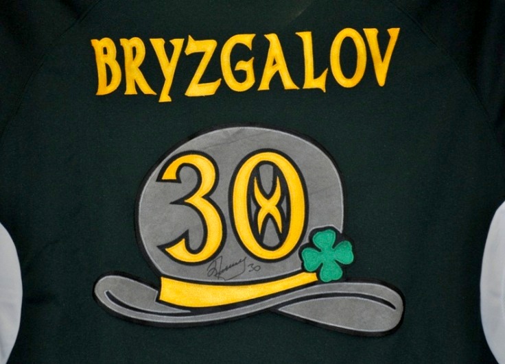 Bryzgalov's leprechaun jerseyNow I can't let you go without seeing the back of these bad boys. It's got the little leprechaun hat and everything.
The good news for Bryz and his teammates is that they won't actually have to wear these in public. They're simply being customized, autographed, and sold to the highest bidder.
And if you want a shot at being one of those bidders, you can find all you need to know at auction.nhl.com. They even have a Sean Burke #1 "alumni jersey" on offer. Interesting.
All right, that about wraps it up, but I do have one more link for you. If you'd like to see the full jersey design, MVPToday.com has you covered. Though beware their green is not quite the green seen in these photos.
Thanks to Dan for letting us know about this.

Reader Comments (18)
Those Coyotes jerseys should burn in the hell the Flames jerseys come from.
I noticed that those Flames jerseys weren't Rbk Edge. The stripes are way too thick and it overall looks heavy. But with us already knowing what they "should" look like, we can't be surprised, only disappointed. My biggest fear is that they'll somehow screw the striping up, like the Oilers and Panthers jerseys (and the Ducks', to a lesser extent), with the incomplete stripes.
I think if the Flames modeled their jersey after what the Bruins have, that'd be great. Remember the huge stripes they had at the bottom of their black jerseys pre-Rbk. Now they're traditional, and the colors work perfectly. If Calgary did the EXACT same thing, I'd totally buy that jersey.
Hurray, the retro's coming back! I always loved that jersey, and the fact that we went 5-0 in it this year makes it all the sweeter. :D
WTF PHX and CGY make somthing new!
Please no more RBK Edge crap
Glad the Flames didn't screw things up and make a new third jersey. The retro jersey is awesome and everyone seems to like it, so just continue to use it as a third next year. Pens take note, don't fix what is not broke.
I want the Oilers to make the white retro their away jersey, then we can see the flames retro vs the Oilers retro. That would be awsome!
last night i was at the game and won backlunds jersey off his back... though he didnt play
Couldnt have shown a player who's actually gonna be wearing the Flames jersey next season?
Very happy the Flames are keeping these around. I'm a long time Flames fan and it's great to finally see them wearing the correct jerseys again. I hope they wear them about as often as the Oilers have this season.
Flames Jerseys.
Biggest. Cash Cow. EVER.
It seems really unlikely they're going to screw up the striping or change anything. Just look at Edmonton's retro-cum-third-cum-home jersey: that looks exactly like it's supposed to. The Flames' retro/third will, too. Only difference is, the material, and instead of having the NHL logo in the collar it'll be on one of those weird-ass little flaps there just inside it.
@Chris: I always felt it would've been nice if the Wild and Thrashers had had their first games against the Stars and Flames, wearing the old jerseys of the old teams, as a torch-passing moment. Fans of those teams may feel differently, but I think it would've been a nice touch.
What I would love to see is an end to that stinking tail design of the Edge jerseys! Seriously, nobody's tucking their jerseys in on a regular basis, and is it seriously going to impact performance by squaring off the jersey bottoms? If they did THAT, it would be nice.
And plenty of teams have straight, complete stripes on their sleeves - Rangers, Blackhawks, Sabres 3rd, Red Wings, Bruins, Oilers throwback, Devils, Coyotes, Sharks, Pens 3rd, Maple Leafs...
@KEVIN Y
I'm not sure what you mean by stripe thickness. The reebok edge should be able to reproduce the tradition Flames design fine, that is if you ignore the curved waist hem and large slanted collar.
Love this flames design. By far the best in franchise history, i hope they bring back the white and ditch the futuristically ugly corporate design.
Glad to hear the Flames are bringing the retros back as a third. Let's hope they eventually become the primary uniforms in a year or two. Adding black to the Flames' look is like the Bruins adding red to their uniforms.
As for the Stars and the Wild, I hope the Stars and the Wild would work out a deal to give the North Stars' name and trademark to the Wild. Like the Flames' retros, the North Stars' simple green, white, and gold uniforms with the N-Star crest were beautiful. Like the Flames, the North Stars started ruining their look by adding black during the 80s before changing to all-black and going with the Stars wordmark logo after their last trip to the finals.
@EricRomain
Maybe "thick" isn't the right word for me to have used. Maybe it's because the stripe is along the very bottom, instead of "floating". It was like that with my Kings jerseys, pre Rbk, and the Bruins as well. It looked like the bottom was too much because there wasn't a lot of contrast. By that, I mean the stripes kinda drowned out the actual base color of the uniform so much that it looked too busy.
To me, it just looks like there's "too much" striping along the bottom. Again, I compare it to the Bruins jersey. I think Boston has the perfect width and perfect location that it doesn't have that same problem that I think the older jerseys had.
The Flames should go with these full-time, and produce a white road version. Simple is better. No piping! No black!
Doogie2K - this is one of the gripes we have had against the Thrashers (other than a crappy team that keeps "rebuilding" every 2 years by selling off their stars, with the same clueless GM...but I digress!) is that they refuse to acknowledge the Atlanta Flames. Fans have been asking for a game where they don the old flaming "A" and play Calgary. It would be great. I live near a watering hole owned and frequented by former Atlanta Flames, and this is a sore subject with them. They want to be part of hockey in Atlanta - but the team feels there is no interest. The Atlanta jersey was one of the best in the league, simple and timeless. We thought it was great when Calgary added the logo for the alternate captains.
G-Man, I agree with you whole-heartedly! And the Oilers need to do the same as well. I just hope my Canucks get rid of the orca asap.