


Official: NHL All-Star Jerseys Revealed

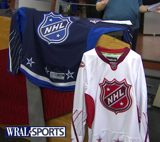 2011 All-Star jerseys / from WRAL-TVThis morning on WRAL-TV, the 2011 NHL All-Star Game sweaters were officially unveiled in the host city of Raleigh, North Carolina.
Carolina Hurricanes marketing director Doug Warf stopped by the station's studio to show off the new jerseys. In his segment, he talked about some of what went into designing them:
- Colors, six of them, were selected because they represent the majority of teams in the NHL. (At least they kept black out of it.)
- NHL shield was used as the crest because we won't know the team's names until the captains are selected. (Which we knew already.)
- Warf says the captains will be picked a week from today on Jan. 18.
- Red team is "home" while blue team is "road." Warf doesn't say how that was determined since the dark jersey is typically worn at home in the NHL. (Maybe because the host team color is red?)
- Reebok is trying new things. Oh geez.
This unveiling comes just a day after we got an early look at one of them here at Icethetics. Now we're able to have a good look at both of them.
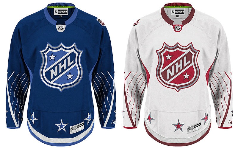 2011 NHL All-Star replica jerseys / from NHL.comAs predicted, the blue sweater is the inverse with all of the same design elements as the red one. Aside from the colors, the main difference between the two is that the All-Star patch is on the left shoulder of the blue jersey while it's on the right shoulder of the white one.
The league confirms the opposite shoulder will bear the player's home team logo. That article also contains more details about the uniforms including Reebok's new Smoothfit numbering and lettering. Good luck buying an authentic customized jersey.
As a side note, the more I see the red jersey, the more the lighter shade starts looking like pink. But I'm sure it'll look fine under the lights on the ice. Well, I hope. Also today, with just 17 days until the Fantasy Draft, the full 42-man All-Star roster has been announced. Half of that group has never been to an All-Star Game before, so that will be fun.
Who do you think the players will pick as captains? And who do you think the captains will pick? Or instead, if you were an All-Star captain, who would you pick? List your rosters below (paragraph form with commas please, bullet lists will be deleted). And don't forget to tell us what you think of the two sweaters.
 Chris
Chris
 Authentic 2011 All-Star jerseys / from NHL.comJust to clear up some confusion, the images of the jerseys above show the Premier replicas that fans can buy. The photo to the right shows the "authentic" versions, as seen on Shop.NHL.com.
Some of you have noticed the difference in spacing between the collar and the NHL shield — the area where the sweater number will go on the actual player jerseys.
As I've mentioned before, these images are not true photographs of the jerseys. The are simply meant to advertise a product. The process starts with a photo but most of the elements, including the crests and patches, are added in later with Photoshop.
To demonstrate this, look at these two different sweaters and notice all the little details like the creases and folds. There's no way you can take two separate photos and end up with exactly the same creases. Just not possible. So one photo is taken and the colors are altered to match the product.
What I'm saying is don't expect these to be dead perfect. We'll probably have to wait until we see a player's actual jersey before we know the exact arrangement of everything.
Chris
 All-Star jersey chest numbers / from NHL NetworkWhy wait? Our buddy Glen C. tweeted this image which shows the numbers on the front of the new 2011 All-Star uniforms.
Certainly an unusual placement for a sweater number. And most of the comments you're going to read here will be nothing more than horrible hyperbole.
So for something different, I'm going to tell you why All-Star Game sweaters should be bold and different. For one, it's the league's only chance to get you outside of your comfort zone.
They're worn one time (maybe twice) and then they're gone. But for that short interval, they have the attention of every hockey fan in North America and they get to grace the backs of the sports most talented.
Don't misunderstand, I love the traditional look the brought to Minnesota in 2004, but I'd hate to see it every season. I'd rather see the league's All-Star designers draw outside the lines once a year and give us something new and exciting to look at for a change. Every third jersey is starting to look the same now.
So I challenge every commenter to tell us what you like about these jerseys. And sure, you can't be a smart ass about it, but no one will be impressed. Let's get outside that comfort zone and recognize that once a year it's refreshing to see something unique. Not every jersey has to be based on the limited sweater design sensibilities of the 1910s.

Reader Comments (52)
These aren't as bad as it could've been. I'm a traditionalist, so to me ASG jerseys haven't been good since 2004 in Minnesota.
I see the captains being Crosby and the other either being H Sedin, Stamkos or Chara...
I think the captains should be the two most charasmatic of the bunch. I think if you had two quiet players with little to no personality, it could make for a real boring draft. If you had, let's say, Iginla and Ovechkin? Not sure if those two work of the group of players that are there...but not two quiet guys.
One other option is pitting teammates against each other. Maybe Kane and Towes are captains, or even more intriguing maybe, the Sedin brothers each take a team. How about Tim Thomas and Carey Price each select teams, or a combination of goalies?
As for the sweaters, I don't mind 'em. Not crazy about the white one, but I dig the blue one. I personally like the old orange, black and white ones from the 80's and 90's, but these are okay too.
I want to see the numbers!
6/10 - I actually like where this is going.
I still think the All-Star jerseys should be the home/away jerseys of the host NHL team (incuding numbering), with the NHL crest as the logos.
Goalies should be captains just to break with tradition. Game doesn't mean anything anyway so why not?
If Reebok is going to try anything they should try either a) staying the same or b) reverting back to old-style sweaters. I'm one of the few who like the EDGE style, but I really hate the collar and the Nike-esque panel at the bottom of these jerseys. And that's not even going into the aesthetics of the designs themselves.
Chris-
Let me preface this comment by saying i am a illustrator / designer. Something really has been bothering me about these jerseys. It is understood that the jersey will have numbers on the front above the crest and below the collar. Except that every image we've seen of the CLEARLY shows that the blue jersey has way more space allotted then the white one. However, i have also noticed that the white one isn't the authentic cause it has the Reebok size tag on the bottom while the blue doesn't and appears to be 'more' authentic. Additionally, the white style jersey has a very rounded bottom while the blue is much more tapered. Could it be the white style is cut very differently because it is a replica for fans and they don't expect fans to get numbers and such on them because of the new format? And that one last tidbit, the one image with both jerseys (with the white BG) also appears to have had the large NHL crest photoshopped on. Thoughts?
Ian
Hi Ian, the trouble with looking at these images as the be all, end all is that they're computer generated. They aren't true photographs. The images begin as a photograph of a sweater, but the crests and patches are all added in after the fact leaving lots of room for error. In other words, these aren't true to the actual jerseys. I don't think the crest on either sweater is exactly where it should be. White is too high, blue is too low. We'll probably have to wait until we see an authentic on a player before we know how the numbers below the collar will look.
Just updated the pictures in the post to show the differences between the replicas and authentics.
im pretty happy with this. To be honest I was bracing for i knockoff of the canes' jersey, so this wa a pleasently surprised by this. But I would also like to point out that this is another dark blue jersey
anybody else find these extremely boring?
The players should make a deal that Crosby and Ovechkin all get picked last and that the Sedins cannot be on the same team. Make Cam Ward and Eric Staal the captains. That would be fun for Canes fans.
And the judgment I reserved about the jerseys? Judgment passed. Verdict: yawn. Whoever said it first is right on the money. It would be way better if the ASG jerseys had the yearly logo the front. Then it becomes more iconic of specific years, stories, players, cities, etc......These ones will be quickly forgotten the day after the event.
oh dear lord!
The Red team sweaters should be red, not white, imho. White sweaters on white ice never look as good as a colored sweater. Red vs Blue would look awesome, and those folks with black-and-white HDTVs will figure out a way to cope..... ;-)
Chris,
If you watch the NHL.com video feature talking about the possibility of the Sedins being split up in the ASG draft, you can see a replica jersey with the Number 11 on the front, just to give readers and yourself an idea as to what it would look like.
All in all these aren't too bad. I like the colors but I'd like to see the ASG jerseys share the same design as the host team's away/home jerseys just like MLB has done with their BP ASG jerseys for a number of seasons now. I really like that uniform connection between the host team and the game from a collector's standpoint. Otherwise, the only real distinguishing association between the jersey and the host is the patch.
Also, I really really want to see the name/number font! To me, this is often the make or break of a good jersey. For example, the big block font on Columbus' third really killed that design for me (if the fact it looks the same as Pittsburgh and Florida's already didn't ruin it). However, I'm REALLY worried about this new Reebok "Smoothfit" lettering / numbering when I read that this new system provides: "the ability to include a unique design on the back numbers." I think that opens the door to advertising on the numbers! Please let me be wrong.
Looks like something from the KHL if they had an all star game, I want to see black and silver all star jerseys!!!!
These are over designed. Not for me.
I think the retro thing has been over done, so trying something modern is OK by me, but this has FAIL written all over it. The collars are horrible, the sleeve striping is reminiscent of the original horrid Nike swift design, as is the sudden cut off in the pattern. Not a fan of the NHL crests either. I don't mind the colours, but the extra stars just over do it. Over-all, the design just seems a bit too light and feminine for a contact sport.
Wait, in the final picture, the all-star patches are BOTH on the right shoulder. Shouldn't the blue jersey have it on the left, like in the other pictures?
I really really like 'em.
I think they are no better nor worse than the all-star jerseys of the past. What if they kept the same color and layout of each player's home a road sweater and changed the crest to the all-star game's logo? Anyway, here are my captains and teams:
Team Malkin- Assistant Captains: Ovechkin, D. Sedin
Hiller, Ward, Price, Byfuglien, Letang, Keith, Green, Enstrom, Burns, H. Sedin, E. Stall, Kesler, Kopitar, Sharp, Erikson, Iginla, Kessel, Elias
Team Crosby- Assistant Captains: Toews, Stamkos
Thomas, Fleury, Lundqvist, Lindstrom, Chara, Weber, Boyle, M. Stall, Karlsson, St, Louis, Nash, Richards, Kane, Perry, Duchene, Giroux, Backes, Hemsky
I kind of like it. It is modern without being extremely flashy. i just don't like the numbers on the front, but then again I don't like numbers on the front of jerseys. Dallas has been the only team to get it right in my opinion. But back to the All-Star jerseys, they're nice threads.
I'm kind of glad that the sleeve piping is only to the elbows, as any more would have consigned this to being a baseball themed shirt. The shirts are pleasing to the eye, which is good news as going to far outside the box can sometimes push a shirt over the boundary as such. However, I don't know how far outside the box the designers could go with an all star shirt, I mean it has to be something that has stars on it, without being a Dallas shirt, and the NHL sheild.
Still a red and white v blue and white isn't exactly a colour scheme that can go wrong is it??
Generally I think they're ok, but I'm not convinced about the collars.
Anyone else noticed that the All-Star patch is on the right shoulder for both jerseys in the screengrab from the NHL network (11:46 update), unlike every other image of the jerseys...
I like the jerseys, they're different, although I'm not too crazy about those diagonal pinstripes on the sleeves.
Except the arm stripe snot runs....not bad. I wonder how they'll indicate C's and A's. Maybe we can go real outside the box and start painting their faces too. :)
id give these a 5/10. quirky enough for me to like, but i dont like the weird striping on the sleeve/back numbers. i do like the #s above the crest, sort of a futuristic feel. maybe in the future lower the crest and make the numbers bigger.also like the idea of a all-silver jersey or another weird color. but we'll never see these again anyway so its alright i guess
I'm actually surprised to find myself saying this... I don't mind the number on the front of the jersey. It's not my favorite, but it works. Well, at least the 2-digit number. I'm still not convinced that a single digit centered between NHL crests is going to look that great.
On the picture tweeted, the patch on the shoulder is on the same side instead of the image of the jersey ! Why ?
@Kevin Y & @Dan, yeah, I did notice that the patch is on the right shoulder for both jerseys too. That's a little odd seeing as every other picture I've seen has the blue jersey having the patch on the left.
Anyways, the collar looks better than I expected. I thought it would look really bad the way it was made but if the announcers on the NHL network can pull them off, then so can I. Really thinking of getting one now.
Also the numbers centered in the jersey actually look pretty sharp. Is it me or are both jerseys different fonts?
And finally, to answer the question of how the jerseys will be sold, I have a theory the NHL might have pre-selected some players to certain teams to allow for greater merchandise sales (i.e., Ovechkin already selected to play for the blue team, and the NHL tells the captains that they need to have so-and-so-player on their team, which allows the NHL/Reebok to make replica jerseys and send them out to retailers the day of this all-star draft).
Just a theory obviously but I see it as being very much possible. And has anyone thought how cool it would be to have the Sedin's playing against each other?
Still haven't seen how the numbering or lettering on the back of the jersey look like. Does anyone have a picture by any chance? I was hoping I could customise a jersey on shop.nhl.com to see how it looks but no success there.
And is it just me or are the fonts on the numbering for both jerseys different?
I actually really like them. I like the variations of reds and blues instead of having just one shade. The arched lines are cool, however i just dont like how they stop half way up the sleeve. I think they could have done something else like extend them all until they disappear underneath the arm, round them off, or change the angle. I still llike the way it looks though.
When I first heard that the numbers were going to be located above the crest, I didnt really know how they would manage that. But seeing the number that big just looks out of place and awkward. I think the numbers in that location would be better if they were smaller , almost similar to the size of the nhl logo found on the collar, or maybe slightly bigger. Kind of the way some nfl teams have their team word mark located above the numbers on the front of their jerseys.
Not too crazy about the number location on the front, but I love the colours that the jerseys are. I also love the crest, it looks really great. Not a huge fan of that weird collar, I think it might rip easily because it isn't really a smooth transition.
One thing that I keep laughing about is how the arms of the blue jersey with the stripes look like a blue whale.
I definitely like the jerseys though. Good work RBK and NHL. Much better than those weird different coloured arms jerseys of 2009.
I actually like them. They look pretty clean and simple, and not too busy like the past few all star jerseys of the reebok era. The color schemes work for me too. I hope Dustin Byfuglien ends up on the blue team, I'd totally buy one of those jerseys.
I'm not a fan of the collar or the upward arm stripes that seem to go nowhere but other then that they are ok. I would have like to have seen a lace up collar instead but that's just me.
The patches are on the same shoulder in the last picture. I don't get the number placement but something different, whatever. In the last picture the blue jersey looks darker then every other picture and the red jersey looks lighter then every other picture.
Although it might seem odd, I think the numbers on the front are a great idea, especially considering the "spectacle" of the event. When I first got into hockey, I had trouble identifying who all was in a photo if the camera happened to face them directly in a way that I couldn't see the numbers on the sleeves. For an event like this, where players are out of their norm, having the numbers on front makes it easy to identify whose who in every photograph and every frame of video. For a sport trying to rise to the top of U.S. fandom, I say smart move and kudos to whomever came up with it.
I would have loved to see the numbers inside the shield, replacing the bottom right star. That would have been cool.
Pretty much the one thing I like is the shield logo with the inclusion of the stars on it.
I do kind of like where they're going with the thicker vertical line, but the skinny ones going the opposite direction look odd to say the least. But actually seeing Bill Clement with the white one on... the holiday season mentality must still be lingering in my brain, because his sleeves just remind me of candy canes.
"Not every jersey has to be based on the limited sweater design sensibilities of the 1910s."
They say that what's old is new again, but sometimes what's REALLY old can be new again, too! Check out this photo, from the 1910 Montreal Wanderers, who are said to be the first team in professional hockey to add numbers to their sweaters. Look where they put them in their first season!
This is the only example of wearing numbers between the collar and the logo that I could find... period. I wonder if the person who thought of this saw this photo or came up with the idea on their own? Having seen this picture a few times, I find that I'm quite fine with the number being there, and now that I've seen the actual jersey, I kinda like it. I'm just worried that the numbers on the back are going to be a bit... busy with those curved lines! Guess we'll see soon enough.
Hmmm... All I can say is "Could've been better.
Pros:
-NHL Crest
-Numbers Above the Crest makes it a Little Unique
Cons:
-No Waist Striping
-Arm Striping Should have gone all the way up the Arm
-Number Font Could've Been Better
-The Collar
-Colour in the Armpit Areas
(I don't get why you need colour or striping where you can't see it half the time)
-Also, I agree with what was said above, Why not Just have a Solid Red & Solid Blue Jersey?
Overall: I like the Crest, that should stay in the future, but the jersey shouldn't.
It's an awful, yet sleek design. 2.5 Out of 5.
UPDATE: I'm actually liking the numbers on the front. its not terrible and certianly not retro. Seriously, retro was fun at first now its just old and boring? i wish more teams did what the caps did, a retro themed rebrand without "going retro"
"Why not Just have a Solid Red & Solid Blue Jersey?"
In 2002 they played with a sold burgundy vs a solid blue and the players complained that they looked too similar on the ice. There were a lot of giveaways in that game as a result. It was the only time they did dark vs dark and they haven't gone back - and for good reason. It may not look good, but one team has to be white.
i love them, i can't wait to get ovie's and the wife wants a mike green. so i hope they are on different team so we can have one of each
I don't understand the fact that he uses white w/ the red canvas for the designated "home team". That's not how we do it in hockey any more and if they wanted red to be "home" to signify the Canes they should have done a red jersey and a white jersey for blue
I am not a fan of these jerseys. While I understand that these should be a little more outside the box, as Chris noted, but there's such a thing as going too far, and I think these are an example. Now, I haven't seen these in person, or on a human yet (well not in anything outside of a still photograph, so the pixel that Chris posted from the NHL Network doesn't count), but from what I have seen, there appears to be to many things going on with it, especially on the arms. I do like that they went back to having the player's team logo on the jersey, but the number on the front above the logo comes off as an eyesore, and unnecessary. However, to hear someone say that were dealing with many 1910s design philosophies is, in my opinion, assanine. I think that the jerseys that have been released recently have been rather decent, with the Ducks being an obvious exception, and it seems that every time a jersey tries to step out of the conventional norm, it seems to abysmally fail. The only one that seems to have been good was the infamous Buffa-Slug jersey, and that was bad only because of the logo. The jersey itself wasn't half bad. The current "awful" jerseys from an aesthetic standpoint that are in the league currently, are the ones that lack any form of tail striping, and half of them can be fixed just by adding that one little feature. You can still be conventional and go outside the box, Montréal proved this in 2009. I just don't like them reinventing the wheel for their jerseys every single year. They should only change them after each Olympics. This way, there can be some familiarity, while reinventing the look every so often.
I wonder if the could've done a red jersey and a blue jersey, no white. As long as the colours were bright there should be enough contrast. As for the jerseys, I like them, the number on the front is interesting although I wouldn't want that to become an NHL trend, but for these jerseys it looks cool.
Nice find, Dallas! Oddly enough, looking at those Wanderers numbers, they kind of look like a font halfway between traditional block numbers and the LA Kings' current numbers.
I've always wondered why we have to have a 'color' jersey for one team and a 'white' jersey for the other. Why not just blue and red? The light/dark stuff was because you couldn't tell the teams apart in the 50s on the B&W tv's. Not really an issue any more... BTW the screenshot of the NHL video has the red jersey crest looking orange...