


All-Star Sweaters from the Back
 On Tuesday we were inundated by images of the new 2011 NHL All-Star Game uniforms. But there was one problem. All we saw was the front. And that's left us with a few questions.
First, what does the design on the back even look like? And second, how are the numbers and surnames styled? Today we have our answers.
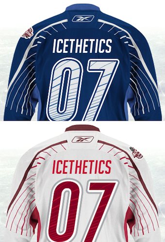 Backs of All-Star jerseys / from NHL.comThe NHL's online store now has the sweaters available for customization and that means we can preview the numbering and lettering in advance of All-Star Weekend.
Of course we won't know who'll play for which team until the Fantasy Draft on Jan. 28. So if you want to get your favorite player's name and digits stitched on the back, you'll just have to guess until then.
One interesting feature you notice straight away about the design on the back is that, while we all thought the pinstripes just stopped at the elbow, it turns out they didn't. They just teleported to the other side of the sleeve and kept going.
Some have called it a baseball-inspired uniform element. I'm not so sure. But regardless, I do like it. It's one of those things that I've not seen on a hockey jersey before.
I talked Monday about how I liked the outside-the-box thinking on these and all All-Star jerseys. One commenter then said, "there's such a thing as going too far."
I have to laugh at the overblown rhetoric for a simple website like this. Going too far? The Florida Everblades decorated their jerseys like Christmas trees this year. That's going too far. This is an attempt at something new that still keeps a very professional feel while attracting a younger crowd.
And sure, you're free to disagree. Many of you seem to be traditionalists when it comes to hockey sweaters. But personally, I hope you don't win out. Because that will make our sport look really dull. And I like that it stands out, especially at the All-Star Game.
 Chris
Chris
 2011 All-Star jersey numbers / from NHL.com
Even though no one asked, I thought some of you might like to see what all of the numbers look like. So rather than forcing you to go to the website and do it yourself, I've saved you some time. They're pretty standard, and the font is the same on the white/red jersey as well.

Reader Comments (38)
I think I actually really like the pinstripe look.
Like you said earlier, the all-star game is an opportunity for the NHL to experiment with new designs and jersey concepts, and I think they nailed it with these jerseys. It's something unique that looks good and will catch the eyes of people out side of the NHL's target audience. Well done boys!
go Phillies! Oh sorry thought that was Phillies jersey for a second.
The Slurpee jerseys. blech.
I made my comments on Monday about baseball shirts, so I'll refrain from that once more. My concern will be the numbers and name on the Blue shirt. The lines going through them will break them up for fans up in the higher reaches of the barn, television may have some difficulties picking them up clearly as well. I say that as we've had similar issues with stripes in numbers in soccer before now, and teams have had to change them mid season.
As for the whole thing, what bothers me now with this shirt, apart from the baseball issue, is why do Reebok seemingly think that going half way with a design and then stoping it, like they did with the stripers on the sleeve, and the half stripe on the Oilers uniforms sleeve is actually good? It's annoying and doesn't look good, it's as if they've sat an exam and ran oout of time to complete the jersey.
Chris - just out of curiosity, and maybe I'm missing something obvious here, but why did you decide to go with 07 for the jersey numbers? Using a round number and a thin one, maybe?
Jason: I started the website in 2007. But actually your theory works too.
Not sure I like the pinstripe look. I don't even like it on baseball uniforms. But I love the outside thinking. Hopefully in the future we'll see teams start adding designs in their numbers or different stitching patterns like what Buffalo did on their new jerseys.
Ahhhhh!! My eyes!!!
Those pinstripes are terrible. And that is saying it gently.
I'm curious, the numbers on the blue jersey look like they are just blue and white, but the numbers on the whites appear to be dark red, lighter red, white, and silver?
i have to agree with the all-star game affording the opportunity to do something different, and really don't mind the jerseys, though i like the red better. however, i'm not crazy about the numbers on the blue jersey. the stripes on the red, a lighter shade offer a clean, understated effect, whereas the royal stripe thru white number provides too much, in my opinion anyway, contrast. would rather have seen a more "faded" blue, or light gray perhaps.
anyway, love the blog and have been coming here for years, as i'm a 40 year old moron who can't buy enough hockey jerseys, nevermind the fact i have no place to where them!
Personally, I don't think numbers look good with anything but a solid color to fill them in. I tend to follow the less is more mantra when it comes to the amount of detail in jerseys, which is probably why I love the vintage comeback going on right now with the Canucks, Sabres, Oilers, etc.
For one-time scenarios like an all-star game, however, the pinstripes on the rest of the jerseys might actually look decent on the ice and at the very least are fresh concepts.
KZED, from what I can tell the thinner stripes in the numbers might actually be light blue like the sides and collar, though it might just look that way because they're not as "bold" as the thicker ones.
Now that we can see the back, I really like the thick stripe that wraps around the shoulder and arm even more. It's a divergence from everything pretty much being straight lines, but doesn't "shock the conscience," to borrow a legal term. With that said, I'm still not a fan of the thinner stripes (the white jersey looks even more like a candy cane as I commented in the previous post), but at least it kind of evokes that shooting star imagery. My take on the stripes in the numbers is that it look better in two shades of red because it's more of an accent, versus. the white and blue is more visually jarring.
I like the extra dash of crazy, if you will. This isn't a permanent jersey - it'll be worn for one game, and it'll be redesigned next year. Why not try something new to see if it sticks?
Traditional jerseys are fine for most games, but there's no negative to trying something new once in a while, and the All-Star game gives us the perfect avenue for it.
@LEIA: i dont think the lines will break up the numbers. i imagine it will be along the same lines (no pun intended) as the sabres third jersey. the stitching through the numbers is only visible from close up. when you look at the jersey from far away, the lines seem to disappear.
as for the all-star jerseys, i like them. my favorite ones are still the eastern conference ones from 07. i also like the "out-of-the-box" thinking. i think these will look great on the ice. hopefully the pants arent full of pin striping though.
I gotta say I'm fond of these jerseys from the back, but I'm still not sure about them from the front. That damn centered number still doesn't work for me. Otherwise (while I know I'm in the minority here) I really like the blue. The white....welll....not so much
The pinstripes are pretty bad; I think they only work in baseball. Even basketball jerseys with pinstripes are pretty hard to look at. My vote would be for the players to just wear their team jersey (home, road or alternate) at the All-Star game to represent their team and just have a special All-Star arm patch or front crest sewn on.
I actually think these might be the nicest All-Star jerseys since the old classic black/white/orange Campbell vs Wales look of the late-90s. Well done!
pinstripes?!?!?! wow, really hope this isn't going to be the next jersey 'trend'........
sorry, but these just look awful, so i'll stick to wearing my classic white/orange/black wales & campbell conference jerseys thanks!
It's an out-there design, to be sure, but we've had some out-there designs in the past, like the 1994 star-pattern jerseys (which, aside from the horrible 90s teal and purple, were a solid design), or the 2000 "millenial" jerseys that put players in blue or red, and goalies in white; I'm willing to give them a shot.
Like some people, though, I think it might've been better to feature the host team's red more prominently, and have the blue-trimmed jersey be white. Unless this might be a sign of another change in the league... could this be a harbinger of a return to home whites in the future? Nah, probably not... but it is fun to speculate!
andrew from NHL Uniforms.com is going to kill himself when he sees this.
these jerseys are sweet!!!! what ever happened to making 3rd jerseys and alternate jerseys unique and groundbreaking?! some of these new "retro" 3rd jerseys are annoying and ugly, they already had their glory days why can't we make some modern looking designs? one of the coolest jerseys I've seen are the oilers 3rds 5 or 6 years ago, the navy with the silver and navy oil drop logo, nothing anyone has ever seen before, now their back to their eyesore tacky blue and orange jerseys. I've been so excited for the caps to come out with new 3rds with the eagle that is currently on their shoulder patch as the prominent logo but instead it looks as if they will go the way of the retro and disappoint. Good on the NHL for mixing it up and trying something new!!!
i get what you're saying Chris about the "outside the box" ideas, but there's just too many elements to this sweater. i think they went too far in putting the numbers above the NHL crest and then having the striping in the numbers as well. also don't really understand the need for all the striping. on the arms or on the back would've been more than enough, but then to randomly jump the stripes from front to back...wtf? doesn't make sense. they're trying to do too much with a sweater that doesn't need it.
A little off topic, but as you are talking about creative jersey's, why do you so rarely mention American and Canadian University Hockey. I find they have the most unique sweaters in the game; just an opinion. I love your blog and keep it up!
vintage needs to arrive at the winter classic. looks fresh; u can't go wrong with vintage
this keeps getting better
Yeah, these are the worst all-star jerseys ever. I don't know why the NHL keeps borrowing concepts from other sports but it's gotta stop. The stripes on the back remind me of the rain on those horrible Tampa thirds from the 90's.
the most annoying thing about the stripes is that some are thicker and more bold than others...makes no sense at all!
The front of these look good. NHL logo can't go wrong.
The backs look like a typical Reebok fail. It's as if they're 'trying' anything to not look traditional.
Lines through the #'s look horrible.
I'm impressed that the NHL is trying out new designs. However, how come no one makes a mention of experimenting with colors? I would love to see the NHL try to stray away from the traditional color spectrum and venture out a little more, a la European soccer. NHL 11 has allowed me to experiment a bit and let's just say, there's plenty of options out there that aren't being explored and stay within the Reebok Edge boundaries..
I really like this look. It reminds of something you'd see on something new and exciting, like a soccer jersey. Hockey will always be able to rock the classic look, but it's nice to see some innovation come out of it too.
I understand now...instead of someone wiping their nose with just the end of the sleeve, they moved the snot lines all the way down the back and then on to the front. ;-) Sorry for being a smart ass...I'm just not a fan of the sleeve work. Love the colors and the shields...interesting concept for the placement of the numbers...haven't decided how I quite feel about that yet, but I just really think they ruined it with the thin stripe work.
I love that Reebok can do all these fancy designs on their jerseys, but the Dallas Stars couldn't keep their amazing Star Jerseys. It's just becoming one big joke to me. The teams that were forced to deviate from their awesome designs because of the "Constraints of the new fabric" are basically being mocked by Reebok now...
The more I think about it, the more I like it. I love the traditional look on sweaters, but it's been played out. I'm at a team that's only been around for 12 years, and we've been talking about a vintage sweater. 12 years. Even though I love the idea, I also have been trying to promote a modern sweater as well. And I think the NHL is doing this right. I've learned that hockey is a very tradition-oriented sport. And the thing that most people don't get about traditions is that they change, ironically, due to human nature. And, to me, what they are establishing are new traditions, with the Winter Classic showcasing vintage style, and the All-Stars showcasing the new styles. It makes sense to me in many ways and I love it. Just trying to decide which one to order.
Absolutely hideous.
"Spiderman, Spiderman, does whatever a spider can..." That's what the striping reminds me of..."spins a web any size, catches thieves just like flies...."
I think Chris is right about allowing the NHL to be creative on the All-Star Jerseys (better here than on your home teams jersey). I am interested in what the number design will reveal; I hope the NHL is not considering going to silk screened numbers. I was also interested in what one of the commenters had to say about the Stars jersey; I didn't know that the Stars ditched their "Star" jersey because Reebok couldn't handle the design. Is this also true for the Avalanche Jersey? I think the Avalanche should go back to their original design with the mountains on it and I think the Panthers should go back to their '96 cup jerseys (back to the Red). I have been collecting authentic NHL jerseys for 20 years and I do like the new Reebok design (although they snag easily) but I think the teams should not be restricted in creativity due to the construction material of the jersey.
Anyone else like the idea of next years All Stars Game being the Winter Classic with throwback ASG jerseys (kill two birds with one stone).
Maybe holding the event in New York or Detroit.