


Uncertainty in Nashville and Tampa
 25 Comments
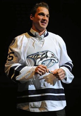 The "limited edition" jersey / Nashville PredatorsDon't bet on this jersey. (Pun.)
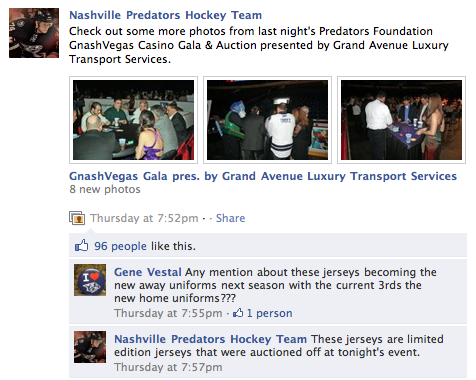
The Nashville Predators hosted the GnashVegas Casino Gala and Auction on Thursday night. It's one of those events teams put on to let rich fans rub elbows with players in a casual setting. And it's only noteworthy here because of what the players showed up wearing.
The jerseys they sported for the event, fully customized with their surnames and numbers (even on the sleeves), are nothing they've ever worn on the ice. Nor will they.
Last month just prior to the inaugural edition of NHL JerseyWatch 2011, we got our first look at what might've been the Preds' new road sweater next season. Only there were many indications that it wouldn't be.
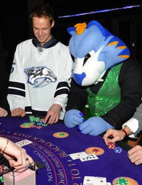 GnashVegas Casino Gala / Nashville PredatorsRumors had circulated for some time that the Predators wanted to simplify their color palette and exile their present home and road uniforms in favor of their current alternate along with a white version of it.
Said white version showed on a silent auction table during a game recently. It fanned the flames, feeding rumors about jersey changes. As did the fact that every player was wearing one on GnashVegas night. But the club's Facebook folks threw a bucket of cold water on that theory.
They posted a photo album from the event and the first person to comment on it asked, "Any mention about these jerseys becoming the new away uniforms next season with the current 3rds [sic] the new home uniforms?"
The direct reply from the Predators: "These jerseys are limited edition jerseys that were auctioned off at tonight's event."
But the ensuing commenters weren't deterred, one asking, "why do I get a feeling that we will be seeing a lot more of these amazing, fantastic awesomely cool jerseys?"
The team's Facebook operator tersely reiterated, "These jerseys will not be used next season."
Of course that leaves the door open to indeed using new jerseys next season, just not these. Which we already know to be the case, thanks to Reebok. If you'd like to see more pictures of the players sporting their "limited edition" jerseys on casino night, there's an additional photo gallery on the team's website.
And the point of all of this is that we still aren't quite sure what to expect from Nashville in 2011. By the way, I must've gotten more than a dozen emails about this so thanks to all of you who sent in links.
 The other bit of news has to do with the Tampa Bay Lightning, who just unveiled their rebranding plans a couple weeks ago to mixed reviews. Turns out, those plans may not necessarily be set in stone. Or they are and some don't want to believe it.
On Friday, the always reliable Uni Watch posted a note in the ticker that I have to question as more wishful thinking than actual fact. But if it's good enough for Paul, it's good enough for me.
Very interesting NHL news from Cork Gaines, who writes: “One of the Lightning radio broadcasters was on a local station in Tampa talking and mentioned that what they unveiled last week may not be exactly what they wear on the ice next season. He mentioned possibly adding a lightning bolt to the shorts and some other unspecified tweaks. This makes me think we got a mid-season unveiling just so the team could gauge reaction and make adjustments — a concept I’m surprised we don’t see more often.”
First of all, can anyone corroborate this? The Lightning have two radio guys — Dave Mishkin, the PxP dude, and Phil Esposito who provides color for home games. I don't see Mishkin stepping outside the lines on this — unless it was a clever attempt by the team to drop a hint to fans unhappy with the recently revealed changes. Either that or Espo spilled the beans. Which would not surprise me in the least.
I'm not sure I agree with Cork that the midseason unveiling was a way to gauge reaction. That's what focus groups are for. I take Leiweke at his word that the timing was all about making sure they got the new logo out there the way they wanted, rather than some crappy website (like this one) leaking it before the summer.
Management said they expected some resistance from fans as it's a pretty sweeping change. But I think they may have gotten a little more than they bargained for. And one thing they've reiterated since the beginning is their intent to listen to the fans. If tweaks are being considered, I'd chalk it up to that.
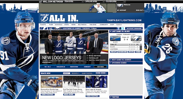
 Lightning customize logo for social avatarsOne more thing. I know the last time I talked about the Bolts, I referenced the makeover of their web presence but I didn't really offer much outside of the background image from the website. They also added new social website avatars, customized versions of their new secondary logo.
On the actual logo, it reads HOCKEY CLUB between the two mini-bolts at the bottom of the circle. It's replaced by Facebook and Twitter in these versions. It's not a big deal, just kind of a cool branding thing.
And in case you haven't checked out the Lightning's website lately, here's how it looks in the new colors:

Reader Comments (25)
Too bad Nasville isn't wearing those jerseys next yr. They're slick. Thing I would like to see most for them is to be wearing Quebec Nordiques jerseys and playing in the north next year.
Looks like the Lightning sent up a little uniform trial balloon! Again, I'll state that I think these new duds are fantastic. But I can see them adding the bolt to the shorts. I noticed that the fans were really perturbed that that element was not carried over from their old uni.
I'm past the logo thing (even though the secondary is far superior to the primary). If they add bolts to the pants and victory stripes I'll be able to sleep at night. Bonus would be silver accents but I don't think that'll happen.
How the Nashville situation is going to go:
We're not switching jerseys next year, but LOOK AT THESE COOL JERSEYS! Now continue to buy the old ones!
Oh, wait, surprise, we are switching jerseys! Cool joke, eh?
I'm not a fan of the bait and switch approach, myself. And if I'm a preds fan, I'm sure as hell not buying a white jersey this year.
You know the more I see the Lightning's new threads the more I start to like them. I am/was all for keeping it simple. A strategy I am thankful that my Flyers employee(for the most part) but I think the Lightning actually made it too simply. I still think they need a third color at least as an accent. But overall, the jerseys are pretty slick.
I would love for the Preds to use the jerseys show above as their road jerseys for next year. It looks like they finally got it right. That being said, blue seems to be making a serious comeback in the NHL. Think about all of the teams that have introduced blue (not just blue, but a darker blue)centric jerseys over the last couple of years...Pens, Lightning, Canucks, Blue Jackets, Rangers, Sabres, Panthers, Predators, Blues and Aves. Did I forget anyone? Seems like dark blue is the new black. As a fan of blue in almost all forms, Thank God.
The white Preds jersey is nice, unfortunately the logo has a lot of white in it - just looks weird and doesn't really stand out. Reminds me of the Canucks' retro stick in a rink logo on the blue jerseys - which looks like a white outline.
I don't remember where I found it, but I know the Lightning put out a pretty extensive survey asking people what they liked, didn't like, what they would add/remove, etc about the jerseys. Then had a comments section at the end asking you to explain, essentially. Maybe they really just had this idea as the base concept and wanted people's reactions/thoughts to fine tune them to a final product.
I really like the preds jersey, its a shame they aren't using it. Wait a minute maybe we should like the "mid-season unveilving" of the tampa jerseys to nashville maybe when the person from Facebook said "they will not be used next season" there actually tweaking them i honsestly do not think the team would pass by jerseys like these which the fans love. plus i doubt there would have been so much speculation last summer about new jerseys if it wasent gonna happen.
Thank god the Predators are not going this route. Don't get me wrong the jerseys are nice enough but in league where blue is becoming more and more common and expansion teams going classic route, its not going to help the team stand out. In fact the best thing the Predators have had going for them uniform wise is their colour scheme. What they should do is embrace that and go back to something like they had from their inaugural year up to the Edge Debacle. Just make the silver a flat grey and you got a great looking, original design.
Okay, Preds. Your first unis were weak, your first third was a horrible color, and your Edge home and road jerseys are worse than your originals. You've finally got a chance to cement a great look, and you're not going to run with it?
Quit toying with us already!
I made that supposition about the Lightning when they launched their rebrand, that getting general feedback this early was a possible consideration for the early release. Focus groups can be wrong, after all...
Hopefully the Preds wise up and switch to the thirds/limited edition. They're the best looking jerseys the team has ever had.
That white Preds jersey is freaking amazing. I have always thought the Preds were the blandest team in hockey with the worst uniforms. But, their current dark blue alternate has changed my mind. I honestly think it's one of the best jerseys in the NHL. Could u imagine if they matched that awesome blue jersey with that awesome white one? Oh my god! The Preds might actually become likable. But, instead, they opt to scrap it in favor of remaining bland. I just don't get it.
I kind of thought that the unveiling by the Bolts was a bit early. I've been wondering how the front office was viewing the fan reaction (which has looked to be somewhere between indifferent and bad) and thinking that there was at least the possibility Stevie Y and the Lightning would do a little tweaking. I hope it's true; the victory stripes simply must come back and I'd love to see the lightning bolts on the pants with an accent color to go around. The Bolts will always be my team; I just hope I see some better duds out of them.
It was Dave Mishkin talking to JP Peterson on 1010 AM. He said there would not be any changes to the new logo, and there would not be any dramatic changes to the uniforms that were unveiled. He just mentioned that what we saw at the unveiling is not necessarily exactly what we will see next year. The only change he mentioned specifically was adding lightning bolts to the sides of the shorts, and even that still sounded like more like a "maybe." In other words, Mishkin doesn't know what changes will be made, but some are being discussed and that he expects some of those to be implemented.
At first I didn't care for the new look Tampa jerseys, but now I think they're great. It's unfortunate they dropped so many colors since they did win the Stanley Cup and built a tradition there, but the new look is refreshing.
I like these Nashville jerseys, however they should simplify the logo to make it fit the simpler jersey striping. Just remove some of the rendering. It's hard to tell from the photos if they kept grey in the jersey itself. It would be nice if they did. Again, teams are dropping colors that make them unique. I hate the shiny silver but grey or the yellow is nice.
i think the whole TB thing is like this...why do a costly focus group that may or may not be able to judge the reaction the jersey will receive when they can just throw it out there to the hockey community which will act like a huge free focus group.
I will still detest the logo, and the lack of black... but if they added the champions stripes on the armpits and put the bolt back on the pant legs... I might just soften my stance on this rebranding.
With the Nashville jersey's it seems like a lot of time and effort to put names, numbers, and "C's" and "A's" to just be worn on special occasions OFF THE ICE for that matter. They do look slick, and I think Jeff P nailed it with having people still buy the old jerseys until next season.
To me, the Preds approach is simply marketing. Let's throw it out there, let people comment on it, gauge reactions, and then come out with either that jersey, or one very similar to it. I like the white jersey, and the blue jersey has been a HUGE hit in Nashville, and it would be foolish not to release a white jersey to complete the set. If anything needs to be changed, there should be more contrast between the jersey and the crest, other than that, I love it! Of course, I'm a Preds fan, so perhaps there is a bias.
That Nashville uniform and their current third are my favourite unis in the NHL. Why oh why would they not use those? The logo especially looks AWESOME in those colours. Chrome with yellow is just a bad look folks. This is SOOOOOOOOO much better.
I think the Lightning should just take thier current 3rd jersesy, lose the word BOLTS on it, replace it with thier current logo...and BAM!!! Better jersey than this new, apparently "test" jersey they've offered.
The current 3rd jerseys are nice, and would sell better if not for that dumb BOLTS logo. It encorporates all the elements and colors (or "colours" if you prefer) that are associated with the Lightning. Wish someone would have told Stevie Y to just make that one simple change.
Well to expand on the Predators White Jersey they have been selling them at the Pro shop for $350. While it is a steep price the ten they had out in the main shop when with in the first 15 minutes they had the doors open. Judging buy how many of the fans have bought the current third jersey and how much everyone seems to love not only that one but this white one. I have a feeling that they are merely teasing us fans or they were using the auction and photos to gauge what the fan response would be and the outpouring of love for it they would be making a huge mistake if they dont. Unless they have a better one up their sleeve (which i highly doubt that they would get another jersey that people love as much as this one)
also thanks for the quote in the article they are fantastically awesome jerseys
Eric - please stop being a moron. You give all of us Canadians who actually think that Nashville is doing well as a hockey market a bad name.
Where did you hear that they sold them at the pro shop? As far as I know they aren't on sale any where. And the players don't even have those jerseys anymore. They wore them all night at the gala, and then were auctioned off at the end of the night. It would have been nice to be able to win one of those since no other person can even buy them yet, but maybe a waste if they won't be used. I would love for them to be the new road third jersey!
I also know for a fact a few tweaks are being considered. no changes to the logo, but tweaks include bolts on the pants (which they deliberated about during the initial design process), victory stripes (which has been a staple in all lightning uniforms those far), and possibly adding silver and/or black trim somewhere on the jersey.
again, they are seriously considering it, but all / none / or some of those changes may or may not happen. but i definitely know they are toying with the idea.