


Canadian NHL Uniform Ranking
In preparation for tomorrow's Hockey Day in Canada, Icethetics has been conducting a series of polls with the goal of ranking the uniforms of the NHL's six Canadian teams. It's the very definition of a popularity contest. And with 18 sweaters and more than 75,000 votes cast, the results are in.
 Rating: 8.6 (#1) 1979/2008
 Rating: 8.2 (#2) 1917Coming in at No. 1 with an 8.6 rating, the Oilers' alternate sweater, a throwback to the days when things were brighter in Edmonton — both in hue and on-ice talent. Wayne Gretzky lifted the Cup four times in those colors. Now Taylor Hall hopes to lead a new crew to glory.
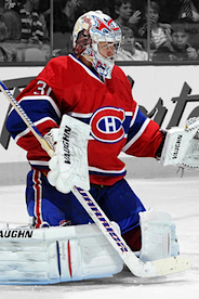
The Montreal Canadiens' red home uniform was a surprising and relatively distant second place with an 8.2. But it had some stiff competition. It's a look that's existed for as long as the NHL itself has. Its place among the best in well-deserved.
Rounding out the Top 3 is another blast-from-the-past retro jersey, this one belonging to the Calgary Flames. Rated by fans an 8.1, it was initially a hold-over from the Atlanta Flames after they relocated in 1980. And though the logo changed, the sweater remained the same for 15 years until the team's look evolved with black trim.
 Rating: 8.1 (#3) 1980/2009
  Rating: 7.8 (#4) 1970/2010
  Rating: 7.6 (#5) 2008
  Rating: 7.4 (#6) 1958/2008
The first white jersey to show up in the rankings appears at No. 4 and it's another throwback! Something tells me we like our Canadian teams in retro sweaters. The Vancouver Canucks are wearing their inaugural season uniform to celebrate their 40th anniversary.
Fittingly, the Canucks also take 5th place with their alternate sweater. Toronto's alternate sweater follows close behind with a 7.4 rating. (Of course we won't be seeing Beauchemin in that jersey anymore.)
 Rating: 7.1 (#7) 1992
  Rating: 7.0 (#8) 1941
  Rating: 6.4 (#9) 1992
  Rating: 5.0 (#10) 2007
The next group includes the Maple Leafs' home and road sweaters and the Habs' road threads, making these the only two teams with all of their sweaters ranked in the Top 10. Of course it also leaves one team out of the Top 10 entirely. But we'll get to the Senators shortly.
 Rating: 4.9 (#11) 2007
  Rating: 4.8 (#12) 2007
  Rating: 4.3 (#13) 2007
  Rating: 4.2 (#14) 2007
But the most noteworthy bit is that even though the Ottawa Senators have three sweaters to choose from, their most popular is 14th out of 18 in all of Canada. Perhaps a change is needed in the capital city, because Icethetics readers really do not like what they have to offer.
 Rating: 3.9 (#15) 2007
  Rating: 2.6 (#16) 2007
  Rating: 2.4 (#17) 2007
  Rating: 2.2 (#18) 2008
The final group is not a huge surprise. Many have bemoaned the "practice jersey" look of the Oilers original Reebok Edge home/road set. When the throwback won fans over, it became the home sweater. Now, rumor has it, it's getting a partner in white next fall.
And readers always suspected the Senators had a terrible alternate uniform. Now we have the data to back that up. That 2.2/10 rating is an abomination. But it's also supposedly getting replaced for 2011-12.
 I found there were a few more numbers to crunch. For instance, what if you average each team's jerseys? How does each team rank overall?
Unsurprisingly, the Habs averaged out at a 7.6, a decisive top finish. The Leafs were second-best with a 6.9 average uniform rating while the Canucks trailed behind with a 6.3.
The Flames' three sweaters work out to a 5.7 overall rating forcing the Oilers to second-worst in Canada with a 4.5, despite having the best individual jersey. Those other two really hurt them. Obviously the Sens sit at the bottom of the group with a meager 3.4 average.
Alternate and specialty jerseys averaged out at 5.9/10. Home sweaters were clearly the most popular with a 6.3 average compared to those road whites with just a 4.8. And the good news is that overall, fans like more than half of all Canadian NHL uniforms.
By the way, for as much as some readers complain about all the blue in the league, these results speak for themselves. Ten of the top 11 Canadian NHL sweaters have blue in them. What's your take on the results?
 Chris
Chris
Just added a new detail to the sweater stats above. In the caption of each photo you'll find the year the jersey was introduced into the NHL (followed by the year it was revived, if applicable). When you look at it that way, all of the bottom 9 uniforms are from the Reebok Edge era (2007). The Canucks' alternate is among the top group but even though it's relatively new, it's inspired by the look of the 1970s. Coincidence?

Reader Comments (48)
That's about what I expected. I'm a die-hard Flames fan, but I cannot defend the home and away unis. The flags, the bizarre striping - just ugly.
Not surprising, I must say ! This is how I voted. It's so obvious that the brighter colors / vintage is LIGHT YEARS better than the new-fangled striping of the Oilers' RBK jerseys, the uber-plain / cookie-cutter jerseys the Senators have to offer or the "futristic meets colloquial crap" of the Sens.
My question, Chris, is -- we know that the white Oilers sweater is going away. Do they keep the copper and dark blue? Wouldn't that look ridiculous to have 2 "throwback / classic" sweaters and then have an ugly third that features colors and piping you're doing way with ? Doesn't make sense to me... We haven't heard that they're getting rid of that jersey. Ugh.
Also -- is there any hope that the Sens will do a complete revamp after introducing what could be a dynamite third sweater (whether it's barberpole or a black one with the 2D logo) ? As in -- just starting from scratch ?
Anyway, it's good to see most, if not all, of the Bettman stripes going the way of the Cooperalls.
I think your ranking poll is bang on. No doubt we Canadians love the tradition of the old style jerseys. I also believe that the Reebok/edge jerseys were designed with similar patterns for too many teams. I for one am tired of the under the arm colours and lack of striping around the base of the jerseys.
I used to take the old Washington Capitals jersey for granted, but when they were brought back for the New Year's Day game they gave the Caps a classy look that was lacking.
Not all jerseys need to have striping to look good......but a survey of the teams that do are without a doubt the best. Thank God my Leafs brought back their baseline striping!
I bet that if you held this contest league wide, the hideous SNES jersey would still come in last.
Honestly, what were they thinking with that logo?
Is there any 'retro' look people don't love? While I love the colour scheme, that stick-in-the-rink logo is awful.
Awesome job with this. You should do one for each division in the NHL.
the canucks still need a good logo (40 years and counting...)
Great job!
Let's do the original six next.
Great article Chris! It's amazing to see how the jerseys just get more and more bland as you go down the list. The Oilers colors just look so washed out when compared to everything else. It almost looks like you slipped out with your photoshop when you were working the black and white for the background.
As for your quote, "By the way, for as much as some readers complain about all the blue in the league, these results speak for themselves. Ten of the top 11 Canadian NHL sweaters have blue in them. What's your take on the results?" There is nothing necessarily wrong with blue. A bright blue looks gorgeous on a jersey and I feel like my Islanders haven't looked this good in ages. I do feel though, that with such a wide range of basic colors to work with, there should definitely be a little more variation out there. It'd be wonderful to see teams starting to explore home jerseys (or alternates) in Green, Yellow, Orange, and Purple at least. And if they want to get creative they can move into other territories such as the Sharks did with their Teal or Atlanta's Powder Blues.
Another pet peeve with me also is toooo many colors on a jersey. I feel like teams should really hold themselves to no more than three colors on the jerseys themselves, unless the 4th is a very light trim for an accent (logos are fine in plenty of color, I could never imagine the Blackhawks logo ever looking as good with a limited palatte). But for the jerseys, keep them simple and it'll make the colors more meaningful to the fans. I remember the Islander's fisherman jersey was pulling 5 different colors at once. It's a mess and you lose your identity as a team (try painting your face in teal, dark blue, orange, white, and silver). What do you think?
How did the Oilers win? The Canadiens red home jersey is one of the most beautiful, iconic jerseys in all of sports! We still have more Stanley Cups at least....
I am surprised that the Oilers beat out the Habs. They are nice jerseys, but not nearly as nice as the Habs. I think it is more a point of how good they are compared to their standard jerseys.
Same goes with the Flames. Their throwback is not nearly as nice as the Canucks or Leafs. But it is just that much better than what they normally wear.
Anyway, just my opinions. You may all completely disagree starting ... now!!
I'm not going to be first, nor the last to point out that the top six jerseys are therefore a reason. They're classic, lasting uniforms recognizable at first glance.
Here's hoping this may get some coverage Saturday.
Wishful thinking.
No real surprises, honestly. Although, with these stats in mind, I keep wondering why so many people are bemoaning the fact that NHL teams now wear colors at home and white on the road. These seem to clearly indicate that, at least for Canadian teams, the white sweaters are far and away the least popular ones. So, with that in mind, why would people want to return to the days that teams wore white at home?
Cannot believe the sens third jersey finished behind those awful oilers jerseys!
these results were pretty much expected. Montreal has and always will (barring a change) a great jersey set and the last time Ottawa looked good was in the 90s.
something that i want to comment on. your bit about the blue sweaters. while you are technically correct about 10 of the top 11 having blue in their jersey i wouldnt really consider Montreal in that list. Using blue as an accent it a lot different then using blue as a primary color in a jersey. i mean, if your looking at red (and its various shades) then 1/2 the league has red in their jerseys. when in reality 1/3 of the league actually has a red jersey.
"And the colorful home jerseys are certainly preferred over the bland road whites."
And THIS people, is why we like dark at home. The whites are pretty dull.
Did anyone else notice that every single one of the bottom seven jerseys feature the newer Edge design? From the unnecessary vertical piping on the Flames and Oilers to the random color panels on the Sens, it's clear to everyone but Reebok that most fans don't like the new styles. Don't even get me started on the incomplete arm stripes on the (deservingly) last three jerseys...
Really tough to argue with the results here. Edmonton have that great and colourful jersey (which hopefully they will have a white version of next year). The Montreal red jersey is an instant classic and has pretty stood the testament of time. Miss those Calgary retros and would be thrilled to see them make a full-time comeback. The Vancouver third and retro are gorgeous, and we NEED more green in this league, so big points right there. And being from Toronto, I remember falling in love with those thirds when they came out with them in 99.
The bottom feeders in this list are well deserving. Ottawa's third and those horrid Oilers jerseys are up there as worst in the league... The only others that may be worse are Dallas and the Thrashers 3rd.
Anyways, Hockey day in Canada is one of those days I love, so I'll be tuning into all the games this saturday. Now with that being said, GO CANUCKS GO!
I'm all about the Montreal reds. The stripe across the chest is still one of the most unique looks not only in hockey, but really in all of sports as far as I'm concerned. Few teams have been able to replicate it properly.
@ JOHN and DTRAIN. What is so awful about the stick n' rink logo? The only thing that can be said about it is that it is plain. But really, how is it any more plain then the Leafs logo, or the Flames logo, or even the Canadiens logo for that matter? When I was younger I didn't really understand it, but as time has gone on and I've been used to seeing it more and more, I REALLY like it! It's colourful, unique, and a little abstract... And ever since they came out with a modernized version of the logo, I may even like it more! But hey, to each their own, right? I was just curious about why it seems to get picked out so often.
Love the response to this post, guys. Had no idea it would be such a hit. And since it is, we'll do the rest of the league this way. It'll be under the Vote tab when I finally get around to building the graphics. We'll break up the teams regionally.
We just did Canada. So here's the West group: Sharks, Kings, Ducks, Coyotes, Avalanche and Stars.
Southeast: Lightning, Panthers, Hurricanes, Blues, Predators and Thrashers
Midwest: Wild, Blackhawks, Red Wings, Blue Jackets, Penguins and Sabres
Northeast: Capitals, Flyers, Bruins, Islanders, Rangers and Devils
This was an awesome idea Chris! Are there any plans for a similar ranking with U.S. teams?
As for the results I definitly cannot argue with the number one pick. That retro third Edmonton is sporting looks absloutely spectacular. In fact I can't remember those colours ever looking that good on the ice, maybe its the materials.
Habs are well deserving of the number two spot. That sweater is simply a classic. In fact jerseys 3 through 9 are all classy and deserving of their scores.
One thing that surprised me however were the low scores of the Canucks Primary and Away jerseys. Also Im surprised that the Senators were ranked lower than the Flames. At least those don't have those cheesy rainbow effect flags on the shoulders, piping to nowhere and thirty different striping patterns.
Lastly Im surpised the Oilers Navy practice jersey wasn't dead last. That is simply the worst jersey in the league bar none. Awesome article.
Chris, the Sabres are NOT in the midwest. Definitely should be included in the Northeast.
How do you guys think the new Calgary Heritage Classic uniforms would rank?
Good question Gari. I'll have to set up a poll and track down some photos after the game.
I will never understand, from a uniform design standpoint, why Ottawa stopped using their inaugural back jerseys. I thought they were very attractive. I guess they carry losing connotations, but nonetheless. They looked sharp.
The best Senators Sweaters - home and away - remain what they wore through the mid-90s.
Even better was when the same black sweater had red numbers, which I assume were switched to white in order to help television audiences (which is a valid reason to switch.)
Great article, great survey, great site. I can't comment mutch but Icethetics is a favorite of mine and a part of my life. I love your work Chris.
I LIKE it, but the Canucks stick in rink logo makes me see a squared off, hyper masculine PacMan with an evil grin, no doubt dirty thoughts on its mind
Pretty much have to agree with this, though I don't agree with the Oilers being in first.
On a Side Note, The Flames NEED to give their retros a full-time comeback next season.
I agree with the above comments that the Sens home and away set from the mid-90s were def the strongest. I had the opportunity to buy an authentic Phillips jersey (made from Ultrafill) from the 98-99 season, with the white stripes and black numbers on the arms. That was such a sleek design and I regret not dishing out the $300 to get it. One can only hope they return to that look but adapted to be EDGE-ified.
Atlantic division next please!
I think the idea of having the home teams wear white is that fans could see the VISITING teams in their colourful verseys. Wouldn't someone going to a Canucks' game, for example, rather see the Montreal Canadiens in their beautiful reds than the more plain whites?
Nice year stats addition.
How about a 'should the NHL abandon the 2007 Reebok Edge look altogether' poll? It would be a landslide, I'm sure - but somebody in the league has to take notice!
Glad to hear that you're planning on doing this for the American teams too, Chris.
Though, of course, you do realize that the end result will be us demanding a straight up vote between the top vote getters in each region going head-to-head in a battle royale, right? :D
Cool, that's pretty much how I voted. People on this site have great taste.
Awesome article too - hope someone in the "mainstream" press picks up on it.
@ Chicagolander
As it is now with the coloured jerseys being the home colours and the road colours always being white you pretty much see the same thing every game. If you revese the coloured with the white jersey it would still be the same boring white but you'd see the different colours for each team that comes to town. Thats why I think people want to go back to the whites as home jerseys.
Awesome that you're doing this for all teams, this is the kind of polls that are really interesting, and this follow up was great. Plus, we'll get to see if any shirt is as horrible as the "sens" one, Atlanta's third is probably a good competitor there...
Also, will you include the new Lightning uniforms in the polls? Would be pretty interesting to see how they would rate.
Morning Joe: While Buffalo makes more sense in the NE part, it's 6 teams in each group of teams for the poll which makes sense. Buffalo is the most western teams of those in the NE, so it makes the most sense.
I love my Senators, but their cookie cutter jerseys got exactly the grade they deserved, same with the Flames... stupid reebok.
Sean Reilly expresses my thoughts exactly.
@ sean reilly, dude I agree 100%. When I was growing up in the 80's, home team wore white. It was my Pens(home white) vs Rangers (away BLUE), Pens(home white) vs Islanders(away ROYAL BLUE), Pens(home white) vs Flyers(away ORANGE), Pens(home white) vs Devils(away RED), Pens (home white) vs Capitals(away RED), so we have 2 blue away, 2 red away and 1 Orange colored uni's coming into the Civic Arena and this is just within the Patrick Division. Adams Div...Bruins(away BLACK), Sabres(away BLUE), Canadiens(away RED), Whalers(away GREEN), Nordiques(away POWDER BLUE). Northstars(away GREEN), Kings(away PURPLE), such a nice plethera of color coming into the opposing arenas. Right now its boring as hell, Pens(home BLACK unis) vs whatever team in town(away WHITE). Supposedly(I cannot stand them) the Pens pansy powder blue 3rd unis('08 WC) are one of the nicest in the league, so you mean to tell me the people of Cal,Edm,LA would not want to see those uni's in person as opposed to just on TV??
I hate the Canucks orca logo so much! More than any other logo they've had. I love their original logo though, and actually like the V-stripes "anti-logo" jerseys they had more than the skate logo. Seriously! Even the yellow ones!
The Flames black-pants uniforms are indeed awful, but while the white Senators jersey is bad, I don't mind their red one or their alternate. (Don't mind Tampa's "Bolts" jersey either. And though it is a more traditional look, the Avalanche's "Colorado" jersey doesn't work for me because the name is just too dang long!)
I'm just glad Ottawa updated the look of the Spartan logo. I really hate the old one, even more than the "Canorca". But I'd love to see them go with the original Senators barbershop jerseys with the "O" logo as their full-time regular uniforms. Different these days, but they'd definitely be a breath of fresh air compared to the rest of the league.
And I never noticed just how bland the Oilers jerseys were until this poll. Though I'd have to say the white one is actually better than the blue, since it actually has some color to break up the blandness, with the arm stripes and the blue pants. The lack of bottom striping on the body does hurt a lot though.
Rather than list off my most favorite, I'll list my least favorite (if they can be called favorites) from last overall and up. drumroll Calgary's road white! Ottawa's road white! Edmonton's home blue! Edmonton's road white! Vancouver's road white! Vancouver's home blue! Calgary's home red!
Anyhoo...
I think the results were skewed because we couldn't input a ranking from 1 to 10.
If I had to rank Edmonton from 1 to 10 they would not get a ten but since my only choice was poor, mid grade or top grade they got a ten.
@ Jimbo & Christopher J. Carlson,
I totally agree. The Stick 'n Rink logos, original and updated version are simple but great logos. Simple is more. The fact is, is that one of us needs to send this poll to Canuck owner, Francesco Aquilini. I found out just recently that he is keeping the orca jerseys with the cluttered "Vancouver" wordmark. He wants to cater to the younger generation instead of going with something that truly represents the Canucks' history and brand. Let's hope he does the right thing by getting rid of Orca Bay's version of the Canuck logo and going with either the Stick or Johnny Canuck full-time. The orca logo, for crying out loud, doesn't even have any green in it, let alone Pacific Coliseum history to it.
@ANDRE
It's a shame that is what Aquilini wants to do. When I hear this kind of logic, it just reminds me of the Toronto Blue Jays. The Blue Jays changed their logo with the belief that it could generate more popularity to have it look more sleak and modern. However, I think most fans (especially myself) just want them to go back to that glorious original logo of theirs when they were winning World Series and whatnot.
I believe that is the same feeling for most of us Canucks fans too. If they would just adopt the new third as their home and make it a matching set, most fans would be very pleased. If they really want to knock it out of the park, they should then make a green third featuring Johnny Canuck!
Most of my years watching the Canucks was with them wearing the Orca (So I don't hate it) But the problem with it now is that it doesn't really fit well with the blue/green/white jersey. I thought it looked quite nice on the previous jerseys that had the maroon/silver/black/blue. However, those colours never represented Vancouver well (in my opinion) so we need to return to our past and embrace our roots more.
Here's hoping the guys running the Canucks will soon listen to guys like us Andre. Cheers!
@ 91Pens92
sorry to say, but honestly i really do believe that the only reason you feel this way is because your team has a horribly boring color scheme. personally, as much as i like all the colors of nhl jerseys, when im watching my islanders play at home, i love to see the stadium in blue and orange everywhere you look. i like to know that the visiting team sees OUR colors and know that theyre visiting OUR stadium.
just ask a calgary fan in the playoffs with their sea of red...or a ranger fan at msg, home of the blueshirts...or a philly fan with their amazing orange jerseys (huuuge upgrade from the black). unfortunately the penguins with their black, white, and "gold" jerseys (gold is in quotes because its such a muted color compared to the bright yellow they once wore that it just fades into the jersey), it just doesnt pop on the ice.
so yes, i do sense a little color envy. i think you should petition to get your yellow back and drop the "gold".
@ Eddie, that's a good point BUT I'd rather have my team going into someone elses building flying OUR colors and I'm not sure where to even begin to get a petition to have the Pens return to yellow gold...lol (kinda hard considering that there are rows of Vegas gold seats at the Consol Energy Center). When Mario first brought back the Skating Pens logo and using Vegas gold, CCM and KOHO were doing the jerseys, on the CCM and KOHO jerseys the Vegas gold was shiny (grew on me) BUT than RBK took over and created the stupid EDGE crap and now the gold is more of a TAN/BEIGE.
Wow. Pretty interesting article. Hopefully Winnipeg will come back as the Jets and keep the red/blue of Canadian teams going. If not, then there's nothing wrong with the unique Moose getting promoted to the NHL.