


Inside the Lightning's New Identity
 43 Comments
 Just when you thought there was nothing more we could say about the recent rebrand of the Tampa Bay Lightning, we get an embarrassment of riches from the New York Times.
Times writer Jeff Z. Klein got the inside scoop on the Bolts' new look straight from the source, Ed O'Hara, the chief creative officer of SME Branding. SME is the creative force behind the branding of many NHL teams. And while reading this article, I was surprised to discover that, for as much work as they do, they only employ 15 people.
The article delves into details, including why an oval was used instead of a circle and how TV tests factor into the decision-making process. Even if you don't care for the Lightning's new identity, it's still worth a read just for the insight into how it all works.
Along with the article, the Times produced a video littered with some of SME Branding's conceptual work that ultimately led to the final design. I recommend watching the video, but here's some of what's in it.
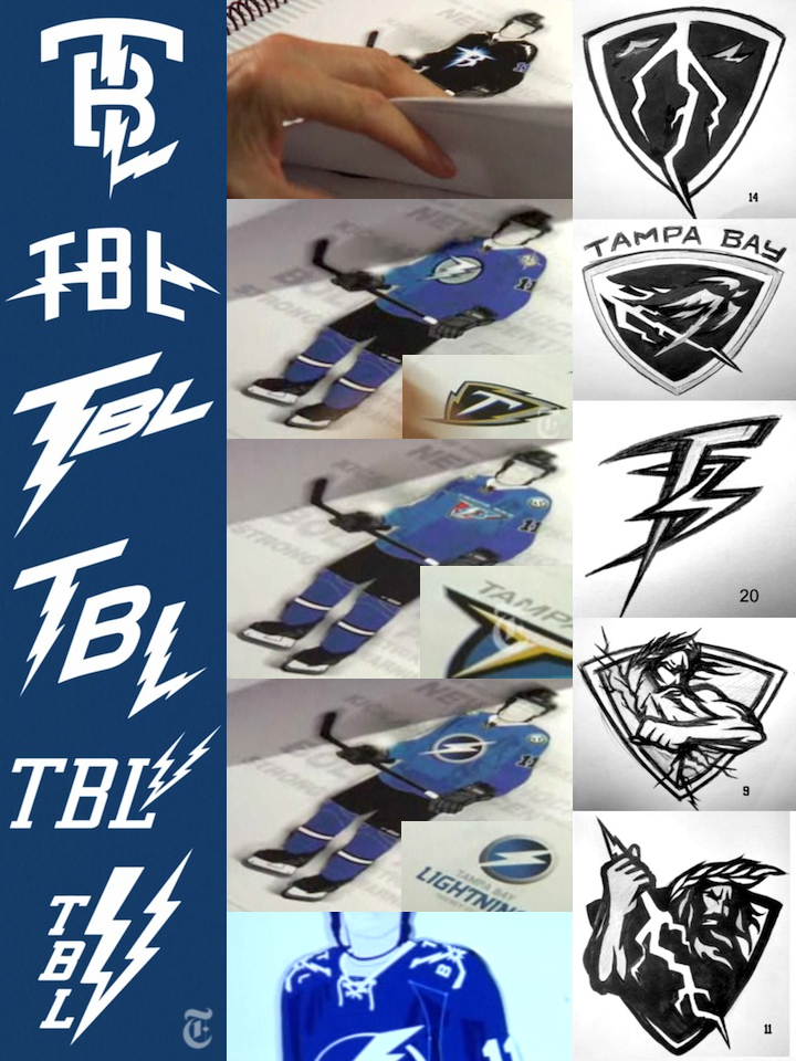 Conceptual work for Lightning identity by SME Branding / New York Times
The whole process took six months and yielded a lot of interesting work. So what do you guys think? Are any of the early designs better than the final product?

Reader Comments (43)
All those options are pretty horrible. Makes me question SME's skills. One of the logos is a rip off of Opel. Are these designers or just people with connections? Those abbreviated word marks are just horrible. The uniform designs that thankfully didn't make the cut are even worst. What's with the option with some red on it?
Anyway, a joke, across the board.
That's one way to get people to like the final product i suppose....release all the shitty concepts and make the shitty final product look decent...I'm personally a fan of the Zeus logo #11 bottom right.
Considering we had some OKC Thunder-style concepts in there, the final product does look pretty good by comparison. Somehow I don't think Zeus graphics would be appropriate to the goal of trying to make them a more iconic hockey brand.
Still, though, the bolts down the pants didn't have to go...
Notice he mentions Original Six and begins to name the teams...omitting the Leafs for some odd reason!
I would have loved to see the Bolts with the logo #11 on their chest!!! It would have been awesome!!!
The Zeus logos as shoulder crests would have been fantastic! Sadly I think the superhero primary they came up with is the best of the lot. The 4th one down looks promising, but has a very Mac icon quality to it, like it should be for a program to zap viruses or something.
Looking at the logo they have today and the one they will have next year one after the other, I have to say the new one is a lot nicer. I really like #20 as well. would be a great 3rd jersey logo. On the new jersey as a whole, not bad, just wish they would have put in some black or gray...
I like the # 20 logo the TB bolt look is super cool and i also like # 11 logo god logo thats pretty detailed, Crazy that they were thinking about puttibe red or yellow in there good thing they didnt would've ruined there whole look but that god logo should be there 3rd logo or something its really original.
If you notice, the jerseys that are held up at the beginning of the video must be prototypes because the TV numbers are in the white arm stripe as opposed to just above, which is where they ended up. IMO they wouldn't show any of the rejected ideas that were great because it may give any competitors inspiration or something to steal. I also found it funny that he listed the "Original 6" teams...all FIVE of them! haha
Awww here we go... please don't start talking down process sketches. These are PROCESS SKETCHES. You don't have to like what the final product became, but don't make judgements about designers' skills based on stuff you were never meant to see.
The number 11 looks cool, but in terms of working as a logo, the final product is still the best option. I would like to have seen them silver remain somehow, but I digress... this rebrand is 8 billion times better than the previous Tampa Bay branding.
Someone tell me why Zeus isn't "The Lightning."
What is this, a Lightning blog or a jersey blog? ;)
Joking aside, the #11 Zeus/Thor-y logo is nice. I'd welcome an actual mascot worked into TB's scheme. But it looks almost exactly like the WHL's Vancouver Giants logo with a god instead of a giant. I think with some tweaking (read: clarity on the "B"), #20 would be good as a secondary. But all of those color TBL wordmarks are barely fit for Junior C hockey. Keep up the good work, Chris.
Re: Josh
As a designer, I understand your point about judging early sketches. My issue is that the final product should also never have seen the light of day, hence my questioning the firms' skills in general.
In all honesty, I visit their website quite often and like most of the stuff they do, I just don't get this one.
OK I understand you like hockey jerseys and logos, but if this is going to become a blog about the aesthetics of hockey just let me know. That way I can take it out of my blog Rolodex.
I think they should keep what they got .
number 11 with zeus was pretty much a carbon copy of the jersey i wore in minors hahaha
#11 pretty cool, maybe as a shoulder patch, probably too busy though (I'm just a fan, not a designer!). The #20 looks way too Mighty Ducks-y, not liking it
I think the prototype full uniform sets indicate one thing; black as a trim color would have looked fantastic!
Zeus, Jupiter, Poseidon or Neptune, whoever that God is in #9 and #11 is awesome! We need that bad boy paired up with the crashing waves at the bottom of the old seasickness alternate from 1999. That would be an amazing jersey, way better than what they settled for. Oh, what a missed opportunity that was.
@Jeffb
I was thinking the same thing. the #11 logo on the chest with the storm jersey, water, rain, and bolts down the sleeves...now that would be a sweater.
Good grief people, enough with the fawning over #11! I'm all for the new redesign. Chris, as a Bolts fan, you may agree with my take (or may not... but whatever). Here's the deal. The Lightning have brought in Stevie Y to run the show and so far, it looks like he's bringing the team in the right direction. I like the whole idea of toning down the look (i.e. going with blue and white, getting rid of the silver and black, removing the lightning bolt from the pants). I believe the message is this: You want to play for the Lightning? Fine. Here's the deal - it's all business. You're here to win a championship. To achieve this you need to focus on that goal and that goal alone. You're not here to relax in the sun. Put on the uni and get out there and get it done. Thanks!
Pffft all this relevant Lightning news! Bias! ;)
I love the Zeus logos. I think they'd be decent shoulder patches! That second-last logo in the middle with the gradient would have been interesting too - it has a very symmetrical Superhero movie look.
Ultimately I am happy with the direction the Lightning took, though I wish they kept a second color (silver or black) to distance themselves from the Leafs.
Even you Chris would admit that a Leafs/Bolts game next season would look like an intra-squad game.
I actually like the new logo...guess that makes me a douche. Still won't own any Tampa Bay jersey though...just not natural.
#9 and #11 are awesome logos, would love to see them filled in on a blue sweater with the TB logo (#20) as a shoulder patch.
Zeus #11 looks pretty effin' badass. That would be a killer shoulder patch logo.
The only differences I would have made was add an exta colour to the primary logo to give it some dimension, put one of those amazing Zeus logos on the jersey for a shoulder patch, and add the bolt to the pants. BAM! If they had of done that, they would be sitting with one of the best jerseys in the league!
I actually really like the Zeus ideas. Obviously they wanted something more simple though, but it's great to see these. Lots of haters in the comments today though!
Fun stuff, Chris!
Should have kept the black pants with bolt stripes.
The Tampa Bay Maple Wings look is insulting.
the zeus logo is sick. some logos look like knock offs, one looks like the OKC Thunder logo but TAMPA BAY instead on top. i like the Lightning bolt logo above the last jersey concept that looks cool too
I actually like the TBL mark that has the "T" as a lightning bolt but not the "L"
The #11 Zeus/Thor angry logo is too cartoonish, much like the Senator Centurion. I understand why they went back to the original 1 color uniform, but the logo is too clip-art for me. The TBL with the horizontal lightning strike through it worked really well, even if it id look like an FM radio station logo.
And i dont understand what there isnt to like on the new jerseys.... Everyone always complains that these new reebok jersey are just too busy and have to much. But then, when we finally get a simplistic design, we all say that its not enough.... Whats up with that? I love these jerseys to be honest
@ Bistro... It is very cartoonish, but it would be a great shoulder patch though. There isn't anything wrong with the Sens logo except that it should be a secondary logo, not the primary on the front of the jersey (unless it's a third). If they were to have used #9 or 11 as a shoulder patch (much like how the Canucks used Johnny Canuck on their thirds) it could work quite nicely.
@ Go Sabres: I actually like the full blue jersey and piping, they just didn't have to drop the black exactly. The logo is now to plain since the dropping of the back and silver (in my opinion). I also think that pretty much everybody enjoyed the Bolt strip on the pants as well because it was sort of a neat little trademark of theirs. They could have made a more simplistic design without having to drop 20 yrs of tradition, and trying to fix things that were not exactly broken.
i personally like the 2nd uni concept, the blue jersey while keeping the black and silver in the logo, and of course that zeus logo just rocks, the blue and white route they went with, looks too leaf-ish
I absolutely hate the Zeus idea. I agree that it "looks cool" but it would make an awful brand image and odd jersey - like the infamous NYI fishsticks.
Main disagreement with the new look revolves around the definition of "tradition". The TBL have won the Stanley Cup in black, white, gray, and blue, with lightning bolts on their pants instead of stripes. This look is Lightning tradition. Once they skate out in blue and white, they will be assuming the tradition of others - the 1979 Maple Leafs tradition (to be blunt, an often mediocre team that hasn't won since '67).
Furthermore, four of the original six use two colors + white. This clearly makes the best traditional jerseys: Boston, Chicago, NYR, Montreal. The Red Wings get away with their jerseys because they have the best logo in sports.
I think they went with the best logo and the best look, Maybe a little less Red Wingsy on the jersey, but you can't have it all right?. Logo 9 or 11 would be an awesome shoulderpatch and/or third jersey, I'm no big fan of the Bolts-jersey.
Of the "TBL-logos" I like the second from the top. All of the others are absolutely horrible!
As a lightning fan, I have to say that I don't like anything in the picture spare one logo--the one in the right column, second from the top. It's very indicative (to me, at least) of the origin of the team name, from what I recall of the story.
#11 is pretty beast.
Like most everyone else, I too think the Zeus logo is excellent. I think it would clash too much with the main logo to work as a shoulder patch, but it definitely would work on a third jersey in a couple of years. I also don't mind the logo on the black jersey in the top center image, although I'd like to see a better version of it to see the exact details. The only TBL that comes anywhere close to working is the one second from the top.
The one they chose in the long run was totally the best.
I think in ten years times it's going to be one of the most popular logos in the league.
Love these. At first I thought it was just the Opel logo, but there's plenty of difference.
#11 would be a great shoulder patch on a third (which could be black with the logo in silver, trimmed with blue for a new/throwback look)
I started to like the Lightning after I picked up Stamkos in fantasy hockey in his rookie year (although he couldn't make himself known then), and they've really grown on me. Of course, I still like it when my Caps beat them down...
either one of those 'zeus' logos would have looked damn good as either the main logo (possibly for a new 3rd jersey) or as a shoulder patch. a missed opportunity?? or could it be a late addition to the new jerseys?? REALLY hope its the latter!!