


Senators Confirm New Third Jersey
 The Ottawa Senators held their fan forum call today and use thed opportunity to officially confirm their intention to launch a brand new "heritage" third jersey to mark their 20th anniversary season in 2011-12.
Taking a page out of the Buffalo Sabres' book, the Sens' new sweater will be a throwback to a team that existed long before they did. The team's owner, president and general manager were all on the call and also discussed the 2012 NHL All-Star Game.
Here are some of the relevant details from their website:
2011-12 season: The Senators will celebrate the club’s 20th anniversary in the National Hockey League throughout the whole season. Celebrations will highlight the Senators and city of Ottawa playing host to the 2012 NHL All-Star Game and Weekend, as well as recognize the 11 Stanley Cup-winning teams of early-era.
Senators heritage jersey: The Senators will introduce a new third jersey, a heritage jersey in recognition of early-era teams.
2012 NHL All-Star Game and Weekend: Senators full- and half-season seat owners, renewing by March 31, will receive priority access to tickets for the all-star game. New purchasers will also have access.
They offered no specific information on the design of the new alternate sweater, but based on the mention of "early-era teams," I think we can make a few good guesses. You know where to send your concept art.
 Chris
Chris
 Sens concept / Jacob BarretteThis might be a good time to point out some previous Icethetics posts that have some relevance to today's news.
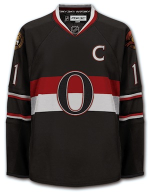
- In August 2009, we held a poll between the Senators' current third jersey and Jacob Barrette's concept design (right). Guess which one got 88% of the vote.
- A couple months ago, Ottawa's AHL farm club in Binghamton sported the barber-pole look with "vintage white." It was not pretty. Worse (if possible) than Calgary's Winter Classic threads.
- Also in January, the Ottawa Sun speculated on an "O" jersey for the Sens next season.
- Perhaps most noteworthy, both the barber-pole and the Barrette jersey designs have appeared on the Sens' official website in the past. I'm referring to an artist rendering of the O Store at ScotiaBank Place from 2009.
- And lastly, memories... If you want to get all nostalgic on the now "old" Ottawa third jersey. Remember when it first leaked?
That's all I've got for now. Anything else would just be speculation.
Chris
The story continues today with more speculation on the design of Ottawa's new third jersey.
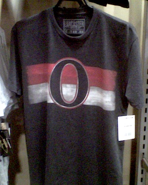 Senators O T-shirt / Joel HouleFirst, one reader pointed out that the Senators are actually selling a T-shirt that looks and awful lot like Barrette's concept jersey (see above).
Even if it doesn't end up being the new sweater, it's at least nice to know that design is available on officially licensed merchandise. And don't mind the ignoramuses who say it looks like a zero. They're just trying to goad Sens fans.
Second, The 6th Sens blog picked up on a radio interview that revealed some new information on the actual design of the new uniform. Sens president Cyril Leeder was asked for details. He actually gave some:
Looking to see whether Leeder would disclose any hints about the sweaters or keep those cards close to his chest, Lloyd asked, "Are we going to see some kind of barber-pole ... old-school [look]?"
Leeder replied, "Well, you'll definitely see a barber-pole. ... The original barber-pole was the Ottawa Senators jersey so it's definitely going to be part of the design.
"We've actually got the prototype sitting right in the office next to me here and we think it's a sharp jersey. It's really going to be a great jersey and a good testament and tribute to the teams that started hockey here in this city. And really ... the first dynasty in the NHL was the Ottawa Senators."
We keep talking about the B-Sens barber-pole jersey and Barrette's design as though it has to be one or the other. The way I see Leeder's comment, why can't it be a mix of both?
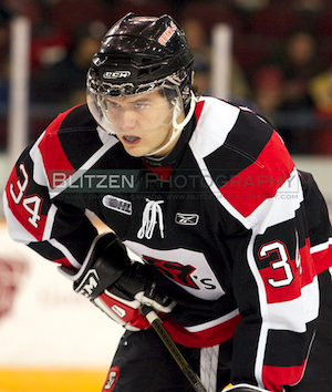 Ottawa 67's / Blitzen PhotographyHe says the barber-pole will be "part of the design." That means the entire jersey doesn't have to be covered in stripes — maybe just the sleeves?
If that sounds familiar to you, you're probably a fan of the OHL's Ottawa 67's who currently wear a sweater quite similar to that description.
Personally, I'm pulling for this look as I just can't stomach another jersey covered in bad stripes — especially one that will see action up to 15 games a season.
I've always thought CHL teams have some of the best uniforms in hockey (and I can't wait to try to put together their jersey galleries). And while the 67's jersey isn't my favorite, it would be a solid choice for a Sens alternate.
One reason I say that is because of its similarity to the team's current black third. And that could be a good thing. While Icethetics readers may not like it, it's apparently very popular among people who spend money on jerseys in Ottawa.
Still, I can't help but worry we'll be disappointed by the Senators — as it's happened all too often in the past.
What do you guys think? Would the 67's jersey be a good look? The barber-pole? Barrette's jersey? Or should it be something entirely new and original?

Reader Comments (42)
I like this. As long as they stay away from the thin stripes (a la the Canadiens CAC jerseys) and go with the template the Ottawa 67s used, they're good.
I hope it is not a barber pole. The Ottawa 67's said they couldn't do that on their edge jersey's, so hopefully it will be a nice simple O jersey.
Huzzah! The death of "SENS" is at hand! Though I'm sure we all know by now what it will look like.
The only thing that would be better than this is if they replaced their current jerseys with something more traditional and put the 2-D Senators Logo on it.
Hope it's the Black O jersey that's been circulating around the web for a while now. That would be a quality jersey.
Ryan, you and I both know what rubbish that statement is. If the Habs could do it, and the Senators' AHL affiliate in Binghamton could, then there's no reason why Ottawa can't do it.
It can be done, if it's done correctly.
The jersey will mirror the number of wins the team has.
Why does everyone always hate on the stripes? It something unique and different and better than the cookie cutter reebok edge everyone went to.
Ah, thanks for posting the update. That's the one I'd like to see. And, at the risk of being attacked, I really, really don't like the pinstripe look. At all. Just way, way too busy looking for my taste.
Sens President Cyril Leeder was on the Team 1200's Healthy Scratches radio program this afternoon and told the hosts that the team would be using a barberpole jersey.
From host Steve Lloyd's Twitter: "From Cyril Leeder: 1. "barberpole" will be part of the Sens heritage sweater next yr. 2. Club is exploring a behind the scenes show."
I will be so happy if it is either one of Jacob Barrette's or a full barberpole jersey. A full barberpole jersey, à la the 50s Senators/67's, rather than the 30s Senators (i.e. fewer, broader stripes), it will look amazing.
I was at a Sens game last weekend and I noticed that they were selling black t-shirts with the same design as the black jersey in this post, with the =O= logo on black. its a solid design and with a little luck, will become a jersey!
These throwbacks are horrible or fantastic depending on your standpoint: horrible if you're a Sens fan, FANTASTIC if you're the rest of the world! Um... ITS A BIG ZERO! This has got to be a joke.
thats a beauty of a jersey up there. i would have to buy that one for the odr even if i dont like the sens
Definitely excited!!! I really hope they design something the Sens can be proud of.... Cause these days there aint much to feel good about. lol.
Awesome!! Do the barber pole, with thick stripes, could be best jersey in league if done right.
The Sens jersey is WORSE than the Flames clown suits? Are you crazy? That throwback is the only decent barberpole worn in the modern era. Get your eyes examined.
'Heritage' jersey?? mmmm, does that mean the Sen's will be playing out doors in Feb' 2012??
The above jersey is pretty sweet! I still don't know why the Ottawa Senators continues to ignore it's most recent history & suddenly wants to embrace it's ancient history. The old 2D or new 2D must be used. This 3D crap has been fazed out by almost every other team that experimented with it. Why must Ottawa continue to use designs that are obviously very unpopular aesthetically?
I think Jacob Barrette's is beautifully simple and properly stylish in a modern way while paying homage to the Sens' history, and I've been hoping for it to become reality since originally seeing it. Meanwhile, when I saw the Binghamton barberpole jerseys I was filled with disappointment. If they do lean more on the barberpole theme, I really hope they work with moderation, as I find both the Binghamton and Habs barberpole jerseys to be way too busy and distracting. I read someone post this a while ago in the comments: "Sometimes vintage is vintage for a reason."
I've been looking forward to a new Sens jersey for a while (I still wear the previous pre-Edge red jersey to games, even though I prefer the redesigned logo), especially with the promise of likely having an All-Star games patch on the shoulder next year (maybe a 20th anniversary patch on the other? Too much? Put in the redesigned 2D logo that rarely sees use and I'll be just as happy), so I was quite willing to even drop money on an authentic and get it lettered/numbered. Fan or not, however, I just can't put money on a jersey that would make me cringe whenever I walked into my closet. To be badly poetic with it, this is going to be a rebuilding year for the Sens, so I'd rather just acknowledge the past and embrace the future, keeping the design more on the modern side than overdoing it with a blinding barberpole throwback.
Vitamin_M, Pop Fisher, et al. are fine examples of why we need to go with a 50s, Howard Riopelle era O for the jersey.
People are illiterate, and can't figure out that the O stands for Ottawa, so we should probably go with something that is quite obviously an O.
I really tend to eyeroll at the "Its a Zero" stuff regarding the O, if only because its a played out critique now and and its not even in use as a primary logo yet.
Its a great, simple, minimalist logo and I think would look dynamite on a third. I wouldn't want it to overtake the Centurion overall, if only because that logo represents twenty years of branding and it would be a waste to throw that out to trying and ride the coattails of the team the modern Sens are descended from.
I guess ultimately it comes down to one simple thing; the O logo will look good and if the team plays well behind it then, well, its a lot harder to mock a logo when your team is getting beat down by it. Its up to the boys wearing the sweaters to add weight and value to them.
Awesome exciting news! Go Sens and I look forward to wearing an =O= sweater!
I'm not a fan of the barber pole design, but I do like Jacob's up there. I think what I'd like to see most is a variation of Jacob's design that incorporates the old 90's gold with the black laurels inside of it.
No disrespect to Jacob Barrette but I hope they don't use that design. Not feeling those thin Dallas-esque Sleeve stripes at all. It also needs more Red!
I've not seen nor heard of this, but I wonder if they'll go to the old jersey that has Senators spelled out and the parliament building a major focus. I believe those were black and green. That said, I would LOVE the 'O' jersey. I thought for sure that would have been their new 3rds when they introduced "SENS".
I always felt like the 67's beat the Sens to a really good jersey design
Let's put it this way...if it's the B-Sens barberpole, or something closer to the 67s, I will find some casual interest. If the Sens go with the Barrette "O" jersey, I'm buying one...and I'm a Devils fan. Personally, I think think that would be one of the best jerseys in the NHL.
Barrett's design!!! It's looks awesome and still pays tribute to the classic. This is a great, classic jersey, and WILL be up there for best jersey in the league. I understand the vintage appeal of the barberpole, but with all due respect, it is hard to look at. I'll admit I'm a little frugil when it comes to jerseys and other merch (I rarely purchase any team gear), but this =O= jersey, I will buy 4 tomorrow, one for everyone in my family. Great work Jacob!!
I hope the Sens are using Jacob Barrette's idea on that -tshirt, is being compensated, and they are not just not ripping off his idea.
Yes to Barrete's design. No to th 67's. It looks like Ottawa has already licensed his design, why not go all out and continue with a sharp, modern, yet classic look? Let this man get paid! Plus, why model after a junior team? Set your own standards.
"Vintage is vintage for a reason" is right. The Habs showed that it was an absolute eyesore. Who cares if it's history. Ugly history is still ugly. Jonas Hiller is already out with a case of vertigo. If barber poles make a comeback, look out for an epidemic next year.
Charlie, it's important to note that all the elements of his design are owned by the Senators. He has no rights to any of the design and they are free to use it as much as they like. In a case like this for the artist, I'm sure it's more about getting a better jersey design for his team than getting any personal recognition.
Legal or no, and I'm sure that it is, it would be nice of them to give a shout out to the guy who did the work of designing it. Even if they don't even wind up paying him, it would be good for them to at least thank the guy. The legalities of a situation may be one thing, but the ethics can, and often are, completely different.
I'm not saying they haven't or that they won't, since I have no way to know, just that ethically, they should do something.
Also, looking back at those earlier posts, I don't know why the fark I bothered giving their current abomination the benefit of the doubt. Any chance those comments could be expunged from the record?
I would agree with that Jeff. Would be nice for Jacob to get a name check. And while there's certainly no responsibility on the team's part to compensate or credit, it would make for a cool story. And I do believe he has been in communication with the team in the past.
And about those earlier comments, I'm afraid I was with you on the whole giving the benefit of the doubt thing. They will live in infamy.
They should definitely go with Barrette's design. It's simple, elegant, and pays homage to the rich history of Ottawa hockey. If they use Barrette's design, I'd be first in line to buy one.
Yeah that t-shirt doesn't just "look an awful lot like" Barrette's design. It is literally pixel for pixel identical. Look at the strokes around the O. Thin white followed by thin red. Also, look at where the background stripes intersect the O. I hope he got some kind of recognition for this.
Again, JB, the simple reason for that is that it literally is the Senators' secondary logo. Barrette doesn't deserve credit for a logo he "borrowed" to create his design. I'm sure he would say the same thing.
Gotcha. Didn't realize, thanks.
I like the look of that T-shirt, but as previously mentioned it is a direct copy of the shoulder patch on the current jerseys. I'd like to see them make use of their new 2D secondary logo but it doesn't sound like that is going to happen. I don't mind the O, the comments from the people too stupid to see that it is O and not a 0 will get a little tiring but that should pass.
Of course it's the letter "O" and not a zero, but that doesn't matter - it will be known as a zero. The Buffaslug is a Buffalo yet became known as a combination of buffalo and slug because it was a credible comparison. This is very credibly a zero and a horrible image for a team to have.
It just needs a little bit of gold on the actual jersey .
Make the "O" look more like a letter than passing as a "zero" as well and this is fine. The Baltimore Orioles for example have an upper case letter "O" on their caps with a swoosh on the top so as to not be mistaken for a zero.
The jersey will mirror the number of wins the team has.
MAR 2 // 5:58 PM PST | POP FISHER
every team has zero wins the season hasn't started